My Shots - sketchup & vray
-
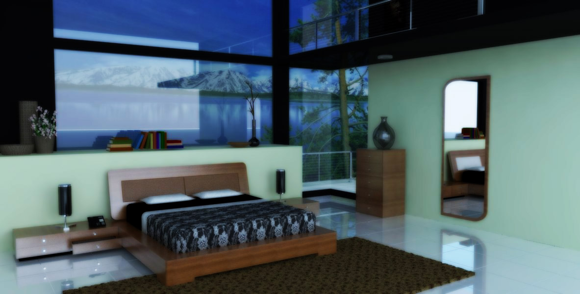
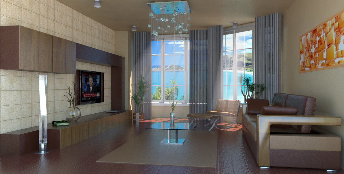
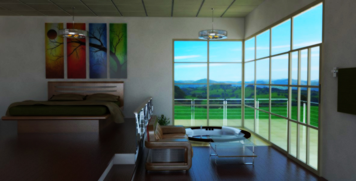
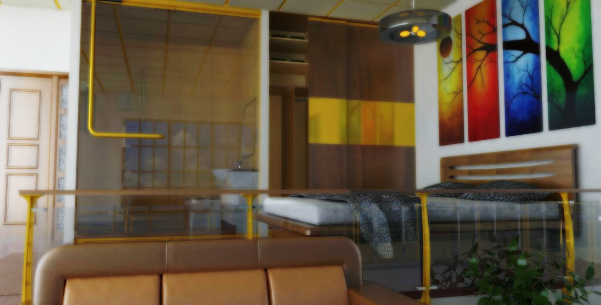
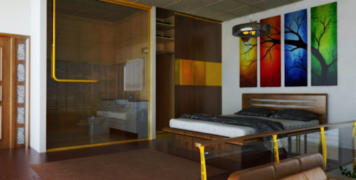
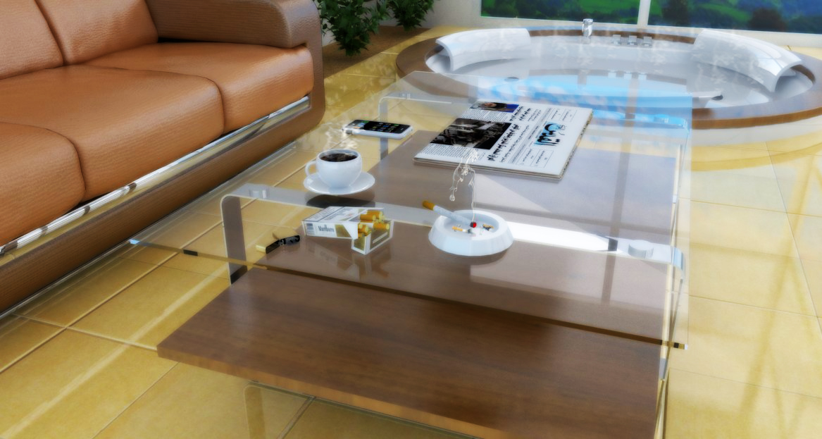
a bed room with bath, balcony and a jacuzzi ...
i started my attempts started by using some 3d models from wharehouse like shot 1 & 2 ,then i designed this room but the file was heavy so i rendered just those 4 images
programmes: sketchup - vray - photoshop
-
SHAHEEN, the second image looks great.
-
the second and the last are my favorites
-
Those are all great shots, but they seem kind of fuzzy? Slightly out of focus?
-
Yes, they all look great. The first one is too blurry; can be disconcerting to those with less than perfect eyesight.
-
thanks guys for your comments and advices ...
i used - filter ( blur - gaussian ) and an overlay layer in order to make the colors much saturated ... but it seems not a good idea ,,,
-
hi shaheen,
that method in itself is not bad, but you really have to watch your blur radius.
also now that I take a closer look... in your second image, the background image doesn't align with the render; the horizon is too high
Hello! It looks like you're interested in this conversation, but you don't have an account yet.
Getting fed up of having to scroll through the same posts each visit? When you register for an account, you'll always come back to exactly where you were before, and choose to be notified of new replies (either via email, or push notification). You'll also be able to save bookmarks and upvote posts to show your appreciation to other community members.
With your input, this post could be even better 💗
Register LoginAdvertisement


