Wild garden
-
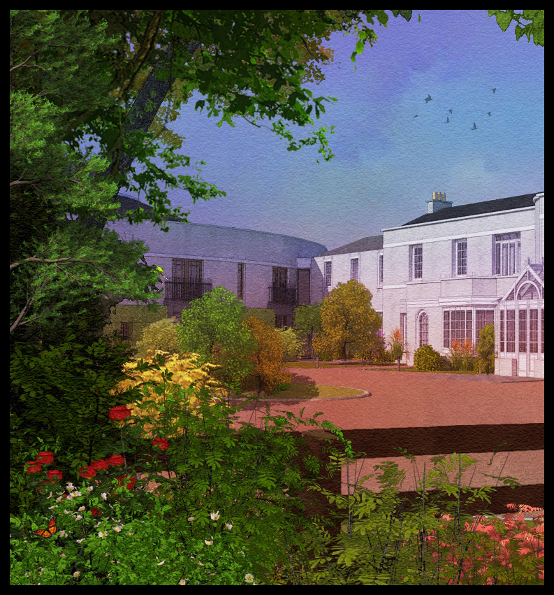
Attached is an image where i am trying to convey a wild garden idea along side a very formal building,also I'm trying to make it as colourful as possible.Originally it was rendered in twilight but unlike other images I have done in this style,it wasn't taken through fotosketcher,just loads of photoshop(42 layers and counting!)
-
I agree with James, this is a beautiful image.
The composition is excellent, I like the building and the vegetation looks amazing
-
@unknownuser said:
This is lovely David, some nice looking plants there and you even squeezed in a butterfly
 nice NPR it certainly works for me..
exactly...
-
Thanks James & Dylan for your comments.
Below is a website that has some amazing hints in how to create a landscape.This site is about painting but the same Rules follow through.(I'm sure I've broken 1 or 2)
http://www.wetcanvas.com/Articles2/135/120/
From my own perspective,I want the building to be grounded in some manner.Most of my images are created from a point of view as if you have just suddenly happened on a building,almost as if the building is secondary.I do create more conventional images i.e no foreground etc but I think that this style can help to create a certain mood and definetly helps in early design stages. -
sorry,i also meant to add that some of the vegetation is from the "Billboards" that accompany the xfrog downloads on this forum
http://forums.sketchucation.com/viewtopic.php?f=40&t=34516 -
I really like the composition.
One of my favourite Art Profs would have complimented you on it's highly abstract qualities.
Quite fine -
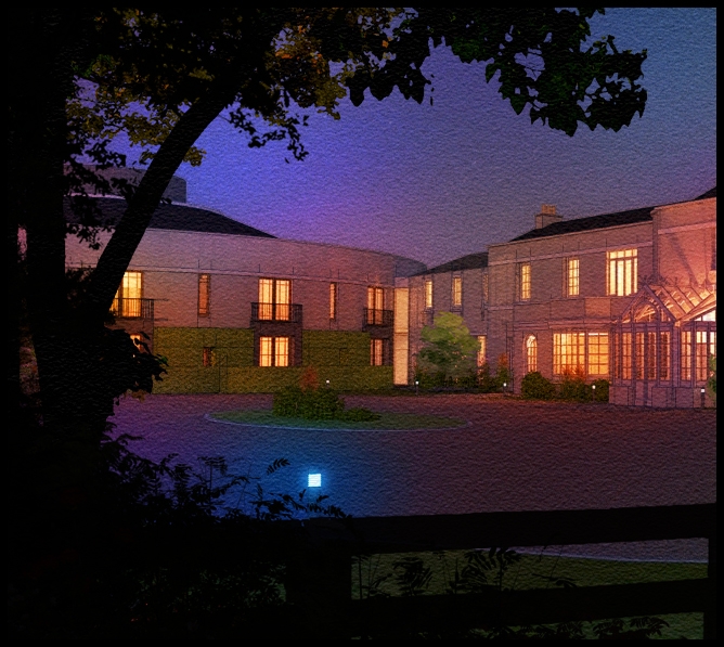
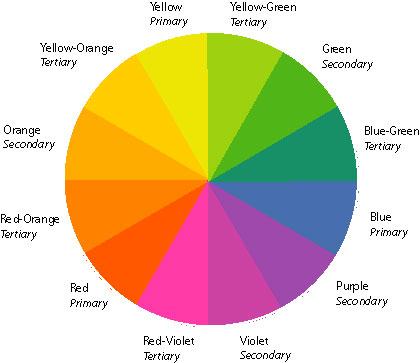
Attached is a low res night shot of the garden.I try to use as many colours from the attached colour wheel in order to create contrasts,i.e bright oranges against mellow blues and purples.As I said before night is rarely if ever black,there is always a hint of blue in the atmosphere.
-
Wow, both are stunning pieces of work and have amazing impact.
-
Great work. My only criticism is that the driveway light/garden light looks more like a whole cut in a watercolor laying on a light table. My recommendation would be to take the original art for the vegetation before you blackened it and take that little bit (with original color but color balanced to the blue end of the spectrum) that would be illuminated by the lamp and float it to a new layer. The effect being that light from the lamp would give a tinge of blue light to the nearby foliage.
-
Those are beautiful, David!
-
The night shot is especially stunning.
Best,
Jason. -
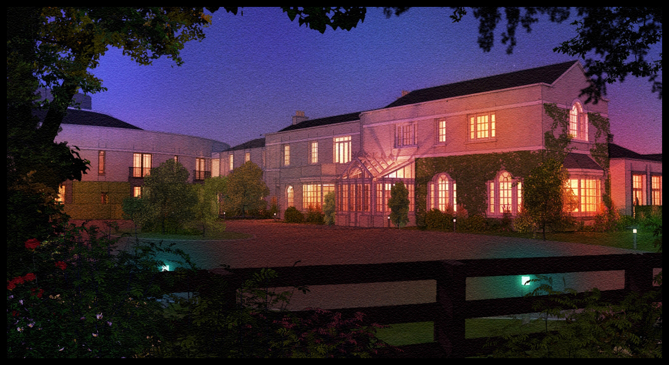
attached is a larger image of the night shot with some tweaking.
-
I like what the tweaks have done. The night lamps are pushed back and fit better into the context. Very nice.
-
That last render is stunning.
-
another night shot,again a 10 minute twilight render with multiple overlays and layers added in photoshop.
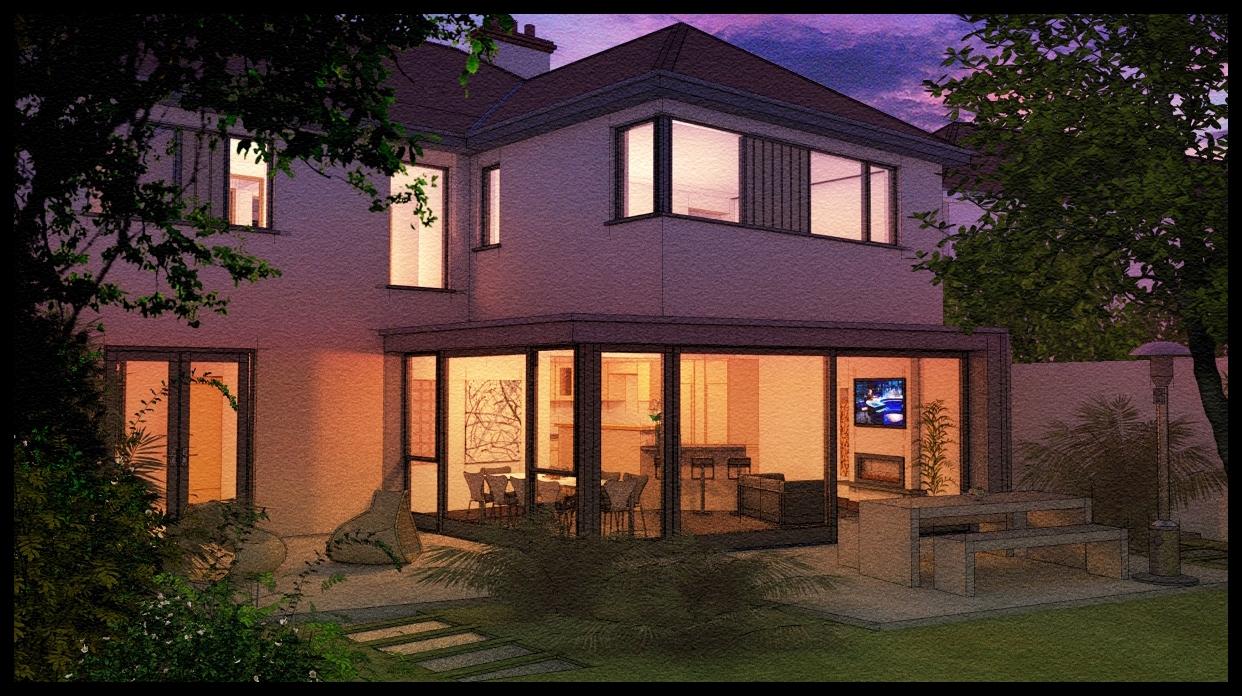
-
original twilight 10 mins render attached
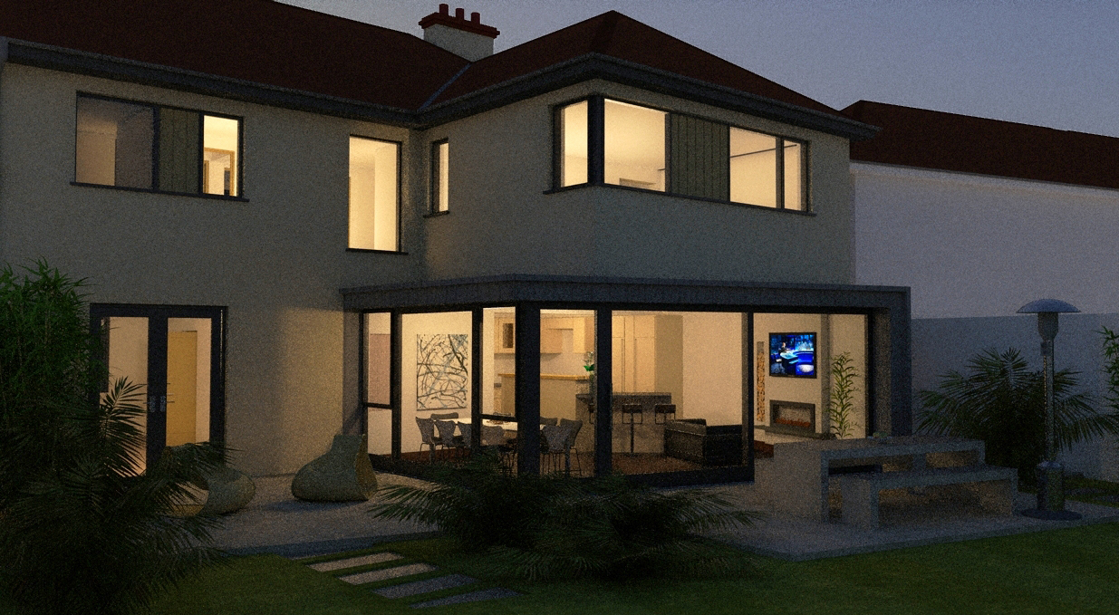
-
I like the render
 -- but the photoshop work and your skill with color just makes it "art"... I'm a big fan
Best,
Jason. -
another night shot,but there are some additional landscaping elements I need to add and I will re-upload when its complete
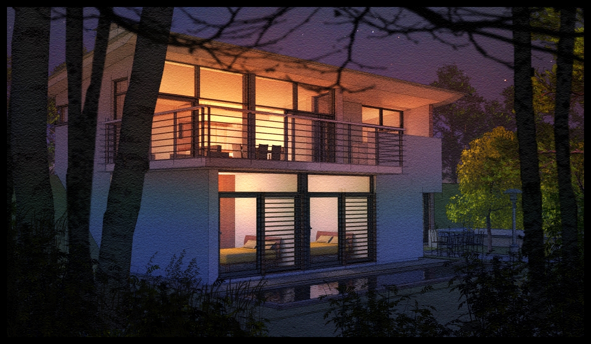
-
below is an elongated version of the last image with more trees and vegetation.

-
I can hear the crickets. No maybe that is just tinitis.
Hello! It looks like you're interested in this conversation, but you don't have an account yet.
Getting fed up of having to scroll through the same posts each visit? When you register for an account, you'll always come back to exactly where you were before, and choose to be notified of new replies (either via email, or push notification). You'll also be able to save bookmarks and upvote posts to show your appreciation to other community members.
With your input, this post could be even better 💗
Register LoginAdvertisement


