New old renders
-
Michalis thanks....yes I love the water as well.
Oli thanks... still no feed back. I suppose no news ...good news. I know from discussions design seems fine in their eyes. It will be power of local opposition which will make it or brake it. All consultation with relevant statutory bodies were positive so far. Keep the fingers crossed.
Yeah... I will try to add some dirt stuff and also test instance brush with xfrog trees at some point. I have only started to learn Thea.
Paul.... I am only kidding.
  I am not sure though what you really mean.
 -
@sepo said:
I am not sure though what you really mean.


It may be that my screen is not able to pick up the subtlties of color.
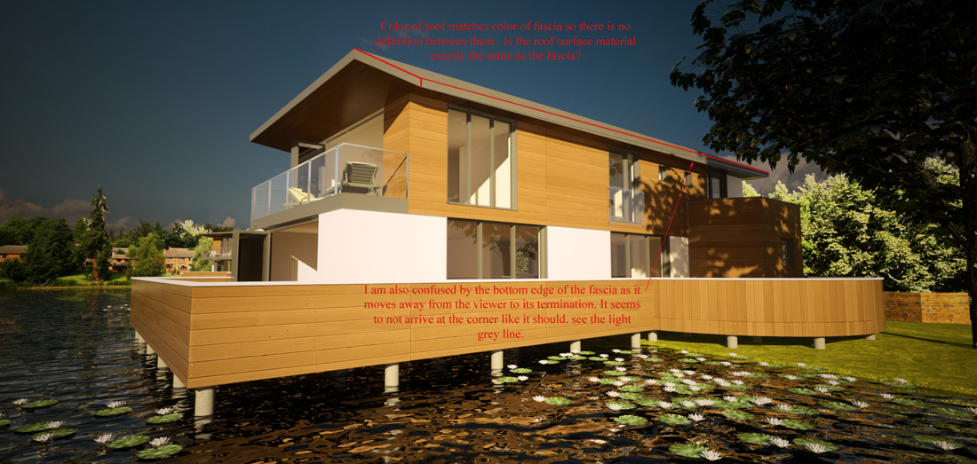
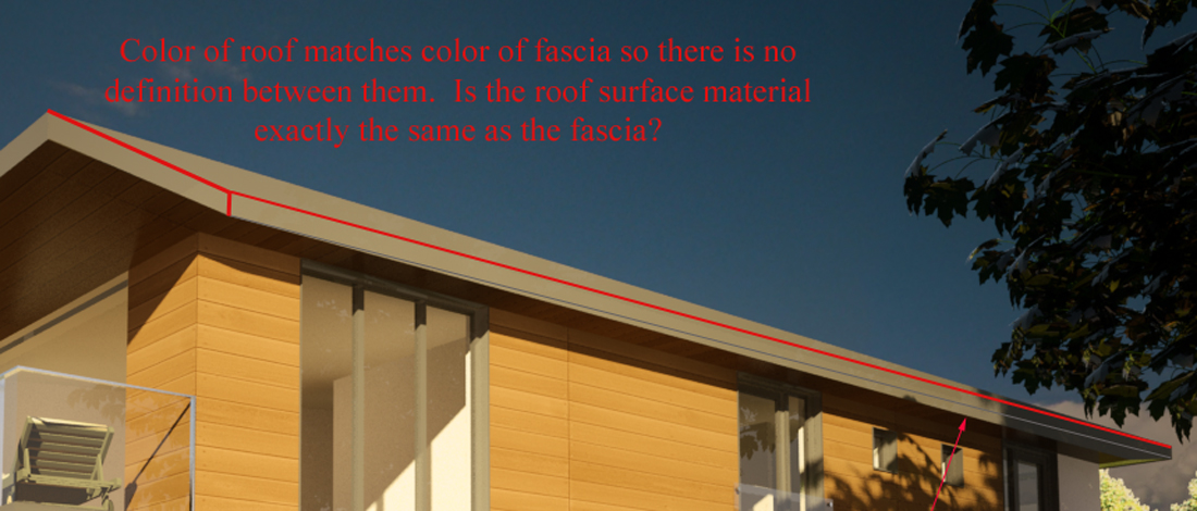
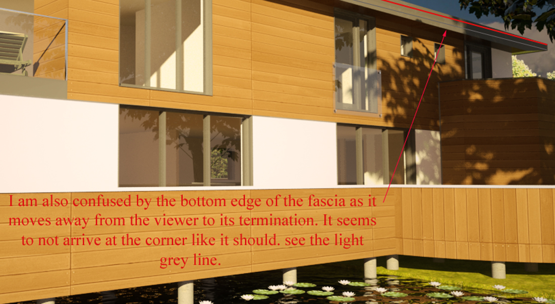
Or maybe I am reading the roof and facia planes incorrectly.I put some notes on the image to try explaining what I am seeing.
p
-
pmolson, it think sepo's building has a flat roof. Fascia narrows towards ends of the roof.
-
@edson said:
great stuff, sid. and I mean both the renders and the architecture.

Thanks Edson. Your comments are always appreciated.
-
@pmolson said:
@sepo said:
I am not sure though what you really mean.
[attachment=2:1zvtkxaj]<!-- ia2 -->wildernessthesbsd2.jpg<!-- ia2 -->[/attachment:1zvtkxaj][attachment=1:1zvtkxaj]<!-- ia1 -->wildernessthesbsd2crop1.jpg<!-- ia1 -->[/attachment:1zvtkxaj][attachment=0:1zvtkxaj]<!-- ia0 -->wildernessthesbsd2crop2.jpg<!-- ia0 -->[/attachment:1zvtkxaj]
It may be that my screen is not able to pick up the subtlties of color.
Or maybe I am reading the roof and facia planes incorrectly.I put some notes on the image to try explaining what I am seeing.
p
Paul, it is flat roof which has tapered eaves.... Let me find another image which might explain it better.
-
-
Took me a bit, but I see it now.
Thanks.
P
-
-
Great work Sid! Even in b/w it feels warm and welcoming - makes me wanna go and live there.


alex
-
Thanks Alexander. The best possible comment I could have.

-
Sid
Stunning work mate! The dwellings are stunning indeed!
Re rendering, it looks like you could use some bump to the timber panels, the left end face of the larger posted image shows this clearly.
Re design, I'm surprised the terraces of the over water dwellings have a completely solid balustrading all around! This in effect will block any seated view of the water when inside. I understand this could be to drive privacy though if that is the wish of the end user some long plant pots could be place to avoid any loss, though at least the option exists to view the water for those who may demand, even if only for part of the far end.
Again mate stunning work and particularly from a design aspect!
-
@unknownuser said:
Stunning work mate! The dwellings are stunning indeed!
Thanks Richard.

@unknownuser said:
Re rendering, it looks like you could use some bump to the timber panels, the left end face of the larger posted image shows this clearly.
I agree and I have bump on the last render. I know it is hard to see but the bumps are there.
@unknownuser said:
Re design, I'm surprised the terraces of the over water dwellings have a completely solid balustrading all around! This in effect will block any seated view of the water when inside. I understand this could be to drive privacy though if that is the wish of the end user some long plant pots could be place to avoid any loss, though at least the option exists to view the water for those who may demand, even if only for part of the far end.
It is quite complicated reason. Mixture of privacy, wind protection and demand by locals for reduction in quantity of glass due to possible glare.
-
I cant see these attachments sid. Why not using the SCF method?
-
-
-
excellent set sid. keep on shining. the last one was really impressive.
-
Great renders sid.


Now watch this old film from the 1960s by the Czech animator Karel Zeman if not already
http://www.youtube.com/watch?v=z9tjcHdJwB8 -
Thanks Nomer and Michalis.

Hello! It looks like you're interested in this conversation, but you don't have an account yet.
Getting fed up of having to scroll through the same posts each visit? When you register for an account, you'll always come back to exactly where you were before, and choose to be notified of new replies (either via email, or push notification). You'll also be able to save bookmarks and upvote posts to show your appreciation to other community members.
With your input, this post could be even better 💗
Register LoginAdvertisement


