New project and lessons learned
-
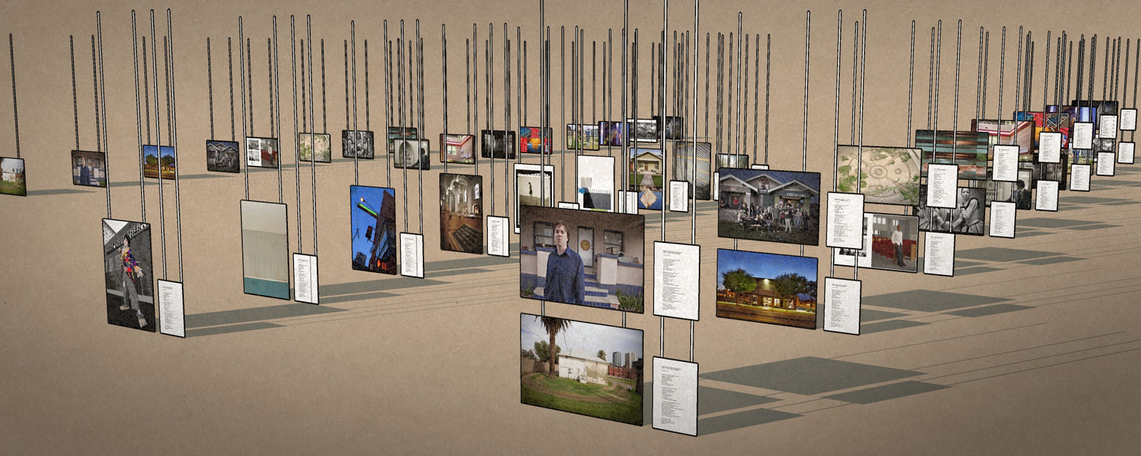
This is less about images and more about alternative uses for SU, and lessons that I relearn every time I use SU.This is a real, not virtual, art project in Phoenix, where 26 photographers and 26 writers use one of 26 city blocks as inspiration. These are the photos and accompanying stories mounted on cables that will hang from the ceiling of a building that I am also modeling.
Lessons:
- Absolutely never trust CAD drawings. I have done four projects so far where I was given CAD drawing as a basis to work from. In one case arbitrary dimensions were added to the printed drawings that did not match the actual line dimensions. Another set of drawing had almost overlapping lines on the same level that could not be seen until you got to the maximum enlargement. On this project there are a number of elevator bays shown on the floor plan. The walls between them should be on the same plane, but when you raise the walls and try to connect them above the door frames the walls don't quite meet.
- For a long time I ignored layers because they seemed cumbersome. It has been a painful lesson but layers are incredibly useful. But all of you knew that already.
- Don't try to complete a complex project as one model. Do sub components as separate files and do the final project by joining sub components. Error correction is much easier and you will waste far less time and make fewer mistakes while waiting for you computer to catch up.
- Never construct the same component more than once. Seems obvious, but I keep cheating on the rule over and over again.
- Once a part is completed and placed in the model lock it. If you don't you will find a way to break it.
The purpose of the project is to show the owners of the show venue that the show will be an asset and also demonstrate that there is minimal risk in staging of the show.
-
Thank you for the tips. I'm a beginner and I've only just discovered the joys of layers. Now, the idea of making everything in a separate file is making me want to jump and shout! It seems so obvious and yet...
I'm working on a bathroom in excruciating detail (for me) and all those little bits have just been taking so long to redraw, so I have been watering things down. Nope! No more! I will break it up now.
I don't understand about the locking, however. Would you explain further?
Thanks,
Bantymom -
What a strange coincidence. I'm still learning the same work flow.
BTW, very nice conceptualizing and a cool project.

-
@bantymom said:
I don't understand about the locking, however. Would you explain further?
Thanks,
BantymomIn the Windows Menu, open up Entity Information. Now select a component (or a Group, or a number of lines, really) Entity Information will show you all that is needed to be know about your selection. Underneath the informations, there are a series of check boxes: try clicking on the one that says "locked". Now your selection will become red, because you can no longer edit or modify it.
Clicking on "Locked" again will unlock the objects.
You obtain the same effect, right clicking on the selected elements and choosing "lock".
Locking an element guarantees you will not delete a completed component by mistake. Als it lets you use snap point on the locked elements, if you need them as reference for new elements.

-
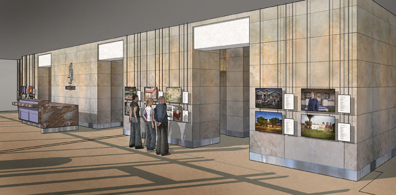
Here is how the show will stage in this building lobby. I am finding more things that were built differently than the CAD file but I am making progress.On trick I just learned is that you can let sun come through a solid roof to mimic interior light. It is a bit of a cheat, but justified on low and no budget projects.
Regarding locked components and groups, "like Broom Stick" says.
-
Nice work, roger. and great texturing!
Are you staying with Sketchup output?
@unknownuser said:
In one case arbitrary dimensions were added to the printed drawings that did not match the actual line dimensions. Another set of drawing had almost overlapping lines on the same level that could not be seen until you got to the maximum enlargement
tell me about it. I've spent nearly 2 weeks on a simple project just because the cad drawing was so bad. overlapping lines, non-intersecting lines, exploded splines/polylines (weld plugin came in handy)....written dimensions didn't relate to line dimensions....everything was out of scale.....it makes your life a nightmare!! so well done overcoming the problems, I feel your pain!!
-
Thanks for the comment on the texturing.
I spent hours looking for the right marble textures for the floor. I should do a tutorial on it. I found one tile I liked and then cut it into 12 horizontal slices. Then on every other slice I either flipped it end to end or cut the strip in half and the switched the right and left halves. Then I merged all the resulting layers. The next step was to make twelve vertical slices through the resulting layers and reverse the order of those slices. Now I had 144 tiles that did not blend into the surrounding tiles either by color or pattern. Lastly I found a small brown tile for all the darker inset tiles.
On the wall tiles, a fellow member of the American Society of Media Photographers and one of the exhibitors made some photos of the venue and I was able to pull the pattern from his photos.
Being a photographer as well as architectural illustrator always helps with texturing.
-
Roger,
That's great Sketchup/Photoshop work. I enjoy your watching your work-in-progress and your lessons learned...I'd be delighted to see how you made those tiles, please do make a tutorial!

-
I was going to post more on my methods but we found out a kid that was on my son's hockey team in high school was hit pretty badly by a mortar round in Afghanistan. We went to visit the parents and then the rest of the day just sort of went to waste.
Anyhow about the model. I took some short cuts. After working with SU for several years I just realized you can make any object you want loose its shadow. So instead of doing some complicated lighting in KT I just turned off the ceiling shadows and let the sun shine through the opaque ceiling. Even though the ceiling was passing the light but without shadows it bottom side still showed up quite dark. In PS I just outlined the ceiling and lightened its value dramatically as if light was bouncing back up from the floor.
Its a cheap trick and is not fully accurate but can do a good job of simulating a lighted interior. It may not be a fully photo realistic method, but it still yields a pleasant result.
-
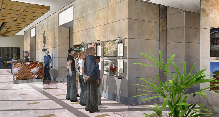
Have put a bit more work into the project and it is beginning to live.
This is the same project rendered by an artist working for the developer rather than the art show promoter. The floor and ceiling in my render are accurate to the final project. However I am picking up some potential improvements from this render.

-
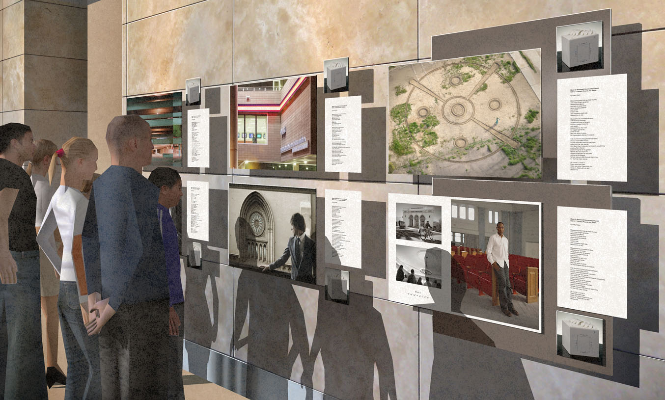
Using a mounting substrate that attaches to clips into the spaces between tiles allows more flexibility in the positioning of art elements that don't span the cracks between tiles. The right two art groups are contrasted with the remaining art not shown with a substrate. After studying the result I would probably use just one backing for each two art groups.
Hello! It looks like you're interested in this conversation, but you don't have an account yet.
Getting fed up of having to scroll through the same posts each visit? When you register for an account, you'll always come back to exactly where you were before, and choose to be notified of new replies (either via email, or push notification). You'll also be able to save bookmarks and upvote posts to show your appreciation to other community members.
With your input, this post could be even better 💗
Register LoginAdvertisement


