2-storey modern asian interior (wip)
-
@dermotcoll said:
Excellent render - love the material choices and the overall composition of the image. Well Done
thanks for dropping by sir!

-
@jo-ke said:
nice work. personally I'm missing some textiles, like a rug or tablecloth but that is only my individual taste.
you're right sir, i still have to work on some other detail on this interior i will post the update of this project soon. thanks for your comment.

-
-
The composition looks much better with those details you added, also the point of view looks better, but now the renders don't look as realistic as the previous. I like the ceiling a lot

-
the materials and rendering settings look pretty nice. I am just not a huge fan of the low camera angles...they can be cool for a few visuals but to have them at that low view point...
And just accessorizing the scene will help bring it to life more. Good work though.
-
@karinagm said:
The composition looks much better with those details you added, also the point of view looks better, but now the renders don't look as realistic as the previous. I like the ceiling a lot

thanks for your comment,this is not the final yet and i'm still working around with the settings in vray but i'm still in learning mode though
-
@steelers05 said:
the materials and rendering settings look pretty nice. I am just not a huge fan of the low camera angles...they can be cool for a few visuals but to have them at that low view point...
And just accessorizing the scene will help bring it to life more. Good work though.
thanks! i'll keep you posted guys with the update of this project. all your comments are well noted. -
Dang! Now I'm hungry!
Looks great. While good before, the new details really set the atmosphere.
-
@unknownuser said:
Dang! Now I'm hungry!
Looks great. While good before, the new details really set the atmosphere.
thanks for your kind words bryan
-
hi guys,i just want to post the updated images that i just posted here a while ago
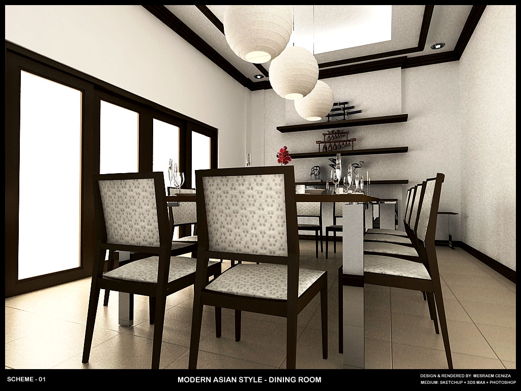
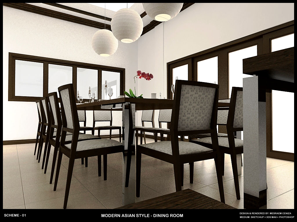
-
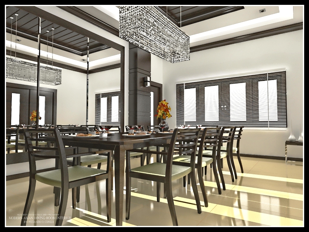
Hi guys, been busy doin some revisions on this project, and here is now the output, yet some minor details are still missing here but i will keep you guys posted. hope you like it.
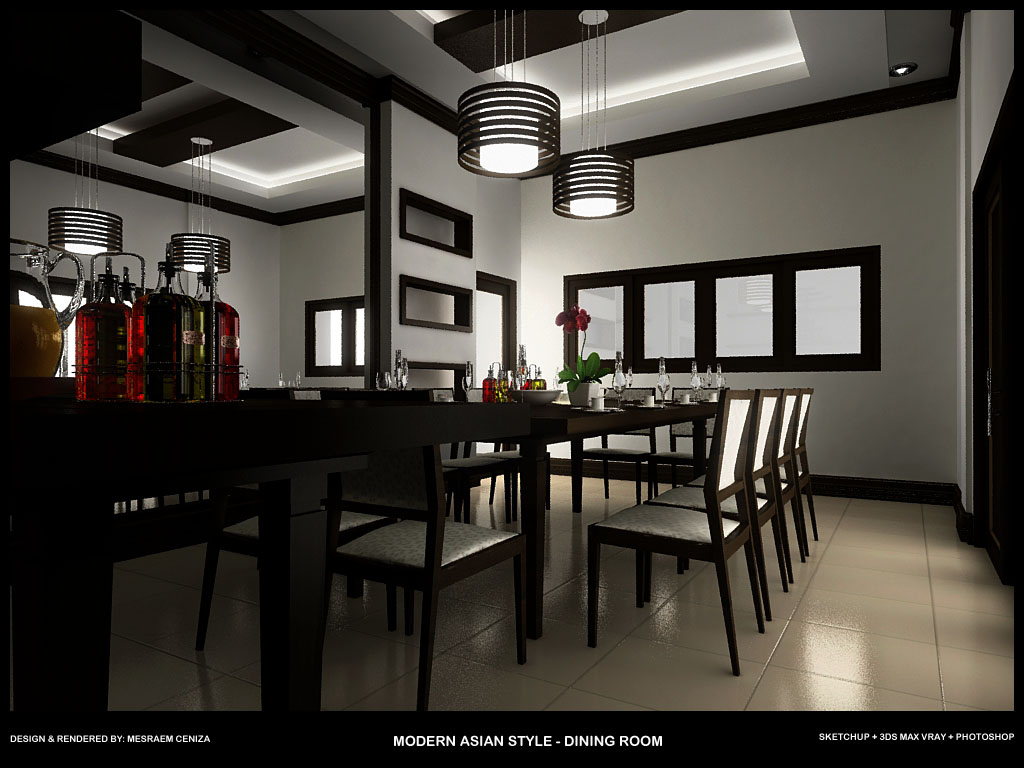
-
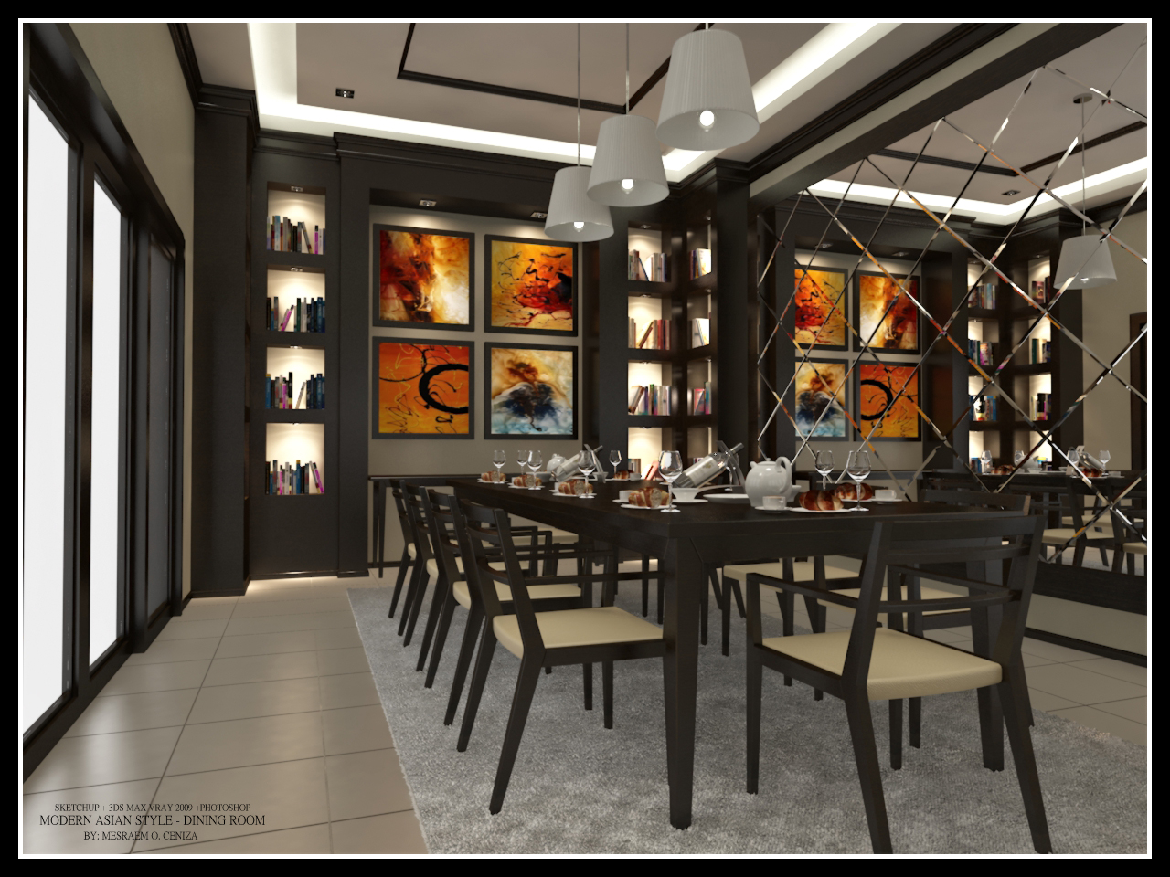
The new lights and rug, in addition to the liqueur bottles and reverse view of the mirror are phenomenal.
-
The image is getting better and better. I like it very much. The rug is a bit too small the chairs should be able to stand completely on it.
-
latest update...
![formal dining area - high resolution2 [1024x768].jpg](/uploads/imported_attachments/RnDO_formaldiningarea-highresolution21024x768.jpg)
![formal dining area - high resolution [1024x768].jpg](/uploads/imported_attachments/LzFs_formaldiningarea-highresolution1024x768.jpg)
-
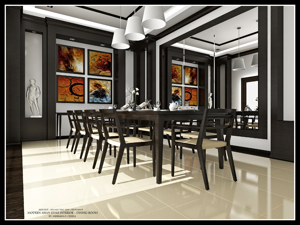
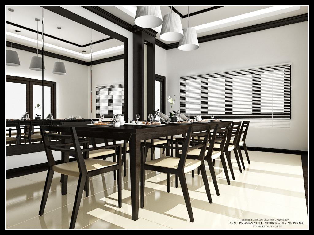
hi guys, here are some latest render of my previous post here.
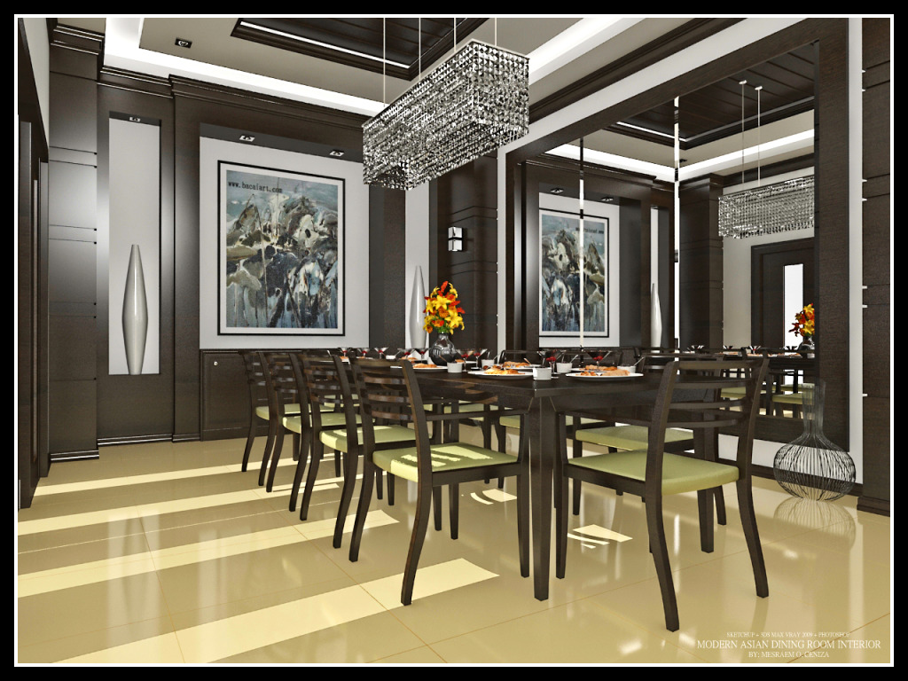
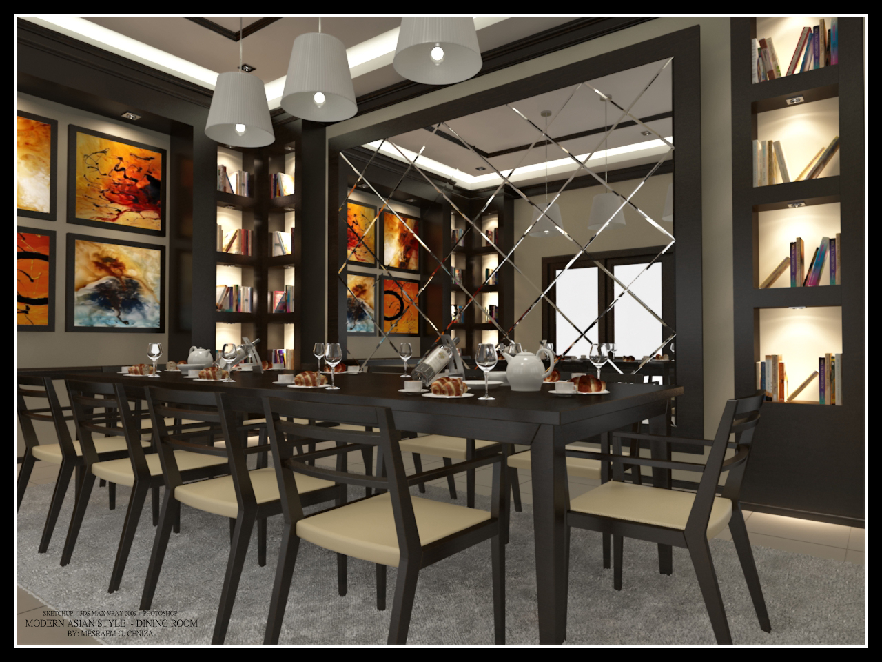
-
Really nice render, congrats...

But, to be really honest, when people use 3dsmax to "render" a scene make by SU, how can we be sure that decorations items or furniture have not been add in 3dsmax... It is the same problem with Théa render or kerkythea or in general to the none integrate render engine...
It is my opinion, I like pure SU scene... Sorry if I use your topic to explain my concern...
-
Excellent renders

-
@fymoro said:
Really nice render, congrats...

But, to be really honest, when people use 3dsmax to "render" a scene make by SU, how can we be sure that decorations items or furniture have not been add in 3dsmax... It is the same problem with Théa render or kerkythea or in general to the none integrate render engine...
It is my opinion, I like pure SU scene... Sorry if I use your topic to explain my concern...
i understand your point sir fred, next time i'll posts some render made purely with sketchup. anyways thanks for your kind words.
-
Hello! It looks like you're interested in this conversation, but you don't have an account yet.
Getting fed up of having to scroll through the same posts each visit? When you register for an account, you'll always come back to exactly where you were before, and choose to be notified of new replies (either via email, or push notification). You'll also be able to save bookmarks and upvote posts to show your appreciation to other community members.
With your input, this post could be even better 💗
Register LoginAdvertisement


