Was just doing some tests
-
hey all i was doing some tests over the weekend.
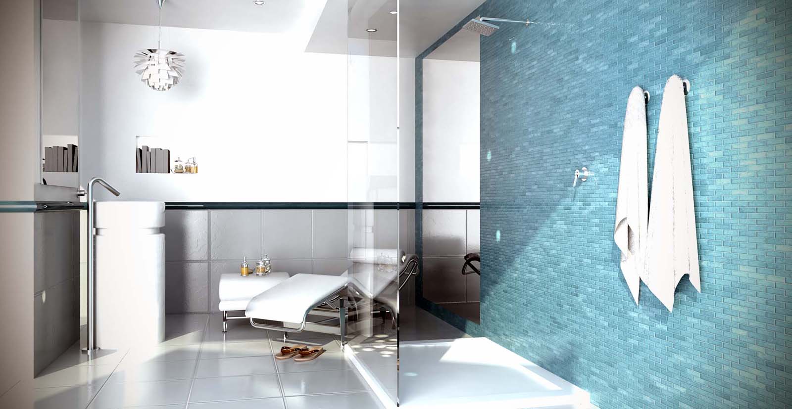
This image was the end result.
what do you guys think any tips and tricks?

-
Couple of things.
First, wow! Second, wow! and third, WOW!

I really love it. Some may say it's a little overexposed, but I dig the style. Which renderer did you use?
What I'd change:- The mirror behind the (awesome) chair feels a little out of place, it distracts me because there seems to be no practical reason it's there (also: it seems to have no thickness)
- The books have no text on their backs. Would really help towards realism
- The trim above the tiles a little too shiny/reflective, or is it metal?
- The lightspots on the wall to the right (and one to the left) probably should be there, but do distract a little
Don't take this as criticism, I wish I could make a render like this

P.S. Where'd you get the flipflops, chair and ottoman? They're super!
-
Nice ligthing, perhaps a bit overexposed, but sorry...all it's out of scale

-
Nice scene, but I wouldn't place the hanging lamp over the sink.
-
I agree with not hanging the pendant there. However I disagree with the overexposure part...yes it may be a bit overexposed...but I really like it. It is very dramatic and has alot of visual movement. Bravo sir!
-
Thanks for the feed back.Firstly the mirror is meant to be sunken into the tiles hence
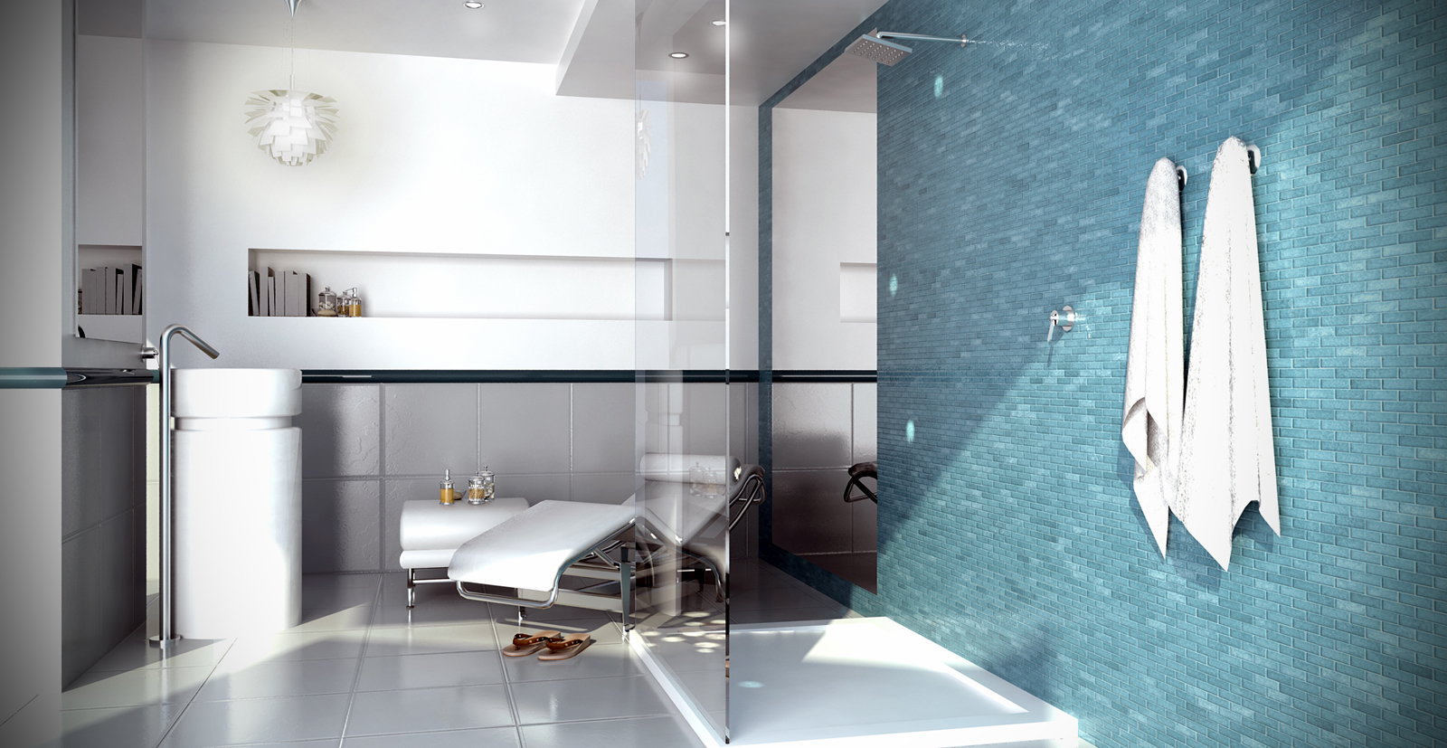
the no thickness. second the lamp isn't above the basin its actually on the other side. I do agree the mirror is out of place and the books need text.here is a revised image.also whats out of scale. The ottoman and the sandles come from form fonts.

-
Beside the scaling or UV issues, I just thought probably the lounge chair wasn't as suitable there.

Btw..could you do an ies for the wall? -
Ian, what's out of scale? For example the sink you used is by "ceramica Flaminia" (it's called "twin column") and it's, real size, 85 cm x 42,5 cm, the lamp is by "Louis Poulsen" (it's called "artichoke") and has a diameter from 60 to 84 cm. So, as you can see, your image is wrong. From a comparison your tiles are around 40x40 cm with mortars at least of 2 cm. Never seen tiles like that. In comparison with your sink, the books are less than 16 cm tall... And I don't know about so small rectangular tiles as those in your shower.
So what's out of scale? Almost all...
Hello! It looks like you're interested in this conversation, but you don't have an account yet.
Getting fed up of having to scroll through the same posts each visit? When you register for an account, you'll always come back to exactly where you were before, and choose to be notified of new replies (either via email, or push notification). You'll also be able to save bookmarks and upvote posts to show your appreciation to other community members.
With your input, this post could be even better 💗
Register LoginAdvertisement


