Shop with Twilight
-
Hi All,
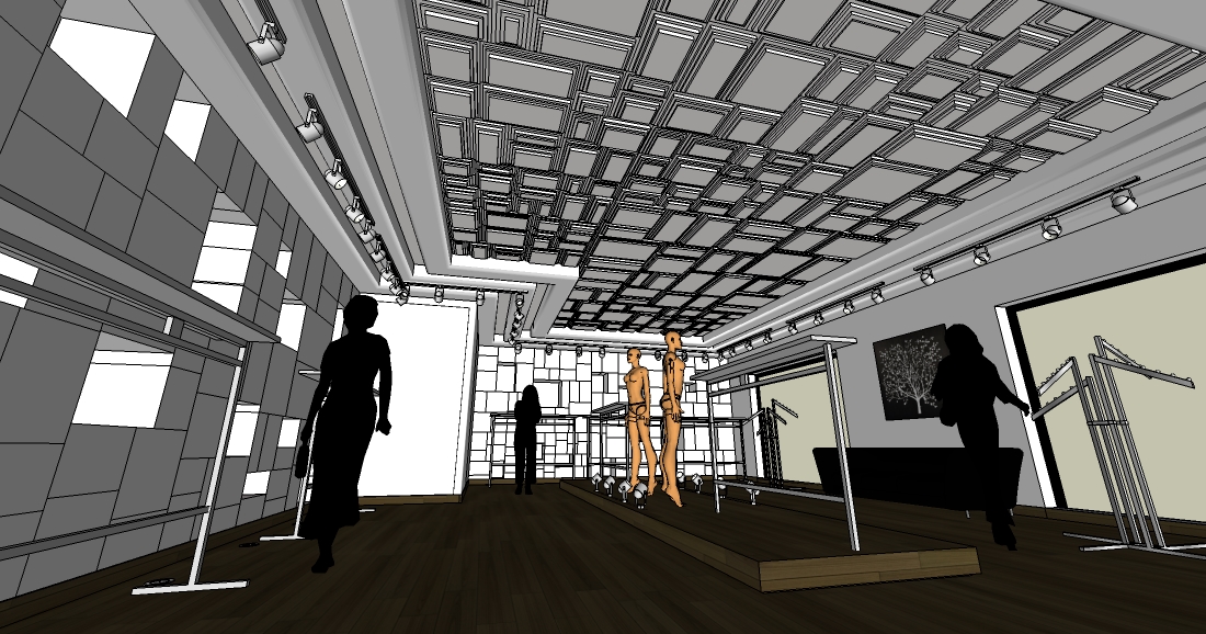
Here is a Shop project, designed and Modeled yesterday afternoon, rendered in 8hours interior + preset last night,
Comment are welcome...

-
I like a lot the illumination but not the perspective!

-
I like the perspective A LOT...!
This is another awesome render, Fred...!!

-
Is this to showcase the Emperor range of clothing?
It might be just me, but I'm getting nothing from that image. This is what the store looks like from the perspective of a child when half the lights are out and there's no stock in the shop. Erm, why'd I wanna see that?
-
Hi !
Well I like it a lot ! From my point of view, it's pretty good considering the modelling/rendering time (underestimated factor...) !
I've seen some of your recent renders and found them excellent but didn't dare congratulate you out of shyness (
 )... This one definitely convinced me to break the ice !
Congrats !
-
Fred,
I am torn here. While I am on the side of not liking the perspective (far too low to be realistic...easily fixed), I am on the side of liking the quality of the light but still feel it is too dim. I do not get the feeling of a clothing store and I think much of that is due to the complete lack of clothes. At that point it could be any store, selling anything, but completely out of stock. Having a few mannequins is the only thing telling me this is a clothing store. Too bad they are not showing any product.
Waiting to see more when the stock stock comes in.
Best regards,
Scott -
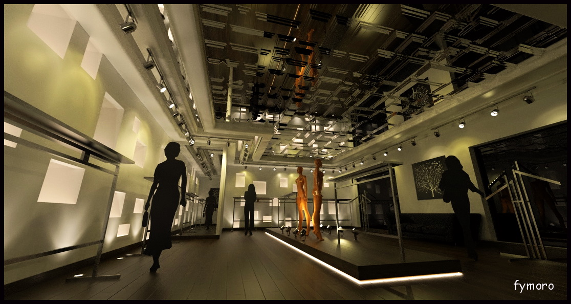
Fred:
very dark.
How about this?
Levels, Free Transform (reduced convergence...you can still have vertical verticals with high distortion
), added outline to people (they were lost in shadows), added clothes and reflections, also added a few sparkles to the spotlights  introduced a slight amount of blue as there was a lot of yellow.
john senior has a point, although it represents the scale and materiality of the space, it does not portray a mood or indeed sell the scheme IMO, seems kinda haunting actually!!!
There are some artifacts from increasing the light levels so I apologise but I think the image is improved, non?
qu'est-ce que tu pense?
-
Much Better Oli. You hit it right on....Haunting but much better now.
-
Fred. I like it a lot. I also like perspective. Everybody is talking here about rules of perspective. There aren't any rules, its just your imagination.
"It might be just me, but I'm getting nothing from that image" johnsenior wrote. It might be some others too, but who cares?
once again.
About lighting: Its somehow dark, you need some more light but not via pp. You need Ambient Occlusion, if there is in Twight. -
@unknownuser said:
Its somehow dark, you need some more light but not via pp
yeah you are right michalis
the distortion can make scenes look uncomfortable, almost like an acid-fuelled nightmare. almost all architectural photos have vertical verticals. Even interiors with high distortion. Our eyes never see the world so distorted (unless you've had one too many
 )
) -
Is this supposed to be render to explain a layout of a shop, or is it supposed to be art?
Is it a WIP or finished work?
-
Well well well, Thanks for your honest comments,
I have to explain a bit more the project and why I have done this kind of render image.
It is not really a shop, but more a cloth Show room and The concept is:
- You choose the model you like, and they make a unique model for you...(very expensive around Usd 5000 for one cloth...
 ), It's normal for Monaco...
It's a very very famous brand, the cloth that they sell are very sophisticated and very hard to model in Sketchup...(for me...
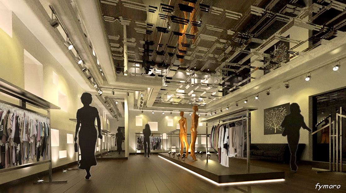
), and I must go quickly to don't loose the job... That is why, I will not add any stocks, and I prefer show to the client the organization inside the "shop", The lighting, the design...
I am agree that is a bit to dark, so I add a neon light all around the ceiling beams, And I have also changes the point of view of the perspective (More real.
Yesterday I sent them the first render a bit more "lighty", and they have appreciated, today I will send them this image, What do you think ?
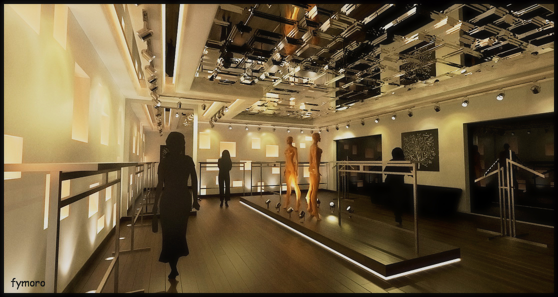
Thanks for your honest comments, And Oliver, how have you made the stars Ray around the spotlight, It's awesome...
- You choose the model you like, and they make a unique model for you...(very expensive around Usd 5000 for one cloth...
-
Wow this last image is superb! Congratulations.
-
massive improvement!! bien fait! how much reflection did you add to the floor and which template? looks very natural
the little 'stars' on the spotlights is a standard photoshop brush.
make sure you have loaded all the brush sets in photoshop....there are lots more than the default set. you just have to load them from the brush menu (click 'append' when photoshop gives you the option and it will add the new ones to your default brushes instead of replacing them)
the preview of the brush looks like a little X.
-
@unknownuser said:
the little 'stars' on the spotlights is a standard photoshop brush
You can also try this great (and free) plugin for Photoshop.
"Luce blends radial or directional light beams into your image. Clicking on the preview places the focus of the light beams. There is a text box for adjusting the intensity of the effect. Activating the Quadric check box produces a more brightness balanced result" -
Thanks Oli and Massimo,
The floor is plastic shiny template in TL.
Thanks for the tips...
Hello! It looks like you're interested in this conversation, but you don't have an account yet.
Getting fed up of having to scroll through the same posts each visit? When you register for an account, you'll always come back to exactly where you were before, and choose to be notified of new replies (either via email, or push notification). You'll also be able to save bookmarks and upvote posts to show your appreciation to other community members.
With your input, this post could be even better 💗
Register Login


Advertisement