High Resolution Recycled Paper Texture
-
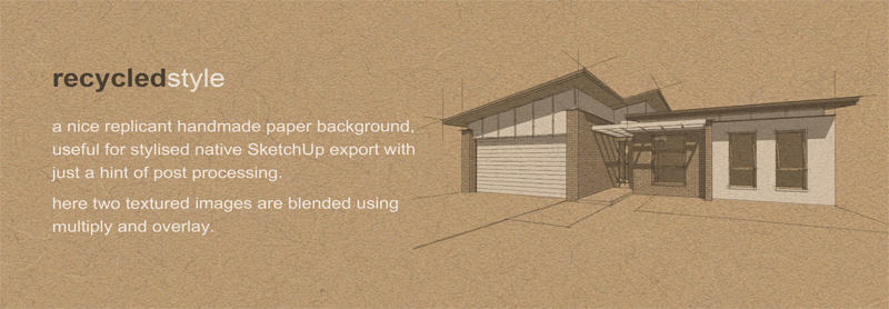
Looking for a really nice recycled paper texture for a brochure last week and again today toward another print presentation project to create a destinct sketch style, I resorted to creating my own with PS.
The good thing about making ones own textures is that by saving the PSD file one has a valuable resource for the future when any other similar style of paper is required and layer blending alternatives can yield a multitude of results.
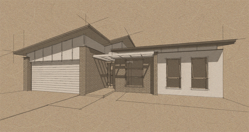
The texture here shown with the style developed from the second print / presentation project.
The zip contains a lower res 2048x2048 pixel version. Hope you can use it!
-
close up!
-
thanks for sharing!- this looks great.
-
-
nice
-
Cheers Mate. Typical Richard quality.
-
Richard
thanks...
-
-
Really nice. Thanks for sharing with all of us.
Scott
-
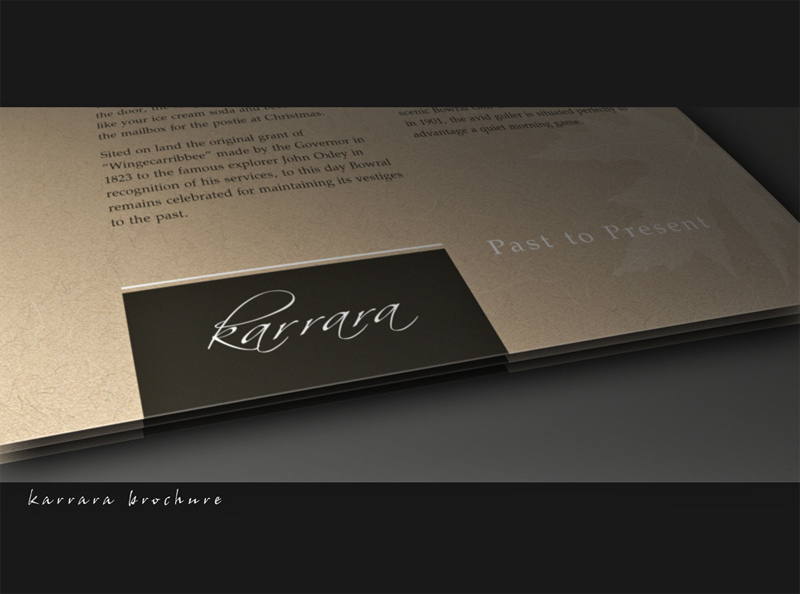
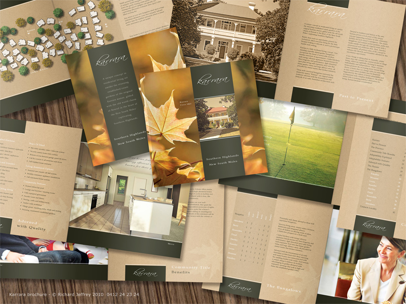
This is the project I created the texture for. A 44 page brochure for a adaptable housing development. 2000 print run!
-
Nice work. Very nice.
Thank you for showing that
-
@dave r said:
Nice work. Very nice.
Thanks Dave! Cant wait to see the final printed product, this will blow you away! 44 pages, full colour, perfect binding (square mag type edge) with gate fold covers, 140gsm pages, 250gsm cover with shipping to Aust $1.60!!!

-
Beautiful... We are working on a set of design guidelines at the moment, very inspirational. Thanks for letting us have a look.


-
@dale said:
Beautiful... We are working on a set of design guidelines at the moment, very inspirational. Thanks for letting us have a look.


Mate if you are refering to design guidelines for branding purposes there are some great examples on Issuu!
Issuu converts PDFs and documents into an interactive flipbook and marketing assets. Embed flipbooks onto your website and distribute online. Create yours with Issuu.
(issuu.com)
-
Hi Richard
Thanks, your sublime use of styles always impresses me. I think I may have found a good font to go with this style.
-
@linea said:
Hi Richard
Thanks, your sublime use of styles always impresses me. I think I may have found a good font to go with this style.
Thanks mate, I think you're right too very nice font and suited to a tee!!
Cheers!! Richard
-
@richard said:
@dale said:
Beautiful... We are working on a set of design guidelines at the moment, very inspirational. Thanks for letting us have a look.


Mate if you are refering to design guidelines for branding purposes there are some great examples on Issuu!
Issuu converts PDFs and documents into an interactive flipbook and marketing assets. Embed flipbooks onto your website and distribute online. Create yours with Issuu.
(issuu.com)
Great source, thanks
The guidelines are for a mixed use business park which being developed by a First Nations group, so it's both about branding the new development, and setting the architectural style, and human environment for the park. It's my feeling that we need to have a "look" to the guidelines themselves which set the tone for this. Yours is a great example, because when I look at it I see quality. Since this document is in most cases the first thing people see, it conveys that right from the start.
-
Dale I understand what you are suggesting there!
I read an article recently suggesting that packaging design had the highest return on investment of any aspect in a product, it is the only experience of a product that 100% of prospectives may experience.
The same could be suggested in your case, the document being the first of contact with the development can like your suggesting have a major effect to make or break in a way.
I would suggest a book for you, not such on the design of such but so good on all aspects of branding and I would have to say that branding extends way past a corporate image, informative! Designing Brand Identity - Alina Wheeler.
Designing Brand Identity: An Essential Guide for the Whole Branding Team: Wheeler, Alina: 9780470401422: Amazon.com: Books
Designing Brand Identity: An Essential Guide for the Whole Branding Team [Wheeler, Alina] on Amazon.com. *FREE* shipping on qualifying offers. Designing Brand Identity: An Essential Guide for the Whole Branding Team
(www.amazon.com)
Mate I can give you one quick but huge tip as you commence this project and as I been doing a few catalogue for home builders of late the saving grace has been the discovery that PDF's generated from LO intergrate seemlessly when dropped into Indesign! Layers and all!
Hopefully we get to see what develops from your work there mate!
-
Thanks Richard, I will investigate both the book and your workflow suggestions. Appreciate your help.
I hope to post the outcome (if the client and my boss agree).
Hello! It looks like you're interested in this conversation, but you don't have an account yet.
Getting fed up of having to scroll through the same posts each visit? When you register for an account, you'll always come back to exactly where you were before, and choose to be notified of new replies (either via email, or push notification). You'll also be able to save bookmarks and upvote posts to show your appreciation to other community members.
With your input, this post could be even better 💗
Register LoginAdvertisement
