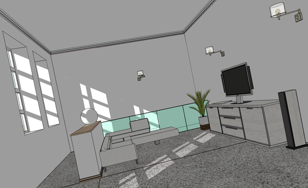
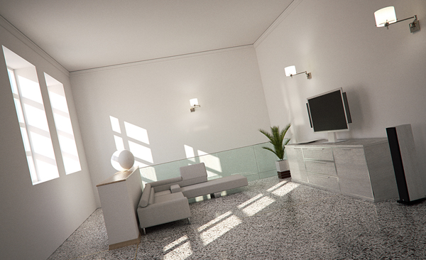
(Req) Image transition slide thingy?
-
Hi Everybody,
I want to make a image transition between line pic and render with a slider in it like to one on the indigo sketchup page.
http://www.indigorenderer.com/documentation/sketchup
It's made by Pibuz. Also forum member here. Don't know if he made it or just the render and model. Cant anybody explain how its made. Maybe a tutorial or an handy piece of software to achieve this.
Greetz From Holland
-
Id send benn from the indigo team a PM and ask him about it, as i think its his creation (although the image is pilbuz's as you say.)
-
It's actually two, different images laid upon each other quite cleverly in a table cell. Then their visibility is ruled by a certain Z-index via css if that says something.

before

after
And of course, "Lounge scene
 Pibuz"
 -
Thanx for the explination. I was getting sad because nobody reacted on the post. I follow you up to the CSS part. I m new with CSS and Flash so I was looking for a tutorial or something. But thanxs for the reply. I'm going to have a look at this CSS stuff

Greetz from Twan
-
If you use Firefox, get the Firebug plugin. It is very cool for semi-educated people (like myself) to understand and track back existing websites' structures and thus learn step-by-step. I am far from being a professional at this stuff.

-
Thanks, Kim. The css and the span attributes do pretty much as what I've seen - I was also suspicious about something DHTML making it dynamic. Now it looks clearer.
-
Here's a script (provided by Rombout)
<script> $('div.image-comparison').mousemove(function(e){ var w = e.clientX, span = $(this).find('span;first'); w -= span.offset().left; span.css({width ; w + 'px'}); }).find("span;first").animate({width ; "600px"}, 2500).animate({width ; "100px"}, 2500); $("a[href*='dist']").click(function(){ if(this.href.match(/\/dist\//)){ var url = this.href.replace(/^.+dist\//,'/dist/'); pageTracker._trackPageview(url); } }); var gridToggle = true; var s= new String(document.location); if(s.match(/silence.local/)){ $('body').keypress(function(e){ if (String.fromCharCode(e.charCode) == 'g'){ $('#container').css('background-image', gridToggle ? "url(/media/nil.gif)" ; "url(/media/225x25.gif)"); gridToggle = !gridToggle; } }); // $('#container').css('background-image', "url(/media/225x25.gif)"); } </script>@unknownuser said:
paste it in the body or header!!! just check the source of the page and you'll see how it works.
i made this thingy with flash, check link. it's a bit more interactiveFrom CMT I have the following...
@unknownuser said:
The script Rombout posted has more than actually what you need.
I write one file with the effect, and here are some explanations:
Step 1: jQuery
This uses jQuery, one way of including it easily on your page is to add this to your html head:<scripttype="text/javascript" src="http://www.google.com/jsapi"></script>
<scripttype="text/javascript">
....google.load("jquery", "1.4.2");
</script>Step Two: Basic Markup
Basically, you need a div with 2 images inside. Better if you wrap those images in span tags. Also, some inline styling is added here. This way, you don't need to create an id for each span to use as selector in a separate file.<divid="compareImages">
....<spanstyle="z-index: 1000; width: 300px;"><imgsrc="before.jpg"/></span>
....<spanstyle="z-index: 900"><imgsrc="after.jpg"/></span>
</div>Step Three: Styling
Some styling is really important. To make it work right, 2 selectors are enough.The first, to the div. It needs some simple things and the most important attribute is 'position'. Can't be static or the spans will be not 'absolutely' positioned corretly. 'relative' works fine.
The second goes to the spans. Important! Position absolute, top and right to 0. Have a look:
<styletype="text/css">
....#compareImages {
........overflow: hidden;
........position: relative;
........width: 600px;
........height: 366px;
........cursor: move;
....}
....#compareImages span {
........overflow: hidden;
........position: absolute;
........top: 0;
........left: 0;
........border-right: 1px solid black;
........display: block;
....}
</style>Step Four: the jQuery heart
The most important step. Here's the script you have to add, please at the bottom of your page:<scripttype="text/javascript">
....$('div#compareImages').mousemove(%(#881350)function{....var w = e.clientX,
....span = $(this).%(#003369)find;....w -= span.%(#003369)offset.left;
....span.css({width : w + 'px'});
....}).%(#003369)find.animate({width : "600px"}, 2500).animate({width : "100px"}, 2500);
</script>What it does really quickly:
1.Get the element by id and uses the mousemove() event which will give the cordinates of the user mouse
2.Assign two variables:
....w for the user'mouse x position
....span for the first span element, the image that goes on top.
3.Now, the offset left is subtracted from w.
4.The span width is applied, on its style.
5.Altough the last, this is the animation that happens first. When you load the page, the initial width of 300px (assigned at the inline styling) is changed to 600px with an delay of 2500 miliseconds and then to 100px, the same delay.Hope this helps!
An complete html with the original pictures is attached, so you can download it.
-
Another way to do that is using a video editor.Just applying a transicion effect will do.
I have done it with windows movie maker. -
FYI, Cesar helped me do the slider thing see here: http://www.solos-art.com/582/
Now Rombout is gonna help me with the round focus thing!! We have some awesome folks here.
Not forgetting Csaba who has helped me so much already setting things up.
I'm buying the beers.

-
Pete, how come your wood background image is back?
(Oh wait, I guess Rombout had to edit the css file - you should leave the original and use a child css file because that won't be overwritten in case of a theme update- I will look into it...)
The effect is cool (although still hick-upping sometimes). Also, you will need to resize your images to fit into the post width. It now has a 1000 (and 900) Z-index - i.e. it is displayed on top of everything.
My friend has just called that he is having an "ad hoc" birthday party so we'll go through some details later... Like this little toy however so hope Rombout will make it publicly available!

-
It was Cesar that did it, Rombout is creating the other script.
Cesar said he will make a wordpress plugin for this so it's easier.
and all that other chinese you mentioned...what? you got admin rights, please fix it when you get a moment, I'll just mess everything up again.
-
I copied and jimmied the script (well kinda threw in different images) and got this:
-
@gaieus said:
Pete, how come your wood background image is back?
(Oh wait, I guess Rombout had to edit the css file - you should leave the original and use a child css file because that won't be overwritten in case of a theme update- I will look into it...)
The effect is cool (although still hick-upping sometimes). Also, you will need to resize your images to fit into the post width. It now has a 1000 (and 900) Z-index - i.e. it is displayed on top of everything.
My friend has just called that he is having an "ad hoc" birthday party so we'll go through some details later... Like this little toy however so hope Rombout will make it publicly available!

hi gaieus,
no i did not do anything on his server...
i only showed him what i did on our server?!
Think ceasar changed all the CSS, i didnt think about all the changes that where already made orso?! -
Never mind - I will redo the changes at the end (so that we are not cross-editing things there). I only mean to do some minor tweaks in the css file anyway. Looking forward to the outcome; these effects are really cool.

Hello! It looks like you're interested in this conversation, but you don't have an account yet.
Getting fed up of having to scroll through the same posts each visit? When you register for an account, you'll always come back to exactly where you were before, and choose to be notified of new replies (either via email, or push notification). You'll also be able to save bookmarks and upvote posts to show your appreciation to other community members.
With your input, this post could be even better 💗
Register LoginAdvertisement


