NPR
-
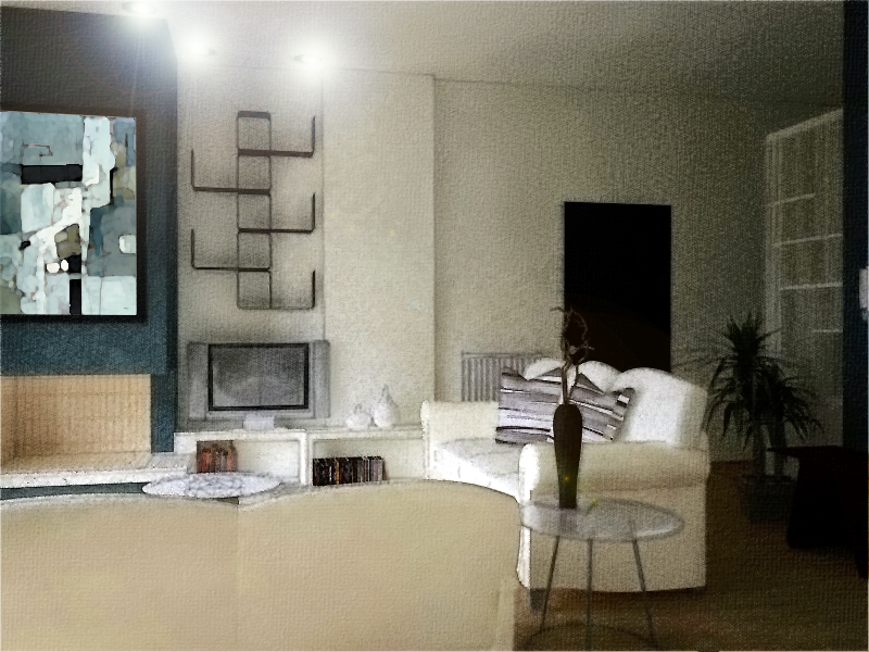
Hi everybody, I was wondering how this one seems to you for an NPR presentation...

-
@anstvam said:
Hi everybody, I was wondering how this one seems to you for an NPR presentation...
I think you got awesome style and taste.
But rendering with NPR style sometimes expose the weakness of the render engine.
Probably can post a couple of shots with different styles or presets or some post-pro to better realism.

-
Cheers. Any suggestions as to what would need immediate improvement?

-
@anstvam said:
Cheers. Any suggestions as to what would need immediate improvement?

It looks great for now.
But I would definetly improve the light setup and after that the materials.
I would really boost up the light coming in, maintain the interiors lights and add new (fill) lights in the dark areas on the extreme right.
That way the render time could come down another 30% and I would achieve better realism.
-
Thanks D. I'll be working on your suggestions. I was wondering how much readable such a rendering is for a client.
-
@anstvam said:
Thanks D. I'll be working on your suggestions. I was wondering how much readable such a rendering is for a client.
IMHO it's more readable with your awesome line style.

-
As someone who does NPR all the time, I can say that the hardest thing is to develop your own style of work. You don't want your images to look like all you have done is a couple of tweaks to a render, but to have a special quality that is your own. My suggestions would be: 1) look at what other people are doing and find styles that you like 2) look at architectural photography to get a sense of lighting. The image you posted has some very dark areas, and also has a rather cold color palette. A photographer will use warm fill lighting in various places that are in shadow. I also don't depend too much on the render, but hand draw a lot of elements using Photoshop and a pen tablet.
Hello! It looks like you're interested in this conversation, but you don't have an account yet.
Getting fed up of having to scroll through the same posts each visit? When you register for an account, you'll always come back to exactly where you were before, and choose to be notified of new replies (either via email, or push notification). You'll also be able to save bookmarks and upvote posts to show your appreciation to other community members.
With your input, this post could be even better 💗
Register LoginAdvertisement


