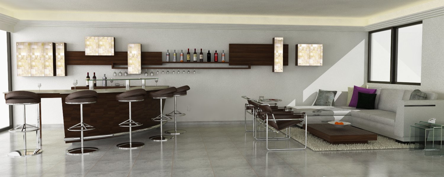
Interiors
-
attach the other

-
verry welcome
 nice start/renders
 -
Hi and welcome. They look good
 . Some comments: the bump/normal of the bricks in the first image is reversed and I would like more soft shadows coming from the window's light and non tiling textures in the second image. Oh and both images are a bit too grainy.
 -
tks massimo and majid im agree the images are grainy, but i dont know what is the paramemter to fix
appreciate the coments -
The first image really need some work with the textures. Some obvious items such as tiling should have been addressed before even rendering. The lighting work is nice. Overall the scene is too perfect. Seating is perfectly placed with no variation which lends itself to an unrealistic feel. Not sure what the item on the right is (chrome bar)?
The second image suffers from some of the same items as the first. The texturing needs work. The couch has an odd stain/shadow/bad texturing...not sure what is it. For this image the couch needs to be a much better couch model. It is far too low poly with unrealistic pillows. The bottles and glasses need texture work as they look flat and incorrect.
Overall these are not bad starts but could use a good but of work none the less.
Scott
-
nice work. but what's with hairy carpets at the moment?! i agree with more passes, too grainy...and yes shadows too hard for the light conditions. still though, nice work.
-
Nice I really like the second one, although the sofa could've been a bit more detailed, ditto for the windows, but still great images! Keep it up ;D
Cheers ;D
-
first image:
bump on floor doesn't look right.
sparkles on lights more distracting than convincing. perhaps you could make it more subtle.great work, keep 'em coming!
-
scotppara,foxar,olishea: tks for the coments im agree about them, im working the textures, but i need help with the shadows, how can i do a realistic shadows?
-
@agf83 said:
tks massimo and majid im agree the images are grainy, but i dont know what is the paramemter to fix
appreciate the comentsVery nice render, esp the first.

I'm just asking if you got the Absolut bottle from the Warehouse?
I'm looking for the same type of bottle, a much better version from the warehouse.
Any ideas?About the noise, hope I am give you tips, but I don't render with Vray.

But try looking for noise threshold, probably lowering them will help.
Hello! It looks like you're interested in this conversation, but you don't have an account yet.
Getting fed up of having to scroll through the same posts each visit? When you register for an account, you'll always come back to exactly where you were before, and choose to be notified of new replies (either via email, or push notification). You'll also be able to save bookmarks and upvote posts to show your appreciation to other community members.
With your input, this post could be even better 💗
Register LoginAdvertisement


