Render This: Interior
-
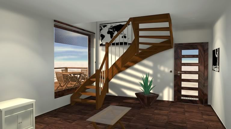
LightUp - 3 minute render time.
I've added a couple of IES downlights too.
-
thanks guys
what I did with the stairs was to have more light inside -
-
@solo said:
@unknownuser said:
Well.... this makes me feel a little bit better about Vue and interiors.
I have gotten into a few heated debates on the E-on and C3D sites for saying this....
"Vue is crap for use in interior renders, please use Vue only for exteriors and another capable app for interiors"
And then some guy will post a reasonable Vue interior to show me up
 , but he would never say how long it took to setup, render or how many hidden lights he used for those dark, dingy and ugly areas.
Haha lol, could you share the link ton the topic? Actually I agree with you, I really
can't get any 'decent' interior render out of it, it's full with blotches and such,
materials like woodwith slight bump and glossyness isn't really a top hit either.besides that, great work of everybody! I've seen some very interesting renders,
I was especially amazed by the LightUp one!Cheers

-
@adamb said:
LightUp - 3 minute render time.
I've added a couple of IES downlights too.

3 minute render


 let us give up all the other engines...
adam the lighting is really good. i just really want to have lightup to add materialup. so as to have some option to add, bump, displacement. nevertheless three minutes is very respectable.@rcossoli, yur treatment in removing those stair part is really cool i love that... i will see tonight to remove also those thing in my version...
-
Thanks Nome...!!!
-
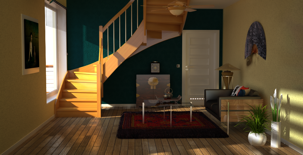
this is what i cook this morning. its a high resolution and setting
-
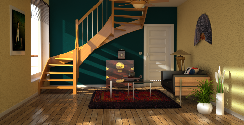
oops sorry for the other render, some uncalcualted area below the fan due to saving ir map calculation. then i moved the fan up. anyway this is perhaps my last one. taking rcossoli's removing of stair elements.
-
Great images nomeradona! Very impressive how hard the scene got improved

-
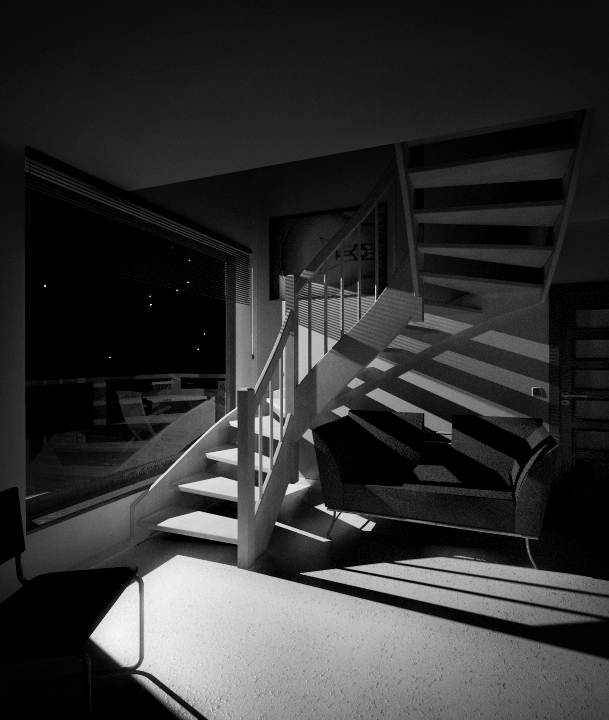
... A calm room, a bit dusty, only enlighten by the colorless light of a full moon...
-
@mrwip said:
... A calm room, a bit dusty, only enlighten by the colorless light of a full moon...
Mr.Wip, always a pleasure to see your output, i really like dramatic looking images, and you have the exact style i like.
don't take me wrong, the other renders look amazing too, because i couldn't get as great as render as those, but as an observer, this one takes the cake
-
Raw.
I think this is my best render ever


-
@foxar said:
Great images nomeradona! Very impressive how hard the scene got improved

actually the scene that has been shared has already some of the great things there. i guess the scene was already doen in vray. what i did was ajust to re arranged based on my ecclectic taste. as for my initial render, i tested the lighting and wanted to create mood and drama. then experimented with another lighting mood ( the morning mood).
one of the best thing in challenge like this is you can compare notes. you can learn from each other. eg. camera set up, moods, even design issue. I like the way rcossoli's treatment on the stair. I gave it a try and it seems better with a small lkooking room like this. hopefuly we have more challenge like this. where we can see some creative lighting and set ups using all the same rooms.
-
@Wip.. i ike that lighting effect.
@ speaker. what rendering engine did you use?
-
Ran my scene through again with the stairs modified and tested out some rug displacement.
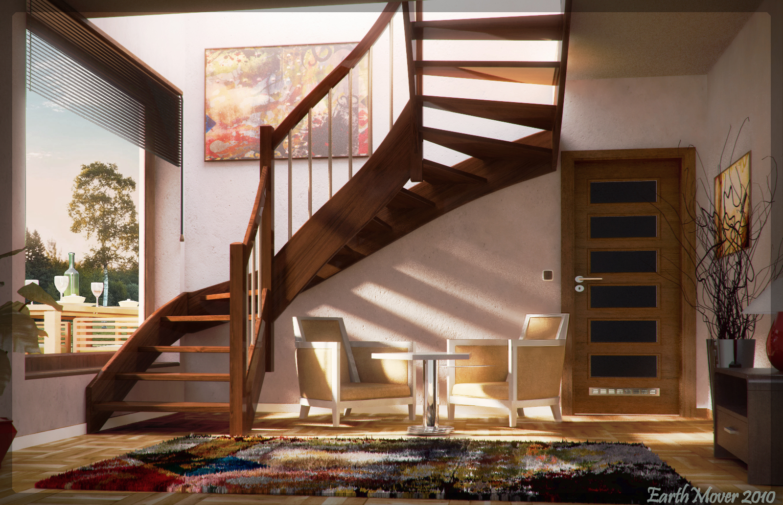
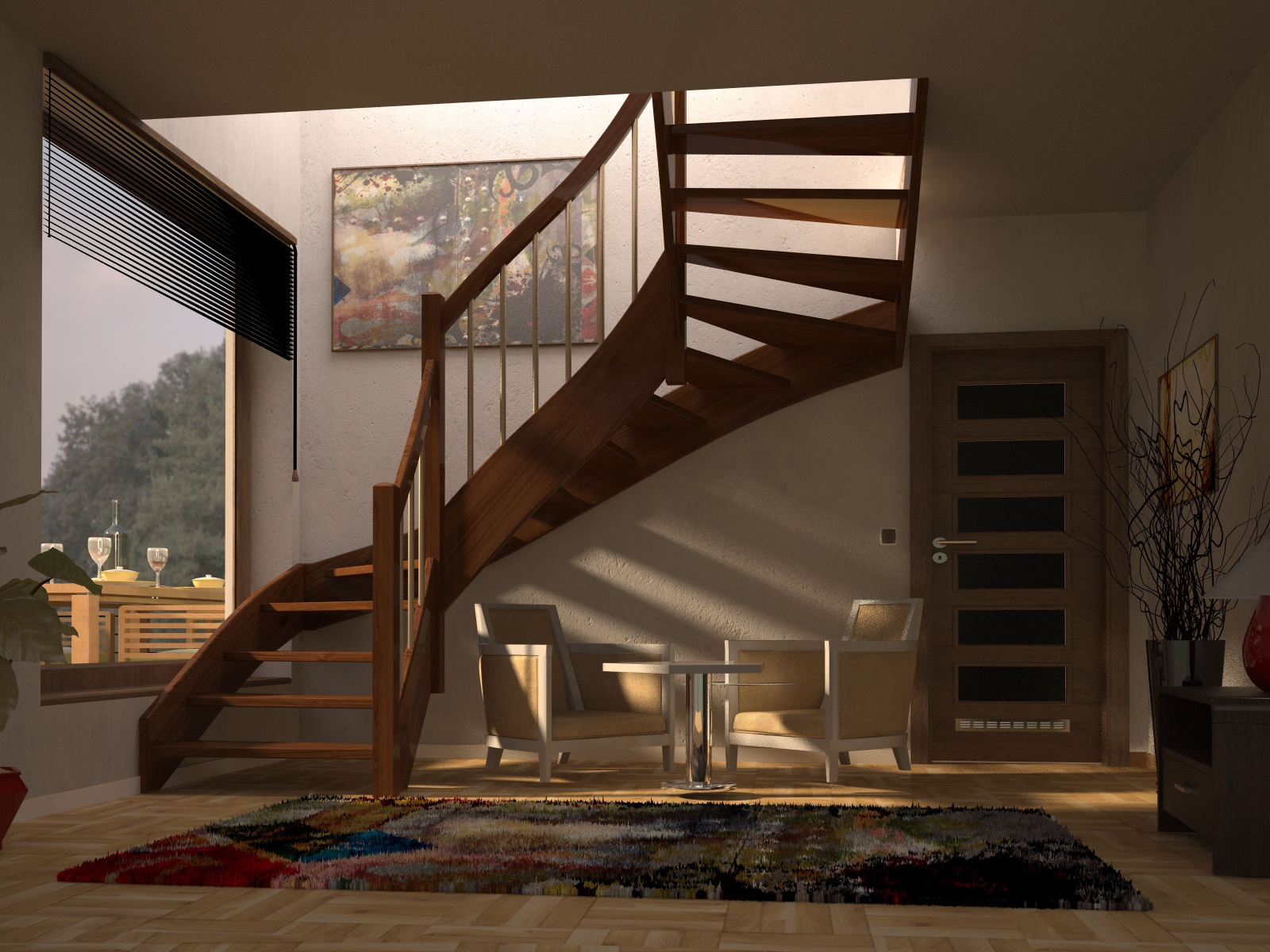
-
nice work earth. i actually prefer the raw output. i could see more details. somewhat some of those detailas were gone during the exposure correction. i like the suttle displacment...
-
Blue Caustic Lights.
Borrowed Matthew's bike theme, but ditch the red for a re-cycle paper wall.
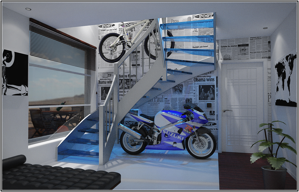
-
exelent!!! render with...?
-
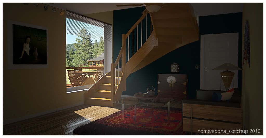
my share. good its sunday. vray + little pp. Ecclectic approach
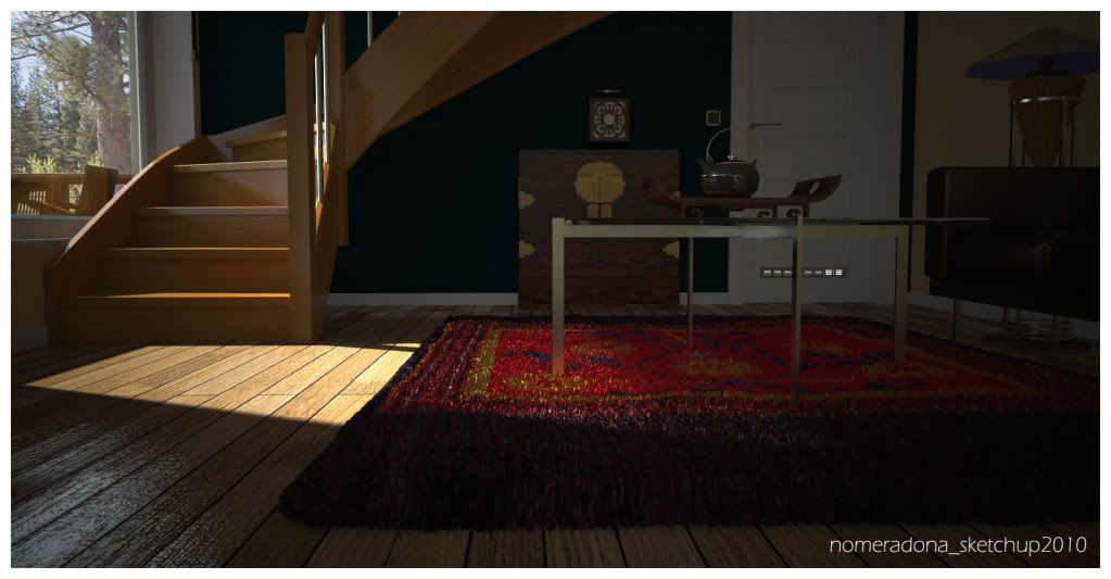
-
@Dspace - I remember your Mini Cooper scene, once again you park your bikes without kickstand

btw ... nice work
Hello! It looks like you're interested in this conversation, but you don't have an account yet.
Getting fed up of having to scroll through the same posts each visit? When you register for an account, you'll always come back to exactly where you were before, and choose to be notified of new replies (either via email, or push notification). You'll also be able to save bookmarks and upvote posts to show your appreciation to other community members.
With your input, this post could be even better 💗
Register LoginAdvertisement


