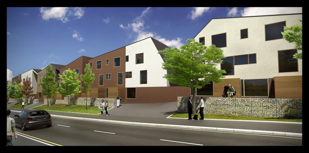
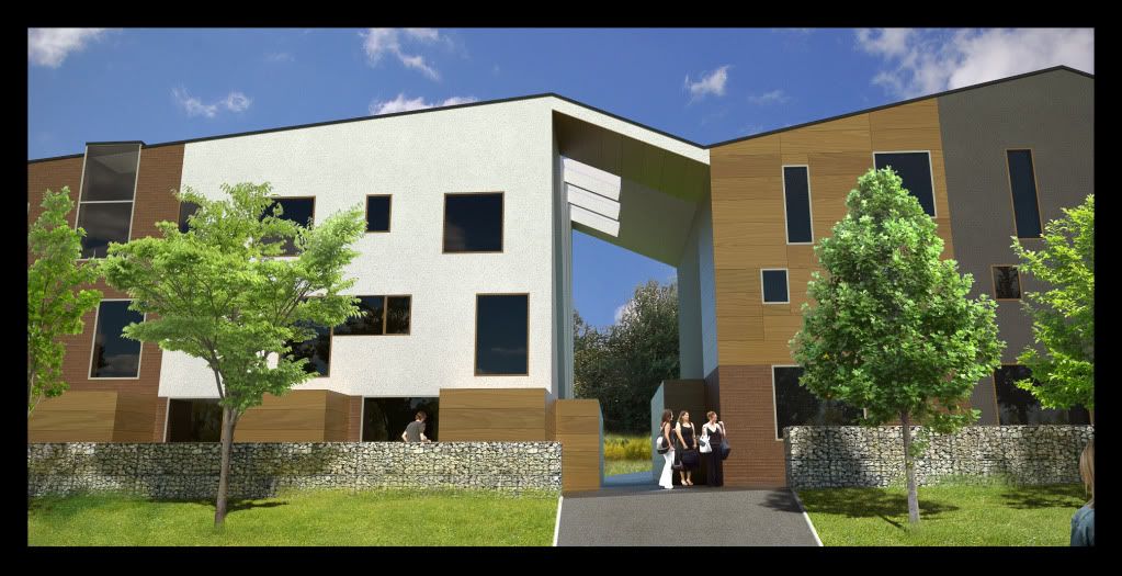
Final streetscape - sketchup, twilight, photoshop
-
Man I love Gabions in any shape or form! We use tham a lot here without any structural failure of the mesh!
Though in Oli's case though I like them I would like to see a material break every now and then!
Nice work by the way Oli!!!! My only crit would be as someone else suggested the colours are a bit saturated and the grass could use some work. And there are a lot of people for a simple street scene IMHO!!
Those ramps give me the jitters a bit though, nice wide steps are so much more appealing.
As I said though, great work! I didn't really expect less!
-
Thanks for the comments Richard, always welcome and helpful.
The architect wanted more people in the scenes but I secretly deleted them haha!
I keep the colours a bit saturated for printing because the printer is always dull.
Rick: no worries pal
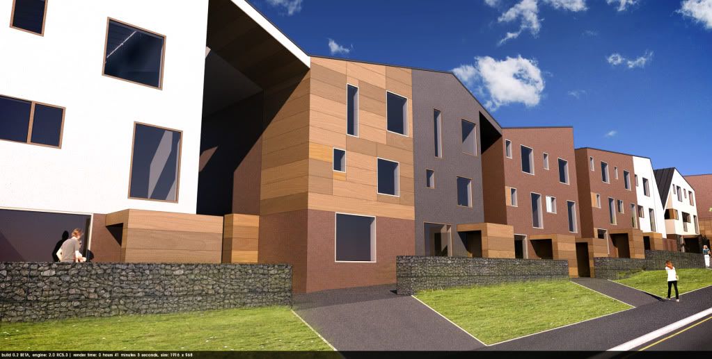
Here are the two other images. I rushed the PP on these so please forgive any mistakes! And don't slag the car off because its identical to mine, thanks to majid for the car paint!
Cheers


-
This is with Podium Version 2 Beta!! Materials only took 5 minutes to setup and this render took only 40 mins as opposed to 5-10 hour unbiased.
I removed the trees because the current beta doesn't render dirty PNGs too well, but the team is working on it I hear.
Little bit of photshop, but generally all Podium version 2! the colours are lovely compared to the previous podium.

-
Agree about the Podium colours, they really work well.
Just needs a better glass reflection and it will make a big difference imo. -
Perhaps I shouldn't comment on this, but I really can't see the huge difference you guy's can...

-
bravo,
pretty light and textures.
lovely ambience. -
I find the architecture quite interesting....
and you seem to visualise the idea quite well. Nice renders.The Podium v 2.0 (beta) colors are indeed very nice. I am looking forward at the Christmas break to get into the new render engine.
The Twilight renders are nice as well. Any pure Physical sky shots? -
frederik: the main difference is quality and colour. Podium 1.x renders were generally quite cold due to physical sky. Remember we are comparing Podium v2 to Podium 1.x (not podium vs twilight god forbid!!)
biebel: I don't get you....you wanna see a physical sky render for twilight?
-
I like the colors alot better with v2 - more vibrant, however the grass doesn't look as nice as previous renders - is this because this a v2 work in progress like the trees too?
Rick
-
@olishea said:
....you wanna see a physical sky render for twilight?
Or Podium v2...it doesn't matter which one.
The reason why I ask is that in all the above renders, the sky seems to look just a bit too dark.
That's why I would like to see what came out using pure Phys sky, without a sky image overlay in post. -
I made the sky a bit darker to balance the dark tarmac at bottom of image. maybe too dark but what the hell....lets have a saturated cheery sky for the planners to put a smile on their faces! I normally apply a vertical black gradient to the sky with overlay belnding mode to make it more punchy....but sometimes I go too far lol.
Rick I added the grass in photoshop....so its different in each image....im not very good at putting grass in yet!! its mostly trial and error lol. The tree issue affects pngs with transparency (but not all)....the podium team will fix this no doubt. remember this is just the very first beta of version 2.
Biebel: the v2 beta physical sky cannot be changed in this version of the beta. But the sky is pretty much raw render....i only added the clouds over the raw physical sky. So the colour and tone of the sky is as you would see it in the render. I would post the raw render but I'm not at work computer. But yes it is quite dark, I agree....but I like it! Podium team mentioned implementing hdri support and other sky options so it looks very promising.
Don't look too much into this image guys, i only spent 5 minutes setting up materials. It's not supposed to be a comparison of render engines....let's never go down that track again! podium and twilight are brothers not enemies. (as Miguel aka Ecuadorian quite rightly said)
Probably not gonna post much around xmas so if I don't say it before.....
HAPPY CHRISTMAS GUYS AND HAVE A GREAT NEW YEAR
GET PISSED UP AND HAVE A GOOD TIME!! -
Oli I think youve done a fantastic job in visualising the architects design. I like pretty much every image and can relate to the project as I'm only an hour away from you in Yorkshire

My only crit would be directed towards the architect.. if your council estates are anything like ours then any smooth surface gets covered in grafitti pretty quickly and these houses are a grafitti artists dream.
Anyway have a good Xmas and keep up the good work next year.
-
@cadmunkey said:
if your council estates are anything like ours then any smooth surface gets covered in grafitti pretty quickly and these houses are a grafitti artists dream.
I disagree.
It may be the case that a cheap and nasty council estate finds itself plastered with graffiti, but I don't see this is a cheap and nasty council estate.
I might be wrong, but I think if that building was built it would be treated with a fair amount of respect.
-
@johnsenior1973 said:
@cadmunkey said:
if your council estates are anything like ours then any smooth surface gets covered in grafitti pretty quickly and these houses are a grafitti artists dream.
It may be the case that a cheap and nasty council estate finds itself plastered with graffiti, but I don't see this is a cheap and nasty council estate.I might be wrong, but I think if that building was built it would be treated with a fair amount of respect.
I'd like to agree, but Councils dont get to pick and choose their tennants. Its the people that make up the estate, and as you know council estates are predominantly made up from lower income families and have much higher crime rates.
Anyway, I hope its a successful scheme long term, as most estates are damn ugly to look at. -
I agree. however we have more than taken this into account and all surfaces are robust enough to be stripped of graffiti etc. it was one of the first criteria in selecting each material...the wood for example is heavily laminated and vandal-proof.
johnsenior: although you are correct in your assumption that the houses would be trated with a fair level of respect....unfortunately there is a minority of (how should I put this) arseholes.
-
Volumes look heavier using podium v2. Much heavier than kerkythea, twilight or podium v1.x.
Nice work here Oli.


-
Thanks, it means a lot.
 Merry Christmas to you Michalis. have a good one!
-
Cutouts need a bit of work but I'm sure you know that already - overall the scheme looks good, nice work.
-
yeah man. I hate using cutout people....but they are quick and easy. thanks for comment
more images to come....when they finish

-
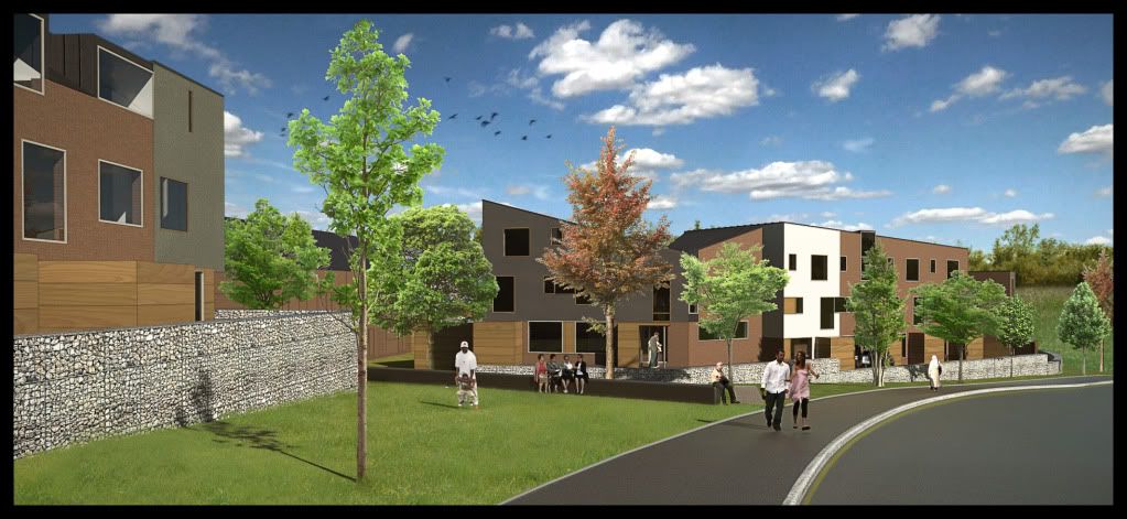
here is another angle. image is not as good quality as the others but it will have to do!

Hello! It looks like you're interested in this conversation, but you don't have an account yet.
Getting fed up of having to scroll through the same posts each visit? When you register for an account, you'll always come back to exactly where you were before, and choose to be notified of new replies (either via email, or push notification). You'll also be able to save bookmarks and upvote posts to show your appreciation to other community members.
With your input, this post could be even better 💗
Register LoginAdvertisement


