Recent renders
-
Wow, those trees look awesome. Are they 3D or 2D?
-
exterior renders are awsome!! the 2nd one is perfect in my opinion,,but the interior need some contrast and are too dark, some more lightning to create some drama and give them life,,but exteriors are one of the best i have seen in skp!!. congrats!
-
I couldn't say it better than Teo.
The exteriors are vivid and full of foliage. You must have used some powerful 3D application, to handle all the high polys.
As said the interiors need more drama/contrast.Very nice renders !
-
Thanks y'all.
Okay I see everyone is in agreeance about the kitchen renders looking muted, I was only using the sun to light the scene, and did not want it to look surgically clean and bright, but I may not have succeeded as I hoped.
I also tried it using Vue, but Vue is not the right tool for interior renders again that's my opinion only.
Render below done in Vue, amazingly it took less than 10 minutes and besides border and logo there was no post work. (yeah, I know the chairs are a little freaky colored)
The exterior renders were done in Vue, all trees are 3D (I do not use 2D for exteriors)
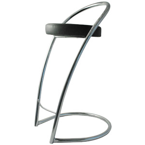
Bruce, the chairs are Effezeta Streamline Delpin, I was thinking the same ( do live in the USA after all and cannot see a 300 pound lard ass sitting in one of those), so when I modeled them I made the tubing thicker, this is how they look:

The kitchens and the media operations room was done with Vray, I'm still learning Twilight and hope to be able to create even better images soon, I am also anticipating Thea as the render solution I have been dreaming about, just hope the learning curve is not to tough.
The last render I intentionally wanted darker as the room is awaiting the buzz of workers, the lights are off (in fact they were not even modelled) as I wanted the glow of the LCD's and lighting from front glass cased rooms to light the scene.
Thanks again for the comments.
-
Nice work pete!
Just some crits I know you like them!
The interiors of the commercial block I feel needs some lighting.
The roof tiles on the house seem really flat, displacement seems to be needed there.
The kitchen even in the later renders seems still bit flat, many of the materials seem over reflective.
The eames chair aluminium seems bit chrome like rather than just polished.Mate the trees from vue are simply amazing!!! I haven't checked vue out really - can one export the trees from there to another format?
Jesus mate you crank the work out!
-
Great work on those exteriors.

-
Where are the renders, I can only see the photos

-
You're SO annoying, Pete...!!

You know that...??
It sure is difficult to get up on your level...
I like the first exterior and the last interior with all the Macs, the best...
Really well done...!!

-
Great work pete.


Interiors look natural and thats very good and very difficult to achieve. Once again you convinced me.
If you love macs so much, buy a good one, a mac pro.
-
pete...the exteriors are awesome. Is all of that vegetation standard in vue or do you purchase external packages and bring them in. But they really are stunning. The interiors are very nice too, but I agree with most of the previously mentioned critiques. Just too muted. Having any luck with vray yet?
-
outstanding work Solo as always.I disagree with people about being muted.Why all have to be clear?Perfectness of every detail kills the all effect,makeing things muted levaeing some details not perfect makes the render perfect,so personally I think firts images are perfect in way they should be.
Keep the good work Solo,always happy to see ''real thing'' -
It's just amazing, bravo Pete.
Fred.
Hello! It looks like you're interested in this conversation, but you don't have an account yet.
Getting fed up of having to scroll through the same posts each visit? When you register for an account, you'll always come back to exactly where you were before, and choose to be notified of new replies (either via email, or push notification). You'll also be able to save bookmarks and upvote posts to show your appreciation to other community members.
With your input, this post could be even better 💗
Register LoginAdvertisement


