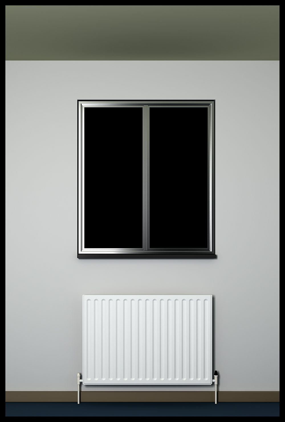
Room
-
"The sole cause of man's unhappiness is that he does not know how to stay quietly in his room." - Blaise Pascal.


-
very intriguing, tom. what about some view out? would it spoil your concept?
-
fancy silver window mullions

Looks cool. Somehow i imagine the wall being a bit grayer. The image is almost symmetrical but just off. Is that intentional?
-
@edson said:
very intriguing, tom. what about some view out? would it spoil your concept?
Yup. Wouldn't be claustrophobic enough.
@kwistenbiebel said:
The image is almost symmetrical but just off. Is that intentional?
No. I need to re-crop.
 You may be right about the walls.
 -
I always like to see what you've been up to mate!
Whilst cropping maybe you could take out a bit of the ceiling!
-
Dunno Richard, I kinda like it this way. Which obviously doesn't mean you aren't right. But I'll only be able to tell after I've left this one in the digital drawer for a while.
-
@unknownuser said:
"The sole cause of man's unhappiness is that he does not know how to stay quietly in his room." - Blaise Pascal.

I understand this completely! This is my problem! I thought I was alone!
-
Love it. It's so distinct, so unlike other images. And so cold. Don't make it too symmetrical.
-
Minimalist Stin-k,
Bring it.
I'm about it -- a bit like a "doctor can see you now," kind of a deal.
The white radiator... that makes me want to escape!
Makes me want to deal the cards for the uncountable time...
And yeah, on that note, I've been spinning all anew about the 78 -- awesome super natural insight, and kicking killer way to hit curves.
Yeah, like that's working killer cool along with, "Mr. BT, can you chuck me down a pair of frosty colds, and a red basket of tots?"
Jack bird nice.
Durant "steam heater" Hapke
-
Whenever Durant drops in to spill his wonderful ideas, you know you are on the right track Stinkie!

If only I could decipher about 20% of what he is saying.
But I do like his interventions
-
@kwistenbiebel said:
Whenever Durant drops in to spill his wonderful ideas, you know you are on the right track Stinkie!

My thoughts exactly.
 It's weird, though. Lately I've been 'accepting' SU's limitations rather than 'fighting' them. By which I mean: keep things simple, hardly any bevelling, no texture maps etc. Seems to work pretty well in my case.
Still want Google to toss in more pow!, though!
-
@kwistenbiebel said:
Whenever Durant drops in to spill his wonderful ideas, you know you are on the right track Stinkie!

If only I could decipher about 20% of what he is saying.
But I do like his interventions
Your right there mate!!!
Every time he posts I find myself reading his strange but endeering poetic language over and over again for some insight into what he must know that I don't!
Stinkie: Looking again I think you are right about the ceiling crop, leave as is. I do really like this image.
Can't wait till you put all these in a gallery thread!!! Maybe you could make up a presentation book on Issuu.com with a subtle layout to suit!! Wanting more mate!
-
I've got my own website, Richard. Like all important people! Won't be online soon, though. If I take a peek in my 'renders' folder, I can tell there just isn't enough good stuff in there yet.

Hello! It looks like you're interested in this conversation, but you don't have an account yet.
Getting fed up of having to scroll through the same posts each visit? When you register for an account, you'll always come back to exactly where you were before, and choose to be notified of new replies (either via email, or push notification). You'll also be able to save bookmarks and upvote posts to show your appreciation to other community members.
With your input, this post could be even better 💗
Register LoginAdvertisement


