Pet Clinic
-
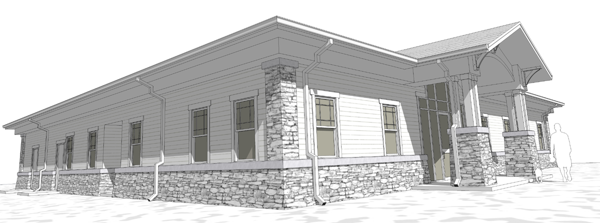
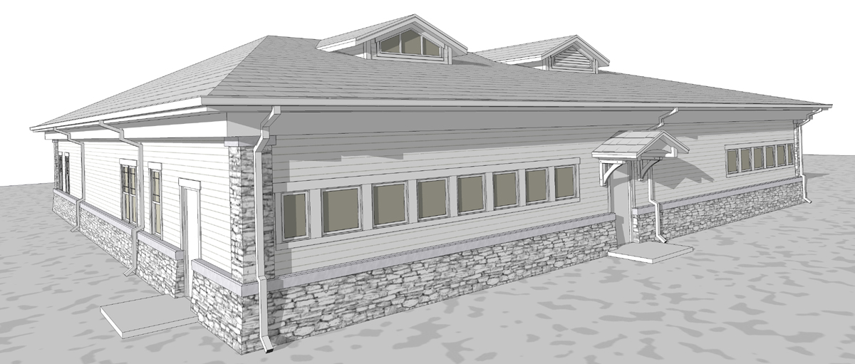
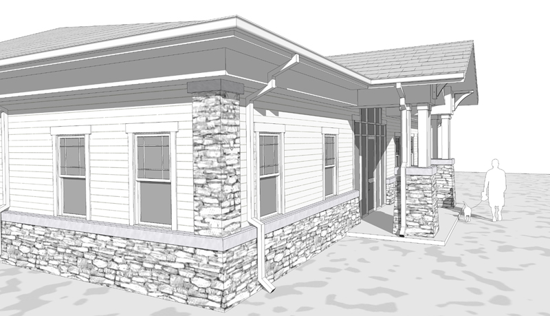
A quick study for a pet clinic we are working on. Jason, I used your style to an extent however I did not make any of the textures
 . The client is very pleased - the site has not been worked out fully yet.

-
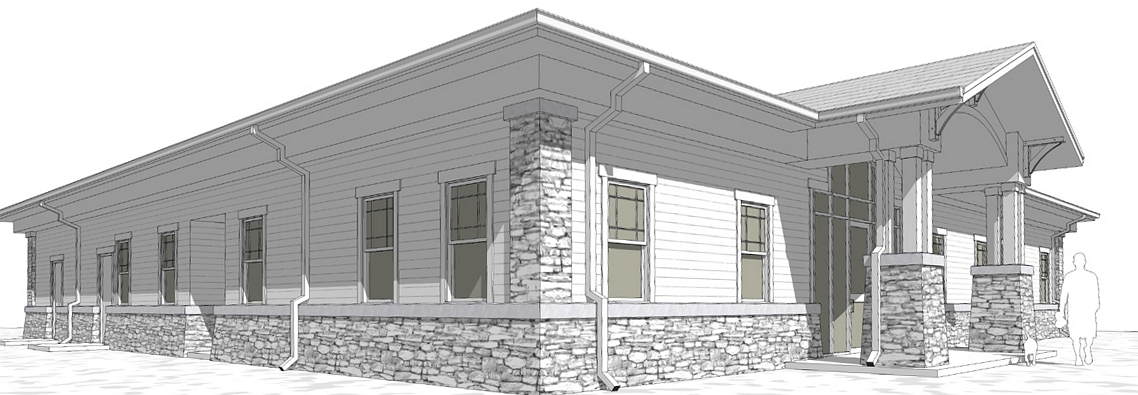
Very nice work. But sorry, as i pointed out to Jason, as an architect i am a bit disturbed by the perspective distortion. May i suggest you to try this little program?
http://www.shiftn.de/
-
haha...see how easy it is?
 what's up with the windows though??
 -
@massimo said:
Very nice work. But sorry, as i pointed out to Jason, as an architect i am a bit disturbed by the perspective distortion. May i suggest you to try this little program?
http://www.shiftn.de/Thanks but I was drunk when I took the pictures

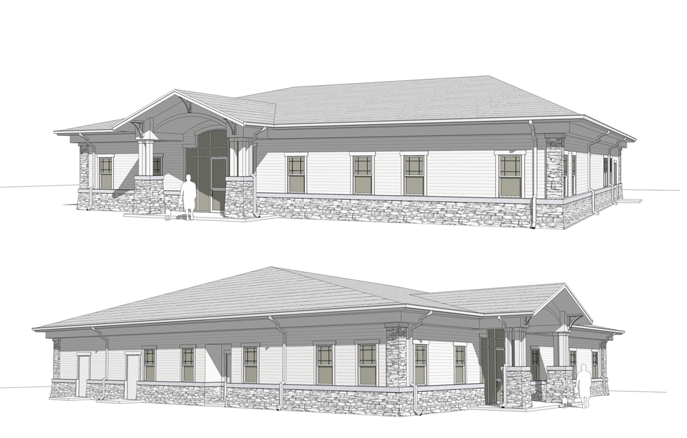
Actually if I wanted the images to look like you show I can do that in SU by changing the FOV. That is not the look I was going for.Actually the images we showed the client were not as distorted... well here let me just show you. I sent here these two plus the back side and elevational views as well.
@marked001 said:
haha...see how easy it is?
 what's up with the windows though??
Too weird? I did not like them being pure white so I went with that. Plus the mullions died a bit in the white. Maybe I should have thickened them up?
Thanks for the comments guys.
-
Drunken architecture...

-
@unknownuser said:
Too weird? I did not like them being pure white so I went with that. Plus the mullions died a bit in the white. Maybe I should have thickened them up?
little bit...only because everything else is a tone of gray...and these are beige...
-
Yep. You know you can look at something a hundred times but just one glance from another person can point out what you knew was wrong but could not put your finger on

Thanks.
(she still loved it though, ha ha)
-
Beautiful work Eric.
-
What Tinanne said
 Thanks for posting!
 -
Very, very nice, Eric.
Hmmmmm, wonder how that entry porch would look with some rain chains on it?

Hello! It looks like you're interested in this conversation, but you don't have an account yet.
Getting fed up of having to scroll through the same posts each visit? When you register for an account, you'll always come back to exactly where you were before, and choose to be notified of new replies (either via email, or push notification). You'll also be able to save bookmarks and upvote posts to show your appreciation to other community members.
With your input, this post could be even better 💗
Register LoginAdvertisement


