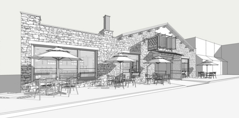
Small Market
-
Great amount of detail Jason. Well done.
-
@unknownuser said:
whats new?

they're over rated!

thanks guys.. its a cool design with some nice small details.. that def helps the images...and my motivation to make it look nice..haha..
-
Jason,
Great work, there is so much detail the color would spoil them.
Cheers.
-
great modelling i like your work!
-
It's not that I don't like your Maxwell renders, Jason, far from it, but this b&w stuff - this really is what you excell at.
 Isn't something like Piranesi just the ticket for you? I'd love to see what you do with an app like that.
Good stuff. Keep it coming.
-
Beautiful ...think B&W is your signature. As a matter of interest how big is the file?
-
Jason,
Good work. Forgive me but i took the liberty of illustrating what i feel would improve most renderings; a little lens correction...

-
I agree with the other comments, I really like the B&W. I don't know if it's the modeling or the layout, but there is just something about these that makes me think this market has pretty good food.

-
Great work indeed, Jason. You did that all in sketchup? But Troy is right.
Try this great and free little program.
http://www.marcus-hebel.de/foto/links.html
Massimo -
Absolutely love these Jason.
-
thanks guys.... appreciate the kind words. usually, the b/w is just because i'm only getting paid to model because they're just used to trace over...haha.. this one, these actually were the presentation images...
stinkie...you're absolutely right, i should really try to get into piranesi...i might try to get my hands on it...
sepo...model is about 27mb
thanks troy and massimo... definitely looks better.. i never think to do this, and it definitely helps. i'll try that program out.
-
super impressive modelling skills!
-
Nice work Jason.
What a nice quaint little market, those types of alternative healthy food joints are becoming very popular here, though expensive!
Dam I hope you don't have to render this one! Finding or making maps for product after product to make it look right would be a biggy!
-
Hi Jason! im from BRAZIL and really like your work! The first time that i saw you work was at quesada's marvel blog! Stunning work! sketchup is not my software and im not a architec... But im trying to use sketchup to improve my comics backgrounds, like some artists! and im a newbie at this forum, its my first post!
i have some questions that i will be pretty glad if you can answer me...
All this model was designed in sketchup?
How you add this look like to the piece? black and white and with those straight lines?thanks to share your art!
Best regards from Brazil
-
hey wilson...welcome to the forum.
to answer your questions...yes, model was built exclusively in sketchup and the images come straight from sketchup. the look is achieved with 'styles'....there are a bunch of styles included, a bunch out to download, and you can create your own.... these all drastically change the look of the images... finally, the textures are just grayscale textures created from colored textures... very simple to do..
-
another great example of the power of Sketchup! BEAUTIFUL WORK! This would be so fun to do a marker rendering of... but it totally is un-necessary, maybe for fun I will color an exterior shot for you.
Bob
-
Hey Jason!
Really really thanks for your answer! seems simple! i found the sketchup styles... thanks a lot!
congrats again for your work!awesome work that you have been done for marvel (quesada)!
Let ask some more (sorry about the tons of questions... im finding tutorials at internet and some more informations about sketchup)... this camera distortion was did at sketchup? how i can do it?best regards from BraziL!
-
AWESOME WORK, NICE JOB!
-
@wilsonilustra said:
Hey Jason!
this camera distortion was did at sketchup? how i can do it?play around with the field of view... select the Magnifying Glass in tools and then you can edit the field of view... these are probably all around 60 degrees... a little exagerated, but not too much (in my opinion)...the higher the number, the more distorted they get.. . good luck.
-
woah awesome level of detail there. The angles of the images really make you feel involved, nice work and nice stairs too!! line extension looks great
Hello! It looks like you're interested in this conversation, but you don't have an account yet.
Getting fed up of having to scroll through the same posts each visit? When you register for an account, you'll always come back to exactly where you were before, and choose to be notified of new replies (either via email, or push notification). You'll also be able to save bookmarks and upvote posts to show your appreciation to other community members.
With your input, this post could be even better 💗
Register LoginAdvertisement


