Photograph mood
-
hi all , nowadays I'm tring to reach a mood in my renders, and here are the results:


c&c r wellcome
-
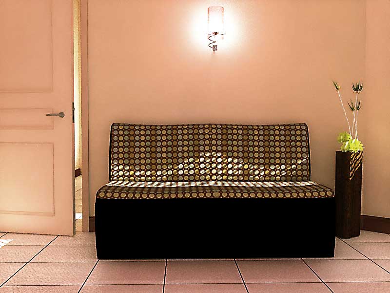
For the first image I think there is a bit too much grain to the image. also I would change the seat fabric as it blends too much with the metal legs.
The second image is GREAT! If I had to be picky I would say a bit more bump in the tile floor. Also the tile is repeating quite obviously. The lighting is very well done as is the blue glass. Nice image.
Scott
-
@unknownuser said:
For the first image I think there is a bit too much grain to the image...
I guess it's MLT progressive, isn't it? Just too few passes.
Nice images - as generally!

-
Majid,
Great work, I love the first image , I really would love to hear more. -
I like the feel of the renders.. the first one is my favorite.. very nice. Maybe you can edit the colors of the second render a bit in Photoshop... They appear a bit hard to me.
-
thanx all for comments, I usually use MLT for my renders, and also i like dotty space it makes.
i dont know what is my problem that makes my renders to seem that are "renders" not "photoes" ?
they seem artificial ... maybe too repetative texture??? or maybe not correct bumps or reflections / or maybe details? or smething from soul?
BTW maybe render masters and artists can direct me?
thanx again for comments majid -
Looks great. I really like the colors and the composition of the second one. Only idea I might have is to perhaps carry the blue tile along the window side wall -- keeping level at the top.
MLT takes a great deal of time. Being new at this myself you might want to try a photonmap rendering and a ray trace rendering.
-
Hi Majid!
I've the same sensation for the renders I do..
There's always something that seems to be missing, what you call SOUL..
I noticed that architecture images are usually desaturated a little, so try that first of all..
Then, i discovered the SHARPEN filter of Photoshop a month ago, and i can say that it slightly increases realism sometimes: perhaps you can try playing a little with its parameters!
Just make some postproduction work, and show us a before/after comparison: i'm pretty sure you will notice improvements too!And obviously, if you find something interesting, share your tips


-
@majid said:
thanx all for comments, I usually use MLT for my renders, and also i like dotty space it makes.
i dont know what is my problem that makes my renders to seem that are "renders" not "photoes" ?
they seem artificial ... maybe too repetative texture??? or maybe not correct bumps or reflections / or maybe details? or smething from soul?
BTW maybe render masters and artists can direct me?
thanx again for comments majidFew people put the care and work into their photos that you put in your renders. As a result, your renders are better than most people's photos and that is why they look different.
-
You may find that you only want to apply sharpen in some parts of a photo and not others. For instance the trim on the door panels got a bad case of the jaggies. So I suggest treating photos as if you were doing HDR. Make three layers (normal,sharpened and blurred) layer them in Photoshop and in each area of the photo erase down to the effect that works best for that area.
-
@pibuz said:
Hi Majid!
...
Then, i discovered the SHARPEN filter of Photoshop a month ago, and i can say that it slightly increases realism sometimes: perhaps you can try playing a little with its parameters!
...
And obviously, if you find something interesting, share your tips recently I tried unsharpen ,as usual over a simple KT render , The amount of sharpen filter, was low but i repeated the filter several times and here is the result,


but desaturation made it too artifical...
-
here is another render of the same scene but whit more details, i think maybe if there was a better texturing way in su then the seat was not so artificail...BTW here is the result ( i was forgetting to add door lock!!! and it was down to floor! )
Hello! It looks like you're interested in this conversation, but you don't have an account yet.
Getting fed up of having to scroll through the same posts each visit? When you register for an account, you'll always come back to exactly where you were before, and choose to be notified of new replies (either via email, or push notification). You'll also be able to save bookmarks and upvote posts to show your appreciation to other community members.
With your input, this post could be even better 💗
Register Login


Advertisement