Please Help - 1st Render(could someone give me some pointers
-
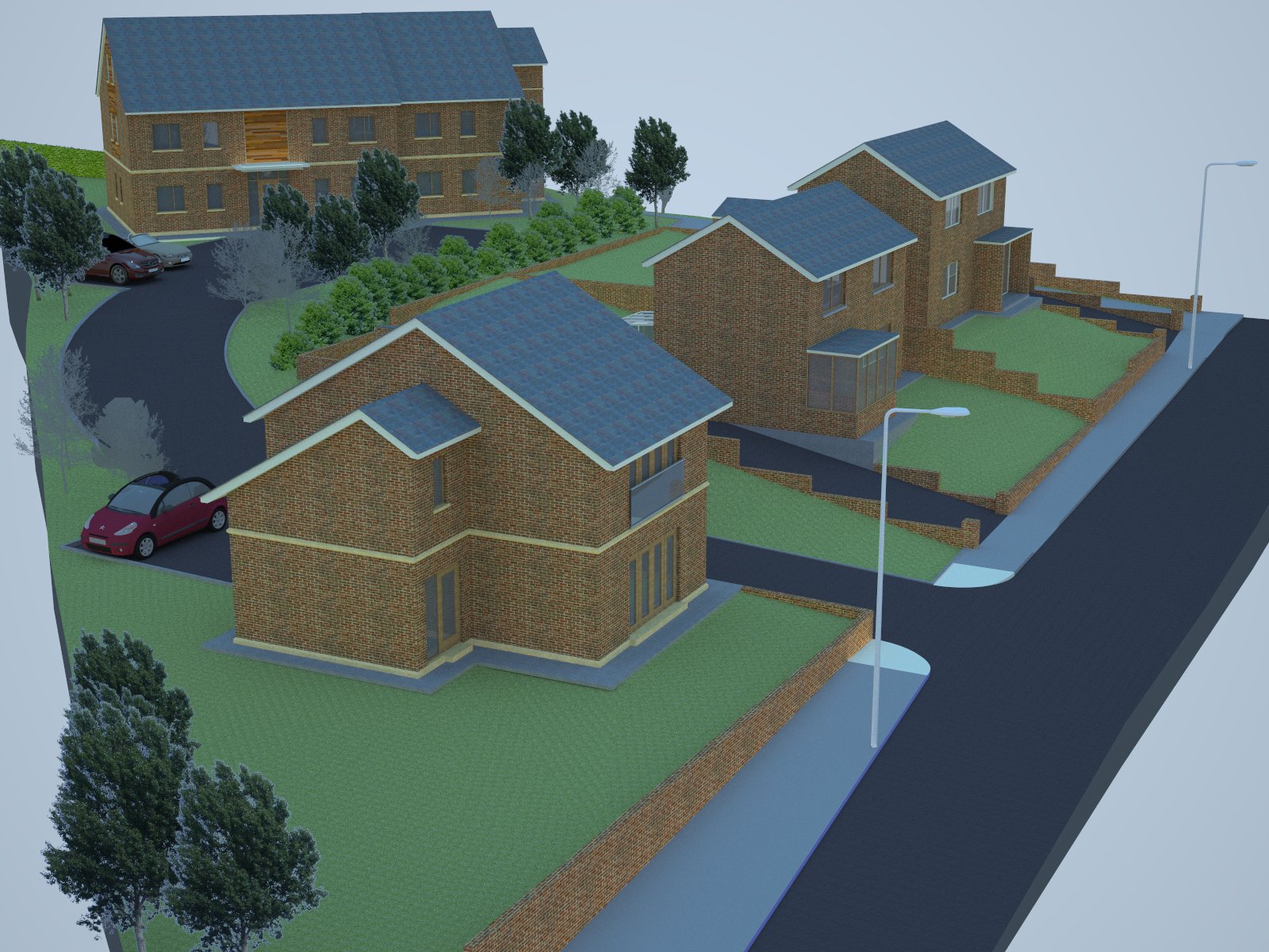
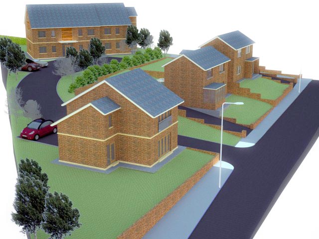
This is a shot of my first render using sketchup 7 and vray for sketcup. It sort of looks alright but I am hoping to make it better, all comments and advise is welcome.
The things I am not happy with are:-
1, It renders very blue, I know this has something to do with the environment and lighting, but with all my fiddling I haven't been able to improve it.
2, The trees are 2d camera follow trees, but they don't look great and some of them look like they have been badly photoshoped in.
3, The materials look alright but not very realistic, especially the grass which looks very flat even though it is contoured.
Please comment on anything further that you think could be improved, apart from the design which isn't mine.
Thanks for any help given.
John

-
-
Open in Photoshop and press Ctrl+Shift+L. This will get rid of any color cast. If you want more control, press Ctrl+L, click on "Auto" and then drag the sliders for each channel (R,G,B) until you're satisfied.
-
Go to the 3D warehouse and enter this search term: Tree Maker. You'll find almost perfect trees. If you want to make your own, go to this thread:
http://www.sketchucation.com/forums/scf/viewtopic.php?f=80&t=14959&st=0&sk=t&sd=a&hilit=treemaker -
You need to find larger textures (not larger in pixels, but representing a larger real-world area) in order to make the tiling less noticeable. I'm attaching a grass texture that has been shared a couple of times in this forum (or was it another forum?)
-
-
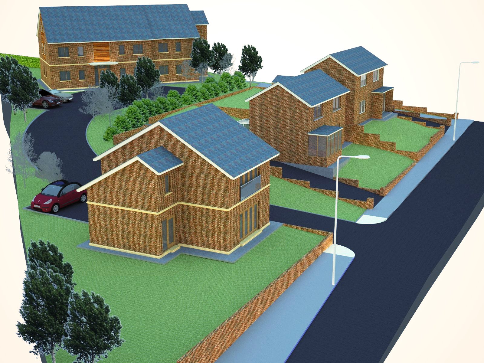
After adjusting the levels (Ctrl+L) and adding a "Bloom effect"...

-
Some post processing can often help. This is just after opening the image in MS Office (2003) Picture Manager (


 ) and running "automatic correction" or what (I have it in Hungarian).
I can add no more since I don't use Vray.

-
Hi,
although i have no experience with Vray, i have been looking at the render and what i am missing, is shadows. For instance the grass (as you said) might look more real, less flat if you can see shadow?
And the lightingpoles and buildings (no idea now what the correct english word is) do not cast any shadows. Maybe with that it might be more realistic?Good luck!
-
@fens said:
...what i am missing, is shadows....
Shadow question further to be discussed here:
http://www.sketchucation.com/forums/scf/viewtopic.php?f=80&t=16337&p=128178#p128178 -
One way to learn, is to tke the advice here, and make a sample scene of your model; couple of walls with a window, portion of roof, yard, driveway, and trees. Small to cut down render time. Set your render settings for speed, and do a bunch of quick changes. Work on one thing at a time, like the grass. Try different textures, scale it, rotate and recolor. At first, don't change many things at once, you won't know what is making the difference. In the hands of the right person, even the very basic stuff in SU will often do, but there are times you have to get better textures. Do this to get a feel, don't try for perfection, everything will change when rendering the big model.
The glow around the trees may be a problem with the renderers alpha support. If so, you have to get better, or 3d trees. Take out the gray looking trees, they don't match the composition. For variety, scale, rotate, skew, combine, recolor, and flip the trees. And of course, you got to get shadows.
A good rendering is as much about composition as it is about render materials. Try different angles and views. 2d components look best when viewed at eye level. If it doesn't look OK in SU, the render will not help. Often post processing makes a huge difference, still, its best to first depend on SU, then the renderers, and only if necessary a post processor. Oh, at first, plan to spend at least 4 time as much time as you might think you take.
Hello! It looks like you're interested in this conversation, but you don't have an account yet.
Getting fed up of having to scroll through the same posts each visit? When you register for an account, you'll always come back to exactly where you were before, and choose to be notified of new replies (either via email, or push notification). You'll also be able to save bookmarks and upvote posts to show your appreciation to other community members.
With your input, this post could be even better 💗
Register LoginAdvertisement


