Business Card
-
Hi guys
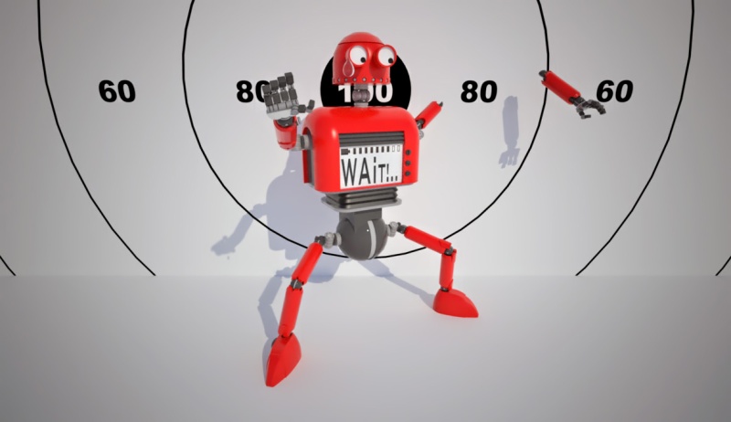
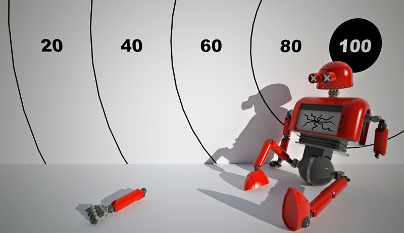
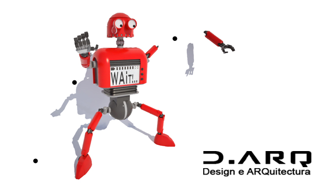
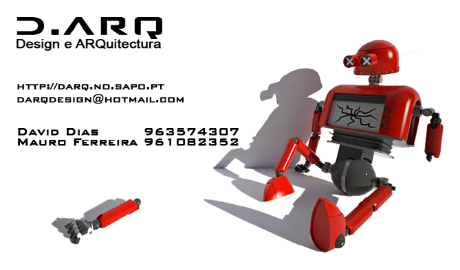
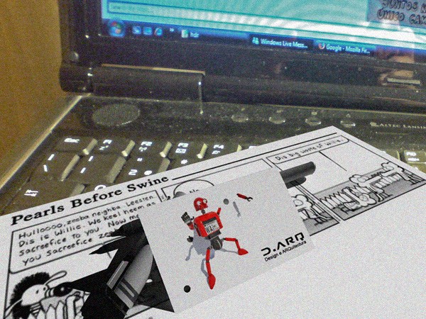
This one was born from a discussion i was having with a friend about starting working together in diferent design areas and then he told me we would need an business card diferent from the usual ones. I went home thinking about this and had the ideia of telling a smal story/scene with the card and also shooting the card in the process(not for real of corse)
 .
.The process for this was: downloading lots of robots from 3d warehouse, chose some to work as a start point, start mixing and editing (a lot...) and redrawing some parts, draw my own parts, put everything together, set up the posing and the scene, start render...and voila. I had a lot of fun doing this and one of my favorite parts it's the tear this litle robot has in a japanese comic style.
Hope you guys like it and feel free to share some tips or tricks for future projects.
David
-
David I really like these, the second last one is the winner IMO, it certainly will be a different card and that's the important part, being remembered.
good luck on your new venture, the road is not easy but if you endure and enjoy you will succeed.
-
David,
I like the bottom one, however the copy seems to crowd the image. I would try it with your company name where it is and move everything else into a line across the bottom below the robot.
Very clever design.
DE -
I'm with pete on this one..second to last is the coolest... very cool idea though.. def need something to get you noticed.
-
Very nice, especially the second one.
-
Thanks for the coments guys. You like more the robot dead?!? you're evil...
 i can't really choose between them but probably the first one for the panic expression is face has. What do you like more in the second one?
Double Espresso: thanks for the tip but could you please explain better? i'm not really understanding what you mean (sorry for my rusty english) but if you can, could you edit my pictures and show me? or anyone can edit my picture and show.
Thanks
David
-
Actually, as a layman sort of comment, I think it is off-putting to dismember the robot. Sure it is just a robot and you can put it back together. Something is weird about dismemberment, can't say why... If the surprise comedy and all can be played up, with a bullet already fired.
I like the "Wait!" image. Is this really an architecture firm, and somehow this relates? Great rendering.
-
Hi pbacot
One of my concerns was also if this could hurt anyone sensebility, but when you see children movies like toy story and alikes we can see toys and robots getting dismembered too, so i don't really think this can hurt anyone or it isn't political correct.
Well i did this in mind with something more than architecture because most of my late works don't even relate remotly to architecture (the last one was a redesing for the front of a mercedes-bez...) so i can say that with this i'm aiming to everything that can use my design and 3d skills (architecture, industrial design, automotive design, comercials... and so on).
The rendering for this one was indigo because the materials and scene were pretty simple and i wanted to do an unibiased render, so no need to lose time exporting and editing in other render packages. Don't know how mucj time it took to render but i left it doing while i was sleeping an in the next day just clean it with ninja noise and adjusted the colours and contrast.
David
-
Hi There,
I think that the types of clients you'll be doing work for won't be too bothered by the robot being dismembered. "D ARQ" (dark) kinda suits animation styles that seem to be popular. I think both designs are good but the second last one keeps it simple. Much easier to remember your company name when that is the only wording on the front of the card, just have the other contact details on the back. Also, how about using G Mail for your e-mail? I kinda like knowing I'm supporting the company that brings us Sketchup.....just a thought. Good luck with your new venture....
Jeff -
Thats a great piece of design David.well done

-
Very cool design, Dacad. A word of warning, though - business cards with the contact information on the back or inside a folded card do not work too well with rolodexs.
-
Great work
 Printing on both sides is not ideal for
scanning cards and this is becoming quite common these
days. -
second to last is the winner hands down....HEHE pun intended. I would also like to see the logo by itself and the other text in a line along the bottom below the robot. Might also be interesting if the broken robot arm were holding some of the text as if it's arm fell off while it was attempting to pry the text off the card.
-
That's a cool idea for a buissiness card

-
Thanks for the coments and suport guys.
I hope this card will help me get noticed but i also know there's lot of competition so it's not going to be easy...but i don't lose nothing in trying
ThanksDavid
Hello! It looks like you're interested in this conversation, but you don't have an account yet.
Getting fed up of having to scroll through the same posts each visit? When you register for an account, you'll always come back to exactly where you were before, and choose to be notified of new replies (either via email, or push notification). You'll also be able to save bookmarks and upvote posts to show your appreciation to other community members.
With your input, this post could be even better 💗
Register LoginAdvertisement


