Too Quiet...
-
That looks great, Ross. The grass texture reminded me of the patterns on newly mowed lawns.
-
@ross macintosh said:
Thanks Guys.
The tip is: Having modeled three-dimensional topography it can be visually helpful using a texture that has a grid pattern incorporated in it.
You know, you're right - at first I wasn't sure that the patterned grass works but looking again it help bring out the sloping ground. Nice work.
-
I'm Busy making a living...err well here are a few examples of what I'm up too lately.


-
phil,
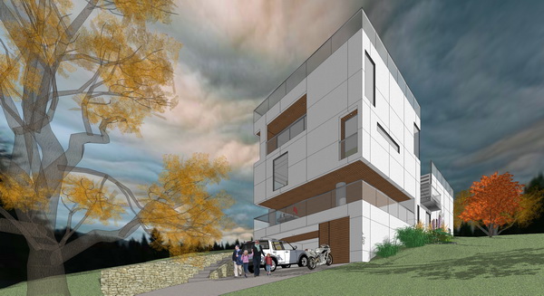
teasing pictures... could we have more on the house?
-
Phil, I love the house. You should've made your own post. Anyways, the sky doesn't seem to fit w/ the house and light settings IMO. Other than that, looks great!
-
The house was designed by another designer/developer and he brought me on board to do the 3d model/illustration. As usual the design needed to be refined and consideration for the actual site need to be given to the design. Yea I should have started a new thread but this was just a response to the Too Quiet topic.
I've found that my available time for forums and extra curricular activities is very little.
The sky was just to add drama to the image I'm not skilled enough to make the shadows and the sky correspond to each other.
OK so I'll bow out from discussing my images and start a new thread.
Thanks Ross for letting me divert your topic for a moment.
Now I'll be quiet again.
Err but not for too long.
-
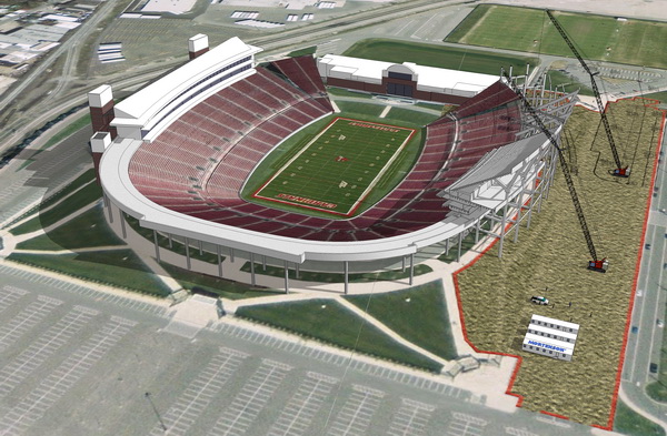
I'm glad you did post here Phil. Both your images are very inspiring. My nine-year-old thought the stadium is really cool. I agree. In your house image it appears to have exagerated perspective distortion. Was that just a graphic choice to add drama or do the walls flair?
Regards, Ross
-
no flaired walls just a camera perspective thing.
-
Your works are good! keep it up!
where did you get the human, did you make them yours.
-
Great images, Phil. I agree with Edson...more, please.
Hello! It looks like you're interested in this conversation, but you don't have an account yet.
Getting fed up of having to scroll through the same posts each visit? When you register for an account, you'll always come back to exactly where you were before, and choose to be notified of new replies (either via email, or push notification). You'll also be able to save bookmarks and upvote posts to show your appreciation to other community members.
With your input, this post could be even better 💗
Register LoginAdvertisement


