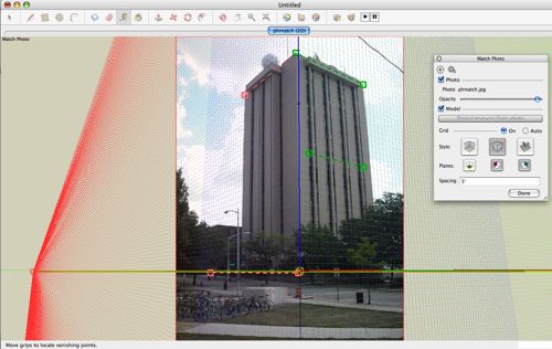
Tilted Horizon in Photo Match
-
I was trying to use Photo Match on tall building. The photo is framed vertically. Thus there are lots of vertical line information but not as many horizontals. Horizontal lines are all short and they are obscured on one face of the building. There is very little cue on horizon; trees and road around it have slope. Anyway, after photo matching it nothing came out right; horizon came out tilted, and central vertical axis didn’t line up with the vertical line of building, and both far edge of the vertical line didn’t came out parallel with building line. All, way off.
I assume tilted horizon means that photo was taken tilted. So with photo match, as you create surfaces, the display is just tilted right, and the 3D elements are really sitting correctly?
When vertical wall line don’t line up with SU line, do you just play with location of horizontal until it looks right? I did that in this case, but the setup line came out not quite lined up with the building element.
-
Ridix,
Have you watched the BaseCamp videos on PhotoMatch? I can't say what is causing your issues. One point that is made on posts here is that the photo should not be cropped, in order to work well. The image may have been cropped already. You can try to fix that by adding to the image before import. If the building looks vertical in the photo I doubt it was taken with a crooked horizon. Can you find horizontal lines to use in the building itself? As you know, pictures of high buildings have more distortion in them, in order to get the whole building in the view. That could be part of the difficulty. From the videos it seems something can be done with just about any image. The results of PM are always going to be a compromise, I think, based on the image distortion and limited accuracy. Post the file?
Peter
-
Ya I did watch BaseCamp video. Good stuff. My first PhotoMatch (PM) worked fine. I was impressed by the fact that PM gave me correct height of the building. I took different shot to compare and it was right on! Up to then I was just editing the photo to take the distortion out. But than taking out distortion caused image to distort you know. So deriving height from photo was not accurate. PM can give you better number.
Here is the photo that is giving me problem. I took the photo. The image is not edited or crapped. But I reduced image size to give me the height of 1024 pix. As I understand it any higher resolution will not display in SU, right?

-
Ridix,
I would use the top corners of the building, plus the window line visible on the right, and the top of the retaining wall on the left. Is that what you did? The streets look to be sloping. I'll try it out when I have a moment.

I think the horizon looks horizontal... The Picture is not quite vertical as the blue axis does not align with the focal vertical edge. I'd adjust that in PS or other image editor first. I don't think photomatch can automatically give scale. You scale it yourself. I just zoomed placing the cursor on the red axis. until Bryce looked like he was near the corner of the building. The Building then measures about 165' high. You can adjust more exactly if you know how big it is. The zooming was more difficult because the axis and the horizon as I set them up are on top of each other.
-
The PhotoMatch looks better. My first try was done on “corrected” image where lens distortion was removed and. And, that added different type of distortion. I think. The blue axis misalignment was quite bad. It is still not right on still. I think PM should have option to have third vanishing point up in the sky for case like this. By the way how did you get 165’ without knowing the base dimension?
-
I just zoomed out, clicking on the red axis, until Bryce looked to be the right size to be standing near the corner. I assumed the base of the exterior wall being somewhere near the top of the retaining wall. Then with the measuring tool I measured up the blue axis, from the point you would begin drawing.
-
until Bryce looked to be the right size
Interesting method. When I took the photo, I was not paying attention to number of pedestrians in the image. But they are there. It can be used to scale. I should intentionally include them from now on, in at least few of the building shots.
Hello! It looks like you're interested in this conversation, but you don't have an account yet.
Getting fed up of having to scroll through the same posts each visit? When you register for an account, you'll always come back to exactly where you were before, and choose to be notified of new replies (either via email, or push notification). You'll also be able to save bookmarks and upvote posts to show your appreciation to other community members.
With your input, this post could be even better 💗
Register LoginAdvertisement


