Building render (wip)
-
Hey Richard
Mate nice job on the materials. Like the others not sure at all why you have rotated the camera! I think a closer view with a wider angle lens would also improve the image!
Look forward to seeing any updates you might grant us!
By the way re the design - I think the eaves could be deeper to give a more dramatic roof form!
Richard
-
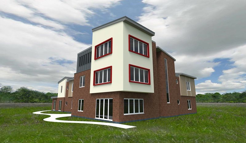
All: Thanks for the comments. I have changed the camera angle, and it does look better!
Frederik: Can you suggest any shrubs, trees etc that will render well in kerkythea? I had added a bump map to the brick anyway, but have increased the amount in these next renders.
Richard: I have increased the eaves depth slightly, although I think I may change the detail of the roof later anyway.
Adjusted first render and render from a different angle:


-
@rsw said:
Frederik: Can you suggest any shrubs, trees etc that will render well in kerkythea?
Of course...

Have you seen some of the 3D trees and scrub available at the KT download section..??
(I assume you have, cause I can see you've used the grass...)@rsw said:
I had added a bump map to the brick anyway, but have increased the amount in these next renders.
Well... I couldn't see it, but it looks better now...

-
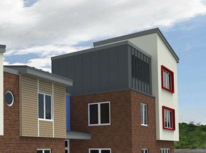
Why the choice of the grey container-like material in this part of the building?

-
@frederik said:
Have you seen some of the 3D trees and scrub available at the KT download section..??

For some reason I missed those. I would rather place these from within sketchup rather than kt but can't see how to do that??...
@johnsenior1973 said:
Why the choice of the grey container-like material in this part of the building?
It is intended to be a vertical standing seam like material, although you may be right that it looks too container/industrial like.
-
@rsw said:
For some reason I missed those. I would rather place these from within sketchup rather than kt but can't see how to do that??...
You can't import the KT model libraries to SU, but although the Xfrog Trees are available in 3ds format, I wouldn't recommend that you try to import them to SU, since they're very high poly...

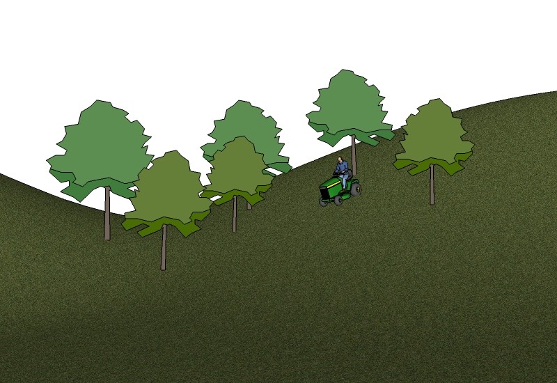
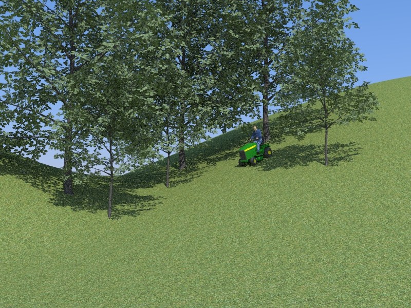
However, in SU you can place proxies (i.e. 2D trees) and if you're using the latest Beta SU2KT which will export components as instances to KT, you can replace these with instanced 3D Xfrog trees in KT...

Now that you've already exported your model from SU and applied textures in KT, I suggest that you place some 2D trees in your scene in SU and then when exporting, you first select all the 2D trees (and only these) and then set the Export selection ONLY to Yes in the SU2KT Export Options window...
Then open your existing model in KT and Merge the new exported trees into the scene...
(You will notice that the proxies are imported as instanced objects..)Now follow these steps to replace the proxies with real 3D trees from the KT model libraries...
1.) Insert a tree or another component you want to replace the proxies...
(Repeat to match the number of different models you want to be instanced)
2.) Select one of trees inserted and open the Instancing Brush tool
(Tools > Instancing Brush)
3.) After having selected the model click the Instance button...
Select the surface and click the Canvas button...
4.) Click the Brush button and enter a name for your new instanced object...
5.) In the Scene Tree View select the instanced proxie you want to be replaced by the new high poly 3D tree and right-click it...
6.) Select Instancing in the sub-menu and select the another Instanced object (in this example the 3D tree instanced object you've just created)...
7.) Repeat point 2, 3, 4, 5 and 6 as much as you want...Voila - you're now able to place proxies in SU and replace them in KT with instanced objects...

Hope this helps..!?


-
exactly what i was looking for! will try that later. thanks
-
cool demonstration, Frederick.
RSW. Your work is encouraging for me, as I haven't got so far myself. If I may make some observations as a layman:
- The second angle, straight on to the corner does not do the building justice.
- The grass actually looks too large to me, too much detail beyond the building, as if it is a small model sitting on grass in the foreground.
- Containers have been used in modern buildings. See DWELL. If you want to get away from this, perhaps more detail and a different color will help.
- More suggestion of realism: landings at the sliders (are they doors?). Have the walkway lead off-camera to the access to site.
I like the building overall. A lot happening. Good luck.
-
Another suggestion, Richard: change the concrete material to something grayer - the white is too harsh.
Design question: why is there blue brick at the bottom (at grade)? Why put such a deign element at the very bottom, where it will get covered by grass/plants?
-
Mate I'm a strong believer that to make a good image keep verticals vertical unless you are going for something very dramatic. IMHO this lets down your last few images.
Richard
-
@pbacot said:
- The second angle, straight on to the corner does not do the building justice.
- The grass actually looks too large to me, too much detail beyond the building, as if it is a small model sitting on grass in the foreground.
- Containers have been used in modern buildings. See DWELL. If you want to get away from this, perhaps more detail and a different color will help.
- More suggestion of realism: landings at the sliders (are they doors?). Have the walkway lead off-camera to the access to site.
Thanks for the comments pbacot.
- The image straight on the corner may not do the building justice, but it does show how the building increases in height to that corner - an intentional design element.
- The grass etc will change significantly - infact the building would actually be in a very urban environment - the current background and grass is temporary.
- As I said to begin with this is an incomplete model, so I will be making changes to the model which will hopefully improve the 'container' element.
- You are correct that landings do need to be added - for some reason the original design did not have doors here, but can't think why, as there doesn't appear to be any logical reason.
@daniel said:
Another suggestion, Richard: change the concrete material to something grayer - the white is too harsh.
Design question: why is there blue brick at the bottom (at grade)? Why put such a deign element at the very bottom, where it will get covered by grass/plants?Daniel, i assume you mean the paths around the building, these will be changing anyway - in fact at the moment the material is only the default su material.
As for the blue/grey brick at the bottom, this would be an engineering brick - to be honest the site is quite tight, so by the time i've put paths, parking etc in as they should be there will be very little grass up against the building anyway.
Thanks for the comments, I probably won't get chance to update this much over the next few days, but will post when I do.
-
The white walls looks plastis I think.
Hello! It looks like you're interested in this conversation, but you don't have an account yet.
Getting fed up of having to scroll through the same posts each visit? When you register for an account, you'll always come back to exactly where you were before, and choose to be notified of new replies (either via email, or push notification). You'll also be able to save bookmarks and upvote posts to show your appreciation to other community members.
With your input, this post could be even better 💗
Register LoginAdvertisement


