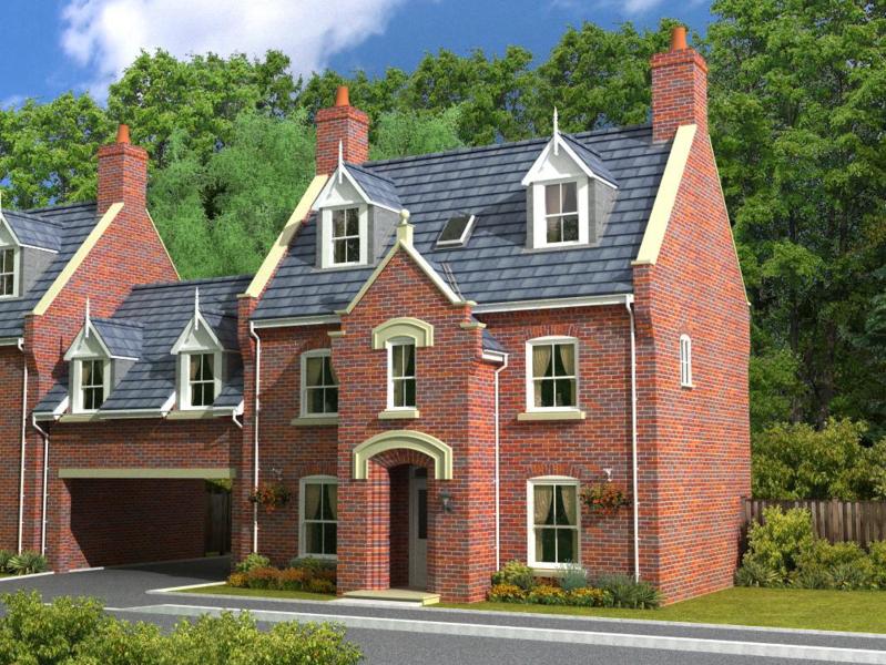
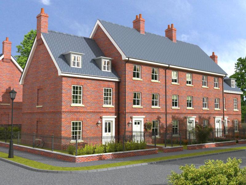
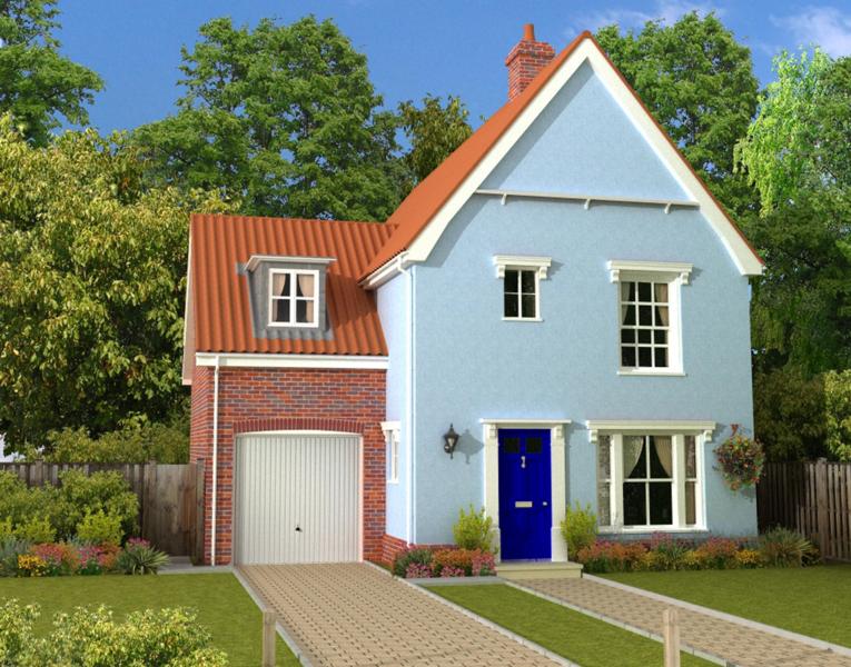
Getting together a portfolio using SU & Podium.
-
Hello Sketchuppers.
I've been dropping in daily for several months now but have been a bit shy and not posted anything. Let me tell you a bit about my situation.
I have been working for a housing developer but I've recently been made redundant due to the current economic crisis and so would like to find a job doing 3D visualisations. I'm in the process of putting together a portfolio of work and would like to call upon all you experts for a little advice.
So far I only have 3 images but I've got several models on the go and will have more to show over the next few weeks. I would really appreciate any comments or criticism you have of these images.


-
Beautiful work, and fantastic detail.
...and welcome to SCF.
-
As solo said, those are very good. They have quite a storybook feel to them, in a very good way of course.
Could i ask what sort of job your looking to apply for? I find it quite hard to think of crits without knowing what sort of people the images are targeted at.
-
Ideally I'd like to work with an architectural firm doing 3D visualisations of residential projects, however, I realise I need to keep my options open. I've been working for a developer which specialises in traditional style homes, hence the images I've posted but I need to get cracking on some models which are more contemporary. I'm not really sure what sort of things to include in my portfolio. I'm assuming I just need to show that I can turn my hand to a range of different stuff; floorplans, exteriors, interiors, modern & traditional. I've got a lot of work to do in a short space of time.

Oh and thanks for the welcome guys. I'm very glad to be here.
-
very good pictures especially the first and second, this very successful brick wall and trees (are put in photoshop?) always gave me the SUPodium curiosity, but the truth will never drive, I think it has much power that if .
ahhh welcome
-
kevsterman, these are some good renders.
I am particularly impressed by the surrounding greenery. you really managed to embed the models in an environment (my buildings always look out of place
 )
)
the level of detail is exceptionally good!however, they look a bit like toy houses to me. something you should be able to change easily by inserting some people. thus we have something to compare their size to.
-
I have to agree with the others these images being from Podium are exceptional!!!
the vegetation is particularly good! I'd like to ask are they all clips added pre or post processing. I also agree that some peeps would help give scale!
-
Those are fantastic.
Welcome to the forum.
-
To answer your questions about the vegetation, they are all clipmaps. Other than a final cropping there was no post processing involved.
I agree that some people would help to give it a sense of scale and also bring it alive some more.
Thanks for your comments guys. I really appreciate them. I haven't been using Podium for very long so I'm still getting used to it but its a great programme and I love using it.
-
You're right, Chango70, I do intend on modeling some contemporary style housing. I'm actually working on an interior model now, a birds eye view of a complete apartment and just trying to work out how best to light it for Podium. I've not done interiors before but there is plenty of info on both this site and over at the Podium forums so I'm doing lots of searches today

Thanks for your suggestion on the tarmac colour. It is quite pale and would benefit from being made darker

-
Another idea. Why don't you model up the 'Magnum Opus' of the office you are applying to. That way not only are you show casing your skills you also appear to be enthusiastic and interested in what they are doing, which often can be the key.
-
Brilliant renders! I was just thinking since your last employer only does traditional style houses perhaps it would be a good idea to model up modern ones. This will open up your options. One with lots of glass would be a nice contrast and some interior to go with it.
I noticed on the second image the tarmac is a bit to light. I would have made it darker.
-
That's a great idea, chango. I haven't got anywhere in particular in mind at the moment but once I start looking round a bit more closely I think thats something I would do.

-
Don't forget to show us the results
 .
. -
Great work kevsterman. I would go along with the general comments,
perhaps some people in the scenes.Mike
PS: I don't think you will be idle for too long

-
I hope you're right, Mike.
-
Welcome Kev,
I think these images are pretty amazing, especially the first two.
Definitely some of the best work posted here.
Great rendering and excellent modelling and depth of detail.Look forward to seeing more

-
Wow thanks Dylan. That's praise indeed.

I hope to post more in the next day or so. Just trying to get the lighting right on an interior.
Hello! It looks like you're interested in this conversation, but you don't have an account yet.
Getting fed up of having to scroll through the same posts each visit? When you register for an account, you'll always come back to exactly where you were before, and choose to be notified of new replies (either via email, or push notification). You'll also be able to save bookmarks and upvote posts to show your appreciation to other community members.
With your input, this post could be even better 💗
Register LoginAdvertisement


