Idea for ruby to reduce file size
-
I do this a lot as small file sizes are necessary to keep things moving on my slow pc. It works, but there is a downside. You can't "smooth" a line between components. You can only hide it. That means the shading/rendering engine doesn't recognize that there is a continuous surface and it doesn't look as good as it could.
Still a good idea, but not one you'd want to always use.
-
Sketchy, you're right. This is a good way to help reduce file size. It would be kind of neat if this could be automated, too. John does make a good point about applying materials to components in which that has been done so caution should be exercised.
-
Hi guys,
Have a look at the attached file. If you "slice" your object (this case a circle) at its midpoints rather than at the endpoints, you can "keep" it seamless (using the good old techniques - hiding edges etc...).
-
Gai, you beat me too it. I was about to post an example showing that. It's a good tip.
-
Yeah, Dave, but in your other topic I realised that texture mappung is almost impossible this way...
-
Yup Gai thats exactly what I was thinking. Does this method solve the rendering issue SchreiberBike brought up?
And my fantasy involved an automated ruby that would to through every group/component and regroup based on symmetry. Or you could select specific groups/components. I would probably only do the whole model before sending it to LayOut, to someone via email, or posting it on a cool message board with file size limitations
 . I would keep a copy of the unmodified version as well.
 -
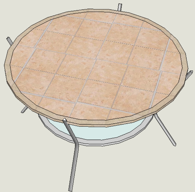
Sketchy, Gai's method only partly helps with the rendering thing. You won't get a hard edge as you would by hiding a corner but textures would still have a problem. Imagine a tiled top on your table example. It would look like it was cut into pie-shaped segments with the tile cut on an angle. For some things like wood grain textures, you could get a look of a typical veneered top, so sometimes it could be good.
-
Yup, here is an example with different transitions of soft shadows (still the "original", low poly model).
Note that the "hardest" shadow edge is neither at a midpoint nor at an endpoint. This is not textured though - just the "clay" model (with the original Front Face) rendered in Kerky.
-
Thanks for the render Gai.
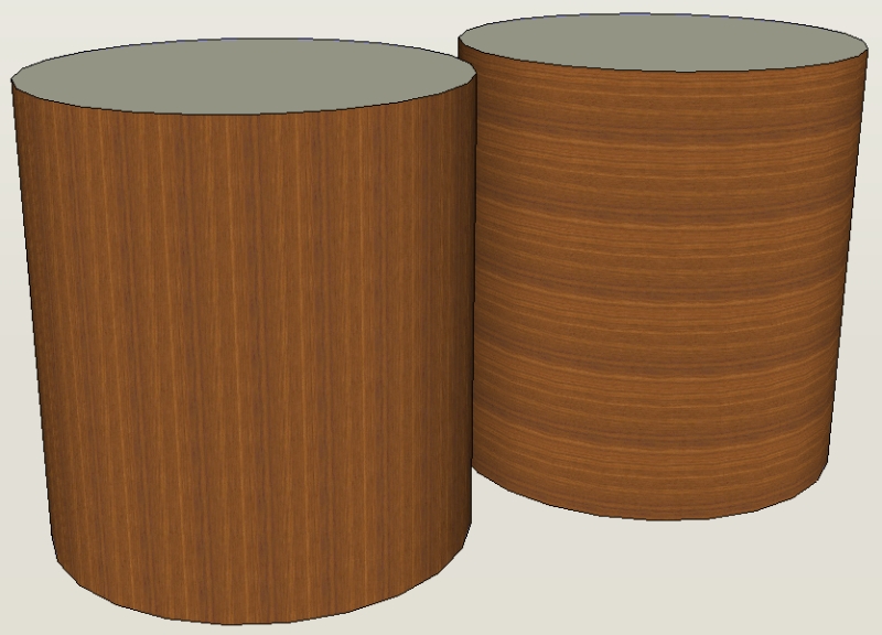
For the sake of discussion here are the two models with textures applied. I didn't take any time to scale or move any of the textures.


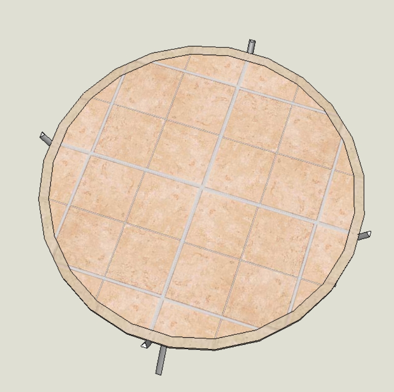
Here I took the tile texture and moved it slightly (no rotation or scaling). A pretty easy shift. I do recognize that other textures would be more problematic.

-
Hi Sketchy,
Did you progress this idea at all? I'm looking for a automated process for splitting a large urban model into individual tiles.
Cheers
Hello! It looks like you're interested in this conversation, but you don't have an account yet.
Getting fed up of having to scroll through the same posts each visit? When you register for an account, you'll always come back to exactly where you were before, and choose to be notified of new replies (either via email, or push notification). You'll also be able to save bookmarks and upvote posts to show your appreciation to other community members.
With your input, this post could be even better 💗
Register LoginAdvertisement


