La loft revisited
-
Very nice image, very pleasing to the eye.
-
Indeed! The bold red on the right, whispered again on the left, (and then hushed up in the left foreground) works really well I think. (And I love the contray corner on that lovely rug...serves them right for being so obscenely rich :`)
-
thanks guys! i'm glad the slightly stylized sensibilities seem to be coming across.

-
wow sir this is good where do you use your renderings? are you a graphic artist?

-
I may be in a very small minority here, but I preferred the space when it was just the sofas. Then the view was everything and it was a breathtaking space. A space that only the ultra-rich could afford, but that's one of the many perks of being ultra-rich.
To critique this render. The rug is curling up way too much, and personally I don't think someone who can afford this type of place would be accepting of a rug curling up like that. Another problem is the way the light in the room doesn't match the light outside.
-
thanks again for the feedback. All encouraging and helpfull.
i'm a concept artist for film/tv/video games.
i agree with you on the minimalist room vs. populated ( i preferred the stark room)....but the vast majority disagreed with me
so i listened and put some stuff in there.i've made the light inside extremely warm vs. a cooler bg just to push the effect and separation, but if it is too much i can normalize the light more and even it out. thoughts?
re: the carpet...well...i was just being a little playful. and also, its a bit of a device to point to the focal point of the piece which is the girl.
-
I really like this new render. especially the plants outside are absolutely to my favour (and the woman of course
) -
This is very beautiful. It has a dreamy romantic quality. I REALLY like it.
I do agree about the rug (although I can appreciate a little playfulness
 )
)My only critic are the tree on the building? It seems that this is a highrise, were you envisioning a deck of some sort out there? If so, there would be railing and the trees probably wouldn't be so close to the building.
-
I think background is scare feeling I think in model don't have rail?
-
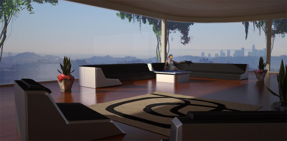
made a few slight changes based on a lot of feedback from different sources.
thanks for the feedback, compliments and crits.
I tried to cool off the interior light so it matched the BG a bit better. Toned down the carpet flip
and flipped the canvas for a bit better compositional read. (this is a fun/fantasy piece so i don't have a design doc. to adhere to)The space was supposed to be less 'high-rise' and more 'swanky pad on the hill' so i figured it had some sort of green roof and vines growing up the walls.
thanks again for all the feedback!

Hello! It looks like you're interested in this conversation, but you don't have an account yet.
Getting fed up of having to scroll through the same posts each visit? When you register for an account, you'll always come back to exactly where you were before, and choose to be notified of new replies (either via email, or push notification). You'll also be able to save bookmarks and upvote posts to show your appreciation to other community members.
With your input, this post could be even better 💗
Register Login


Advertisement