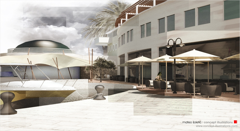
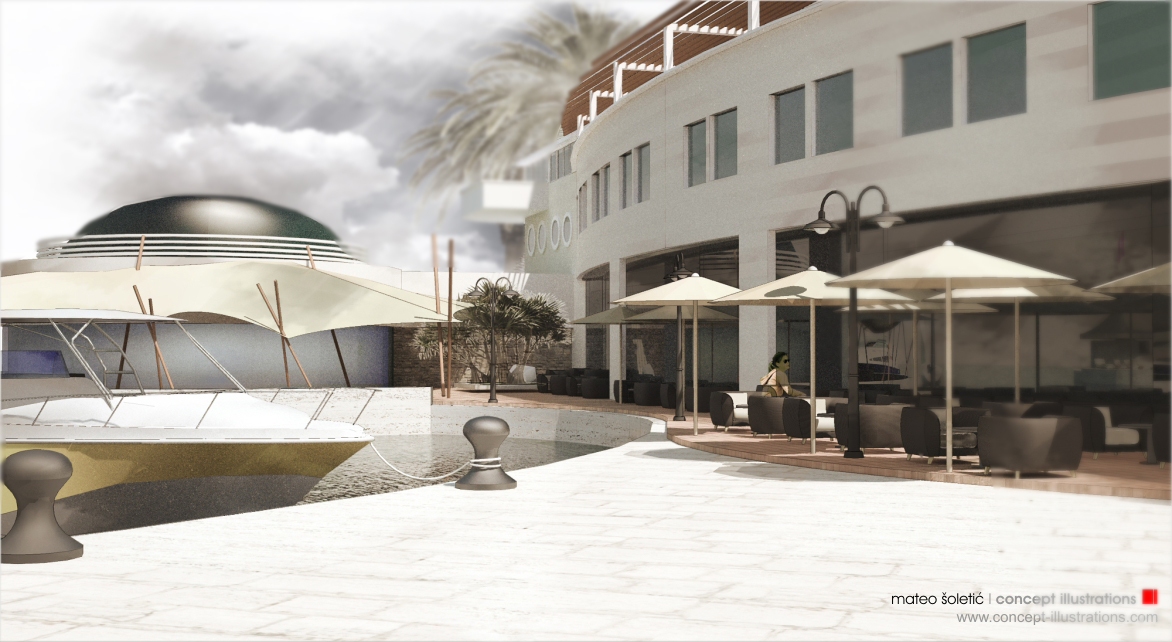
Trying out some new techniques
-
I agree with Fredrick about the sky but still a very nice composition.
I can see me trying to copy this... I mean get inspired from your style.
Beautiful work, I still think you should do more of those sailing inspired works as a fine art series. -
Beautiful rendering, Mateo. You should be proud of yourself.
-
I also would LOVE to see a tutorial for this! Beautiful work!
Scott
-
Got to agree with everyone else, this is fantastic and beautifully done.
I like the sky. -
Beat me to it James, I really like the sky too. However the girl looks lonely

Great work and I look forward to a tutorial

-
mateo,
The look is so beautifully rich, textured and layered. The reflections in the plate glass windows are fantastic. It very much reminds me of illustrations in some of my favorite childrens picture books. My kids are older now so I can't remember the illustrators but I'll bet some of those with younger children can supply some names.
Anyway, you are definitely taking SketchUp to a new level. Congrats for some great work! Keep going!
Fred
-
I like the thunderstorm sky/general sepia tone. I keep thinking that there should be more space indicated between foreground/background using a depth mask, but you really don't have a distinct foreground so it might not be a useful gambit.
The dome in the background shows a few facets in profile, so you might want to take care of that.
-
I love the overall effect, very clean and precise- i thought it might be cool to empasise the photomontage effect, which i sometimes do with my work by highlighting certain areas, mainly to draw the viewer to particular details or away from the not so nice stuff....
i had a go with your image, hope u don't mind:

-
A really nice technique, very professional looking results.
-
Thanks guys for the feedback and the tips.
Archirag,
Nice looking effect , It would be good for some types of presentations, is it a plugin or..Here is with some quick blur effect

-
Mateo,
I absolutely love the original render the way it is. I think the sky works perfectly in harmonhy with the entire image. Everything feels so right. Its beautiful.The colors and tones are very soothing and soft. Terrific work.
Would appreciate knowing how you put this all together.
Best,
Allen
-
Mateo!
Always original and unstressed pictures and themes! -
Thanks again
@unknownuser said:
Would appreciate knowing how you put this all together.
Allen,
90% It is a combination of natural Su and rendered layers combined.
The sky and the trees are added in postprocess. Some filters used and
the overall look is a kind of sephia+BW Tecchnique.
I will be doing a tutorial on this and posting here at the forum. -
Mateo, I've spent a lot of time with this image (the first one) since you posted it...chunks of time: short and long. I am filled awe:
It is the most beautiful rendering of a CG3D model I've ever seen!
I'm going to restrain myself from writing an art school essay and just pick one to praise of the many so impressive facets: how you managed to anchor the portion of the image with the most contrast firmly in the background (and keep it there in spite of all that soft, luscious detail), then, once found, make it the key to understanding all the image's spacial relationships...as if my left eye had been closed until my right had experienced that spot.
wow
-
Mateo, really beautiful. I'm looking forward to the tutorial!
-
Mateo,
So this is Sketchup and Photoshop right?
It looks very good. About the best effect I have seen without render engine and I like this much more than the typical water color output.
It has a certain degree of realism to it and at the same time it is soft and appealing.I love it!
-
Tom,
When someone says that it is the most beautifull rendering of a CG 3D
model one has ever seen., I think it is about the greatest compliment one
can ever get.
Thank You.
Mateo.Tinanne,
Thank You.Kwist,
@unknownuser said:
So this is Sketchup and Photoshop right?
Thank You .
Its SU, Maxwell, and PS. -
Mateo, I thank you (bow from the waist :`)...I just can't help but deal with this image as art rather than rendering: I stroll through it rather than look at it. I've been pleased to ponder your work for a couple of years now, but this one (for reasons to be discovered, I hope) has struck a personal chord not often plucked.
On another note, a question I hope you'll address in your tut: how you get the colors so light without being all hazy looking.
-
Reminds me of the post processing in the movie "Reflections in a Golden Eye". I was 15 into the move when someone whispered "hey this movie is in color."
Very nice effect. Mateo is the master of implied atmosphere.
-
@unknownuser said:
"hey this movie is in color."
Roger, thanks for Your comments and for reminding me of the movie, those were great times.
Mateo
Hello! It looks like you're interested in this conversation, but you don't have an account yet.
Getting fed up of having to scroll through the same posts each visit? When you register for an account, you'll always come back to exactly where you were before, and choose to be notified of new replies (either via email, or push notification). You'll also be able to save bookmarks and upvote posts to show your appreciation to other community members.
With your input, this post could be even better 💗
Register LoginAdvertisement


