Gatehouse renders
-
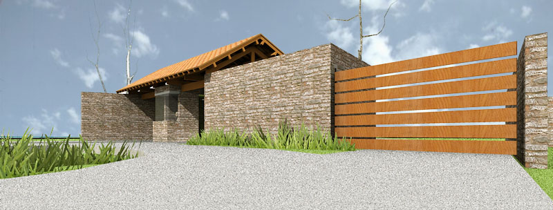
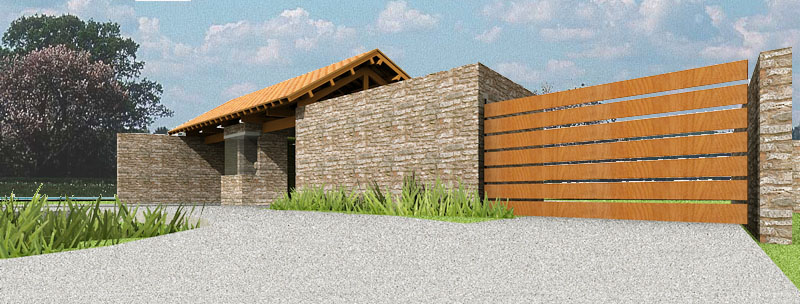
two attempts at rendering a gatehouse for a project i am doing. in one i used some sketchup trees whose leaves did not render. then i inserted a background in the second in photoshop.
time of render in podium: 4min. + 10 min in photoshop for the first one and 15 for the second.
i am glad i am making progress. slow and steady.


-
Great start!
Why is your viewing angle so low to the ground? Makes me feel like I fell skateboarding or something.
-
Edson, have you been working on the structural part of that gatehouse? If so do you have any construction views so we could see how it's built?
-
Might want to try and find a better stone texture for the walls as well, its tiling quite badly

Nice render though, i can see good things if you keep going with it.
-
ah.. i think i remember this project... i agree about the stone texture, but looks like a great start and i definitely love the design.
-
i thank you all for your comments.
eric,
i lowered it a bit trying to make a small building look more impressive. if it gives you that impression maybe the clients will feel that way too. i'd better make it a normal point of view.joe,
yes i have. right now what i have is a tentative structure based on my not-so-extensive experience with wooden structures. later on i will submit it to some expert on the matter. if you like, i can send you a few pictures of it.remus,
i had noticed the tiling problem. but, as i am learning, i am taking one step at a time. it was more important at this moment to get the lighting, the color of the texture and the bump right than fixing the tiling problem. later on i will get to that. -
I do like Edson, I'd very much like to see the structure and give some comments on it. I'm very interested in roofed entrys/gatehouses.
-
@marked001 said:
ah.. i think i remember this project... i agree about the stone texture, but looks like a great start and i definitely love the design.
thanks, jason. you remember well. this is a project i have been working on for 3 years. they did not like a flat-roofed gatehouse so i designed this one.
as we had to spend a lot of time dealing with environmental licensing, the actual design was put on hold so the clients have not seen this yet (which is not such a bad thing since when i show it to them i will be able to use these renders).
-
Edson, really nice! (thought this one would have been long done by now...so it often goes, huh?) I like the lowered viewpoint, but see Eric's point: how 'bout sitting-in-a-small-car viewpoint...a happy medium?
-
Edson
What did you use for the grass in the forground? I have been looking for good grass materials and components.
BTW nice renderings!
-
Looks great, Edson. In my pickiness, have two comments for what they're worth:
On the horizontal boards, you might want to shift the textures on some, maybe even rotate 180 degrees, so they don't look like clones.
Wouldn't that wood weather to a gray over time? It appears very orange on my computer.
-
-
@daniel said:
Looks great, Edson. In my pickiness, have two comments for what they're worth:
On the horizontal boards, you might want to shift the textures on some, maybe even rotate 180 degrees, so they don't look like clones.
Wouldn't that wood weather to a gray over time? It appears very orange on my computer.
i agree with with your comments. ideally i would have addressed those problems earlier but as i am a newbie at this i left some refinements to do later. my main goal at this point is to get the lighting right, then comes texturing.
Hello! It looks like you're interested in this conversation, but you don't have an account yet.
Getting fed up of having to scroll through the same posts each visit? When you register for an account, you'll always come back to exactly where you were before, and choose to be notified of new replies (either via email, or push notification). You'll also be able to save bookmarks and upvote posts to show your appreciation to other community members.
With your input, this post could be even better 💗
Register LoginAdvertisement


