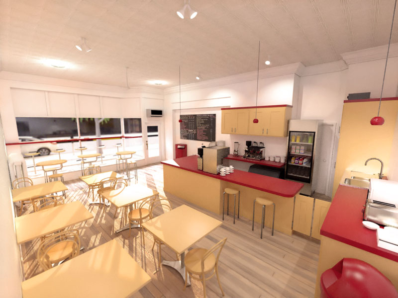
Kerkythea Render - Coffee Shop
-
This site didn't work out, but I figured I'd finish up the render just for fun.
Modeled in SU. Rendered in Kerky - MLT. DOF added in PS using modified depth mask from Kerky.

-
Looks great!
-
Outstanding Nick!
-
This is very good. Makes me feel really stupid for shelling out the dough for Maxwell...

-
@cheffey said:
This is very good. Makes me feel really stupid for shelling out the dough for Maxwell...

Don't be. Maxwell has it's advantages. Besides, with HD sizes these days, there's plenty of room for several rendering apps.

Nice image, btw!
-
Nick, excellent!!!
-
very good, nick. too bad it did not get built.
-
thanks very much for the compliments, everyone. I forgot to ask for constructive criticism - I don't learn anything otherwise.

I haven't tried adding people in a photorealistic render yet, though I think it would really add some life to the scene. Any tips on where to start with that (do 2d people work? or do they have to be 3d to get the shadows right?) I've seen post-pro images of people inserted using PS, is that generally considered the "best" method?
The wood floor is my debut in home-made textures. Not fantastic, but better than what I started with, I think. The reflection on the bump map doesn't look exactly right (I was trying to replicate an oldish, well-worn wood floor), and the repeating pattern in the foreground is subpar.
Also, I think the lighting could be better. From an "artistic" perspective (now that step back and look at it), the spotlights aren't very pretty. Kind of dropped them in there to fill in dark areas... it could have come out better with more work. I think I often tend toward "over-lighting" a render. I sometimes try to light up the whole scene by natural light or fill lighting, when some strategic shadows can really create a more dramatic render. I'm a big fan of natural lighting and generally have tended toward always seeking more windows/natural light sources, so it makes sense that I may overcompensate. It's hard for me to look at a render with a dark corner (i.e. imagine the coffee shop lit by only the light coming through the front window) and say "it's good". Maybe I just need to expirement with more scenes and find some dramatically shadowed scenes out there that I like and try to duplicate the lighting. yeah... that's what I'll do...

thanks again, friends.
Peace!
nick -
if your looking for things to improve: i think the lighting currently looks a bit weird because youve got all that really bright sunlight which makes a lot of the tables by the window look overecposed. I tihnk he trick would be to, as you mentioned, be a bit more selective with your use of spotlights, like perhaps just a few over the serving counter and a few more to light key areas.
Perhaps if you did the renders more from a customer point of view, like on the tables next to the window, you wouldnt get so much over exposure
 not entirely sure aobut that but worth a try if youve got a bit of time to experiment.
Last thing would be to make sure you bevel all the sharp edges you can find, especially those counter tops!
Really those are all just pretty small things, as there isnt anything wrong with your render, its very good!
-
Hi Nick,
This is indees a nice render, but like remus already have pointed out, the lightning could use some "love"...

I suggest that you try converting the spotlights to IES lights...

If you don't know the process for this, please check out the Converting spot to IES lights thread...
The process may seem a bit intricate, but once you've tried it a couple of times, it's really not that difficult...
The lights in the bathroom scenes I've rendered in the rendered bathrooms thread are all IES lights...

Hello! It looks like you're interested in this conversation, but you don't have an account yet.
Getting fed up of having to scroll through the same posts each visit? When you register for an account, you'll always come back to exactly where you were before, and choose to be notified of new replies (either via email, or push notification). You'll also be able to save bookmarks and upvote posts to show your appreciation to other community members.
With your input, this post could be even better 💗
Register LoginAdvertisement


