Project in African Congo
-
Hello all. I need a bit of help. I've got a project located in the African Congo. I'm lost on how to make my scenes look more in tune with the real site.
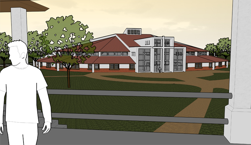 In these shots I'm having trouble finding a grass texture that shows any depth, also the trees are a bit out of place, I think. Not to mention the fact Joe white guy doesn't really look like the locals.
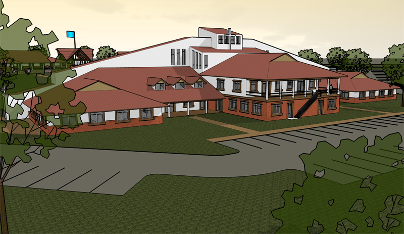
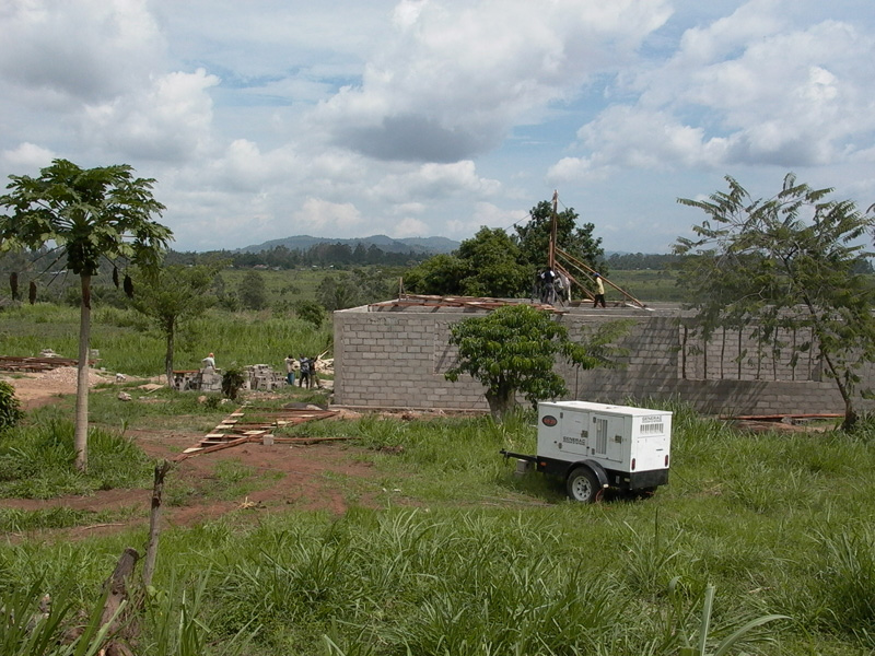
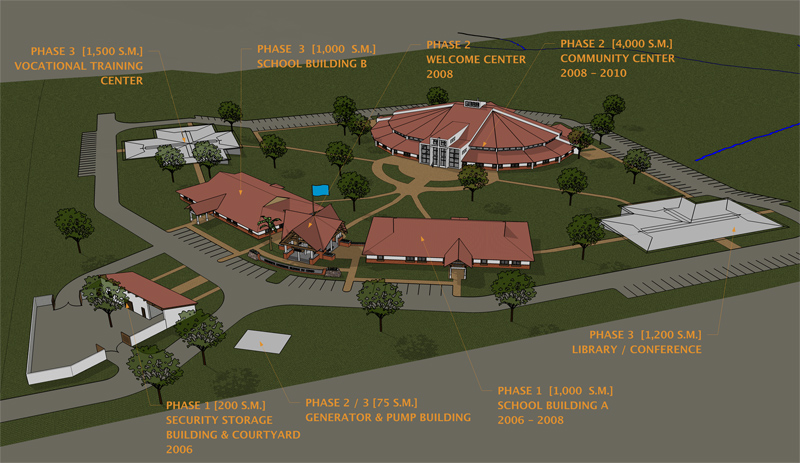 I've attached a few pics of the real site area in a follow up post.
If you want to see higher res shots they are http://archi-tourture.blogspot.com/ -
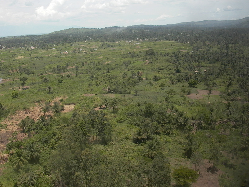
Here is the real world site
-
This might b a bit of a longshot, but its worth haivng a look on google earth to see how good the aerial photos for that area are. If its of a decent quality you should be able to import it in to SU and the place your model on top of the photo, i imagine this would add a fai bit of context.
Alternatively you could always just see if you can get any aerial photos, it doesnt look like a particularly featre full site, so you could perhaps even use an aerial photo of a similar area.
Looks like an interesting project btw, mind if i ask what its for?
-
And as for the rgass texture, id suggest just using a colour to represent the grass. Its very hard to get anything decent looking otherwise.
For the trees, i reckon theyd look a bit better if you turned down the opacity of the foliage, and perhaps paly around with the colour of the whole thing. They look quite lush and green for such an arid environment, so perhaps tone it down towards a dustier shade

And for the people. try the 3d warehouse, there might be soem more suitable people there. If that doesnt work you could again change the colour by hand, and perhaps turn down the opavity a bit as well, so they blend in to the scene a bit more.
-
The Google Earth texture is not good. VERY blurry! I'm struggling with whether to go more realistic or to give it a more hand drawn look. I'm competent in Sketchup, I think, but very less so in Photoshop etc.
The project is part of the Congo Initiative.(http://www.congoinitiative.org/) Its part of some mission work my boss does. We are doing all the drawings here in the states and he goes over there a few time a year. Its a very fun and rewarding type of project. Even if I'm probably never going to see it in person. -
If You want a more realistic look but still in SU output I suggest
using more realistic materials and components like PR PNG trees for
example. The roofing also needs some material. I also suggest some
adjustment in PS regarding brightness and contrast. The images are
too dark for my taste.
Other than that keep up the good work. -
Hi,
Here is a grass component I made out of Kwistenbiebel's grass component he created for rendering. It should be OK for closeups - maybe a bit too big for covering all the areas.
The same could be done with trees and such.
-
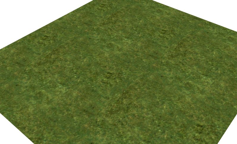
Drew, something I do alot for grass is to up the scale a bunch (attached image is the default SU grass texture scaled to 183') then adjust the color and saturation so I get a nice blend of yellows and greens: might help...?
-
Visually the building itself is very interesting but like you said the site needs some work. There are a few things you could try while rendering directly from SU but to really get an image to "come to life" Photoshop or some other editing program should be used.
A few suggestions:
1.Adjust the shadows darkness a little more to help the relationship between the building and the site read a little clearer. Currently the shadows get lost.
2.Another thing could be to render without lines but this only works really well if there is enough detail in the model. This often helps in making the model feel more realistic.
3.Add shrubs and varying species of ground cover. I'm sure some will exist on the site somewhere.Along with the other mentioned comments you should be well on your way.
Goodluck.
Hello! It looks like you're interested in this conversation, but you don't have an account yet.
Getting fed up of having to scroll through the same posts each visit? When you register for an account, you'll always come back to exactly where you were before, and choose to be notified of new replies (either via email, or push notification). You'll also be able to save bookmarks and upvote posts to show your appreciation to other community members.
With your input, this post could be even better 💗
Register LoginAdvertisement


