the cat seems a bit to much chopped in there, altough the overall picture looks great wondering what you all have done in sketchup and in photoshop.
Posts
-
RE: Smell the Coffee..
-
RE: Beach House Sunroom
looks good, which render program did u used, it looks like lumion sort of?
-
RE: A residential - commercial building
Awesome style and pictures altough the interior in the building seems to be missing, what about some interior walls to make it look more real now it looks like just a empty shell where you can look trough from 1 side to the other.
Besides that just nicely detailed
-
RE: Neighbours
great picture as usual, love the detail, although the perspective looks a bit weird the vanishing points are a bit unnatural.
-
RE: Little Thorpe
@tadema said:
Thanks everyone.
Daniel, I lost the bump on the timber through sloppy PS. The bottom two course of brick is bitumen painted, if you save the image and zoom in it's a little clearer.
thanks again
JohnAt every render you post im wondering where do you get all your textures from they look so neat.
What's your secret, is it just google streetview and PS for some parts??
-
RE: Balcony Pool – day and night
awesome looking render, like the blur, but imo the table in the front attracts to much attention
-
RE: Blenheim
just really nice and detailed, any chance of showing a wireframe to see how detailed it really is,
also do you have a lot of components you use ? otherwise its really time consuming
-
RE: Podium V2 interior
love to see your workflow explained in a tutorial for SU Podium V2 really like the materials you used and how clean it looks.
-
RE: Asian kitchen cafe
it looks nice but it is hard to see any depth in your rendering maybe change the camera angle or your point of view because all the white isnt it making it any clearer.
-
RE: :Townhome Develpment:
it looks really nice and clean but what i suggest is
- some puffy clouds will make it a bit more real / less cartoony.
- what about the glass in the windows looks a bit dull to me maybe a 10% reflection with a deeper blue / grey ish color will give it a bit more depth
besides that i really like the style you renderd this are these custom settings you are using or using photoshop afterwards? cause the trees and people + cars look really nice.
could you share you settings + your way on how to create this style.
I have Podium V2.7 registered version and also V1.7 with a license.
good luck on further development and im looking forward to your answer.
-
RE: Most impressive SketchUp modelling
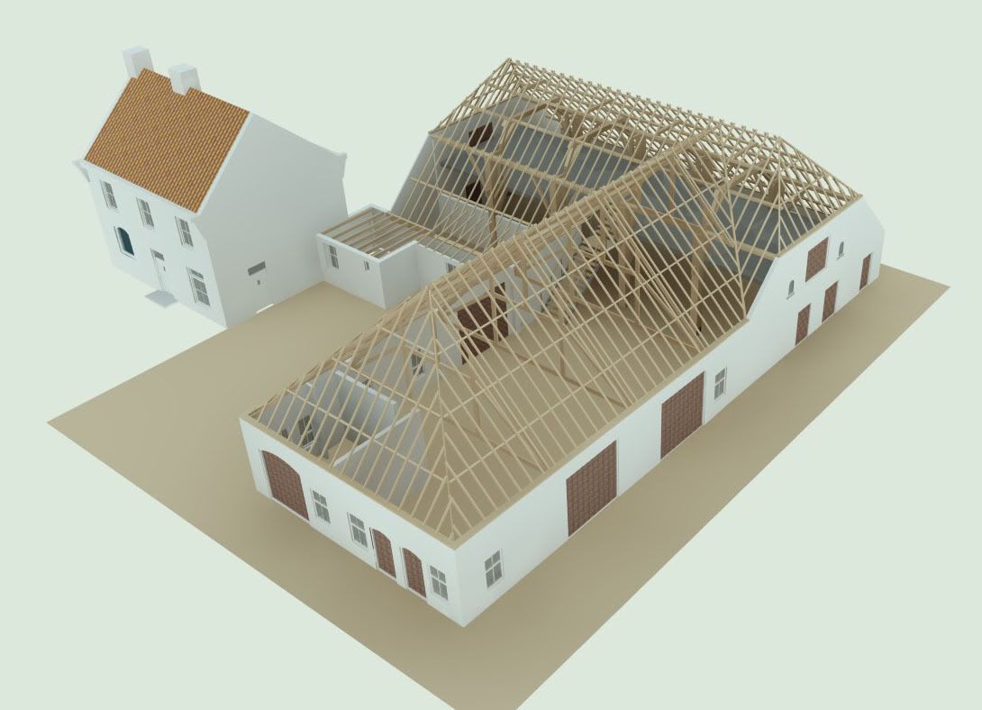
i thought why not post a picture of one of my works that i made some time ago.

-
RE: Suspended office ceilings
Try adding a good bump map to make the edges stand out more and give the texture some depth. I know its the easy way by doing that, the way i always made realistic ceillings is making 1 tile as a component and copy it arround the room and for weird shape i just dragged it after texturing into the right shape.
hope this will help you get better renderings i will give a go later on to see if i can get a good result with it.