Perspective, FOV and other interesting stuff (I hope)
-
This is a topic I've been wanted to discuss for awhile. Persectives, 2-point... 1-point... FOV. I love to see dramatic angles, but I'm not always confident that I've set it up correctly or that it will present the project properly, so I always end up going back to the "same 'ole angle" one I'm comfortable with and have received good results with, so why fix it. But, I'm bored!

Example: Currently I'm working on a project that is dug into the ground about 6ft. So far the client is not happy with what he's seeing (neither am I) and I'm stuck.
While wanted help on this project, I also just wanted to get some ideas and tips on how to create some more dramatic renderings.
I'll post what I have so far in a bit, but I though I'd get the ball rolling.
-
Tina, before there were movies and television and there was only the "artist" we were all accustomed to viewing scenes from a person's eye height. We are still taught in Art school to do perspectives from and eye height of 5'6", the height of the eyes of a 6' man.
However, our culture is now accustomed to all the weird angles we are able to see from the vantage point of a crane/boom we are much more adaptable to seeing things from different angles.
It all depends on which features you will want to reveal and focus on and what "feel" or "mood" you want to illicit.
Take in large areas from just above a tree and view the neighbourhood while still having a foreground frame of reference ( the tree top) to add depth.View a mansion from below eye level to add to it's apparent grandeur. Pretend you are making a movie and want to make a "suggestion" to the viewer by the clever use of the angle of view. I know you are up to it. You are a great talent.
-
Tina, thanks for moving this over to another thread. Susan your comment on societal influence on how we see is on the right track. A friend of mine is an accomplished plein air regional painter here in Arizona. However he gets kind of tense when he sees some of my more extreme perspectives. He gets quite involved in explaining why they are technically incorrect. I get involved explaining that they are technically correct but simply beyond the range of what the human eye sees and the human brain perceives.
The seeing part is easier to demonstrate than the perception part. For the seeing part you just set up a simple perspective with a "normal cone of vision and have a critic just extend the view using the rules already used and soon they see the distortions beginning to appear under their own hand.
The perception thing is much harder to impart. The brain samples our environment, we see the movement of that sabre-toothed tiger in the periphery of our vision and our cave person instincts cause us to shift our head or our eyes to look. We have seen two related scenes with a very narrow cone of sharp vision. The brain merges and remembers those images. It is hard for use to really concentrate on how small an area our sharp vision covers. And thankfully we don't need to think about the integration of scenes or we could never drive a car. Magically the brain jumps in and just does all the work as a background operation. Really quite amazing.
However as artists working on a 2D plane we need to be able to pull apart and manipulate our perceptions on an as needed basis. It is not easy and it is the difference between those who can draw (paint) and those that can't. We can shut off the sampling and integration to a grater degree than other people who can not just sit and stare.
-
In 1827 Delacroix was using the perspectivist Thénot to work on The Death of Sardanapalus (sp?)(Paris, Louvre). Also Millet was know to hire perspecteurs to bring technical correctness to his preliminary sketches.
I have always enjoyed the loose field sketches of Delacroix as much as I enjoy the exquisite technical mastery of his finished work. I keep hoping that some day someone will find the lost sketchbooks. But just think about how much money he could have saved if he had purchased a copy of SketchUp instead of relying on high-priced perspecteurs.
-
Roger I would be most interested in seeing an example of your work that you friend finds distrubing. I thin I would like "disturbting"
Please post? -
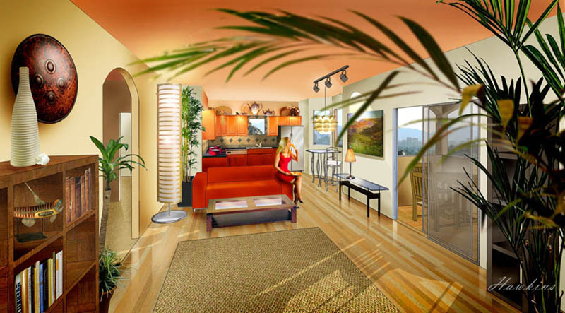
Susan, see the renderings at http://www.phoenixluxurycondos.com. Go to the renderings tab. These were my first commercial building renders. I didn't want to go that extreme on the wide angle but the client prevailed. These are perspective in SU and hand rendered in PS. I am making steady progress in KT, but have not yet mastered a smooth workflow. The client had building plans but no interior design. I just did a quick IKEA idea raid and produced an instant interior rather than a fully developed design. Still it was a valuable experience that helped bring the whole process together for me.
-
Hey this is great stuff!
Susan, thank you! That is quite a compliment coming from you!
Roger, I've been to your site and have seen that image, I love it! It's great. The way the palm frames the room. Really great.
Here are a couple of other angles I've run across..
http://en.wikipedia.org/wiki/Image;Shaklee_Terraces_San_Francisco.jpghttp://www.gilgorski.com/media/digital/memorial.html
http://www.gilgorski.com/media/digital/jackson_int.html
http://www.gilgorski.com/media/Magazine_and_Book_Covers/tribune.html
and there are tons more, but just a few I saw today.I always have trouble, with a SP that is so high. I don't like see so much roof, which is the problem I'm having with this project (WIP)
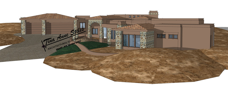
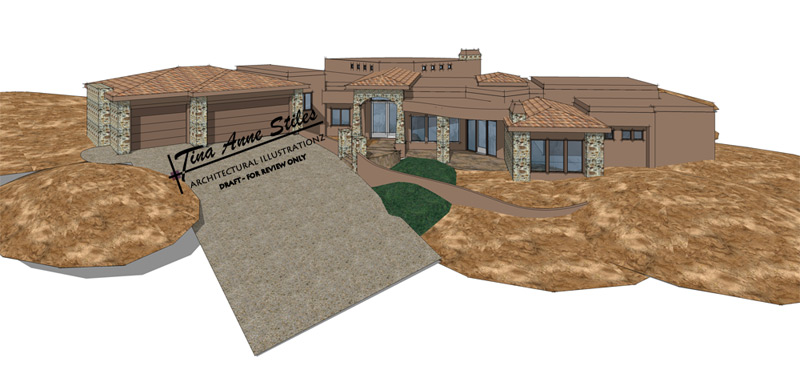
The client wants me to come up even higher. If I don't come up with something else, he's going to make me do it.
-
Roger, that image conveys a sense of depth far more convincingly and successfuly than most images I have seen. I like it very well.
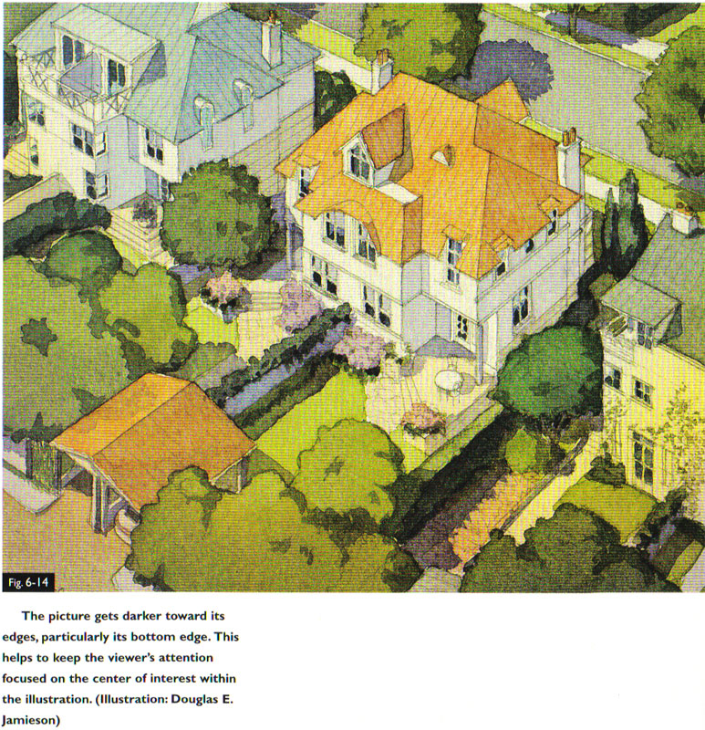
Tina, when you said you needed a top down view, I immediately thought of this image which is in my "Color Drawing" book, ( the last printing. I don't know if it is in the newest version) There is a lot of roof showing in these but he seems to accomplish it very successfuly. I'm afraid the quailty of the scan is horrible so don't judge by the texture and coloured ridges you see. They are not really there. The paint transitions smoothly and as Doyle notes in the book there is a subtle gradiation from one corner to the other.
I also have a fabulous mansion done by Elizabeth Day from a top down view but I can't access that computer at the moment.
I've got one of my own from a long time ago, not a very romantic subject and don't look too carefully at the composition, I was forced to do a lot of things I didn't want to do, but this is what I mean about peeking down over a foreground tree.
Actually Tina I think that yours doesn't work because you haven't really commited to the view from an angle above. It is precisely becuase that angle is neither here nor there, that it isn't very exciting yet.
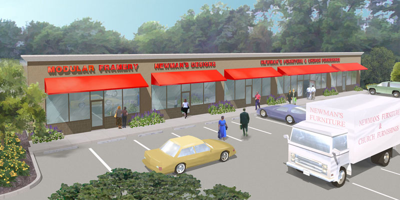
-
Susan, the irony is that the painting on the wall is one of my friend's oil paintings. The girl in red is my daughter. The area above the kitchen cabinets is from my daughters house. The furniture and decoration that did not come from the 3D ware house came straight from IKEA. IKEA knows when I am doing a low budget project because I skulk through the store with my digital camera. The shield on the wall is from a Sikh warrior. My client was a Sikh, but I don't think he noticed. I think he is more an MBA than a warrior Sikh. Very nice guy to work with. I have distances and angles to objects roughly worked out when I go on my photo safaris so I am in the ball park for adding things to the render. If I am not spot on, I can do a little warping in PS. That foreground palm was also IKEA.
I am also looking to actually do some interior design for higher end clients, but I do not have that level of relationship building going just yet.
Oh, and to fill out the list of supporting cast, on the Phoenix Condo site in the bird eye interior the dog sleeping on the carpet is my terrier Cacique.
-
Tina, your comment on the foreground palm reminds me of an architectural photo job I did in Mexico many years ago. I always carry a palm branch in the back of the car so I can blot out empty ceilings, create depth on exteriors or just hide thing that can't be moved.
I did the job and get back to the border at the U.S. entry inspection station. It is hot and I can see the immigration folks hassling people. I finally get to the head of the line and the guys sticks his head in the window and says, "do you have anything to declare or any agricultural products." I answer, "nope." He looks in the back seat and sees the palm and says, "you can't bring that in." (smile - evil idea) I answer, "yes I can." Well it is no you can't, yes I can until he has a nice shade of red to go with his green uniform. He reaches in the window and grabs the fake PLASTIC palm leaf, gives me a surprised look and says, get out of here."
I think I was lucky they did not decide to disassemble the car for revenge. Today, I would probably end up in Guantanamo.
-
An interesting thing about perspective is that what the average person perceives as "right" may be quite different than what might be technically correct. When we create any perspective (or photograph) we are trying to communicate something to the viewer. Typically we want them to have some sort of virtual connection to the subject of our image. That virtual connection is strongest when the image does not trigger any "something is wrong" response in the viewer. Perspective drawings and wide-angle photography frequently do trigger some degree of that response.
I attach example images I had posted on the old SU forums. They both show Notre Dame. One is your typical tourist snapshot and the other has had digital 'perspective correction'. What I'd suggest is that most viewers would think the 'corrected' version looks "better". I think this example tells us something important for our work. Our work probably shouldn't be about getting things technically accurate as much as it should be about having them experienced as successfully as possible.


Regards, Ross
-
In some cultures / architectural periods it was even a desired goal to achive a perspective effect, see just a Greek ("Doric" column with its enthasis:

Though I'm not an architect aor any kind of artists, I do really enjoy these discussions and have to admit that learn a lot from them. Maybe this column is just my (professions) two cents here...

-
I think it depends on what you are trying to convey. I think architectural correction is a learned social convention like a fedora hat or nylons. It can be the accepted norm one decade and rejected the next. I prefer to look at the goal of the rendering and let that dictate the direction. I indulge in perspective correction when an air of formality is required and go toward extreme perspective for an air of dynamism and intimacy.
-
Roger - I agree with what you are saying. The FOV, horizon position, vanishing points, etc. are all tools in our hands that we can apply when we consider what we want to communicate. Once you have a basic understanding of the differences these factors make you are then free to use them to achieve specific intention. I think part of the value of this thread is it can serve to highlight the impact certain choices have.
-
Perception is so dependent on context and social norms. People brought up in jungles under very primitive conditions literally cannot read perspective in a photo until they are acculurated to right angle architecture and open space with a horizon.
Most of us do not pay much attention to the tops of tall buildings because we spend 99% of our time dodging traffic and reading peoples faces. I think this has a lot to do with our discomfort with strong 3 point perspective.
We are a people forced to keep our eye on the road and our nose to the grind stone.
I think I am pretty sophisticated about perspective, but something that happened to me made me rethink the power of the mind on perception. I wanted to give my wife a little well deserved vacation so I arranged to go to a Bed and Breakfast, an incredibly scenic vacation spot in Arizona. It was a Friday and she had to finish work so we we didn't get there till well after dark. We checked in an then asked the owner for directions to a good restaurant. We drove to our room in the dark to wash up. I didn't bother turning the headlights on. When we left I stepped out of the romm to enjoy the view. You could see tall pines framing a distant mountain maybe three miles away. The mountain was steep sided almost like Half Dome in Yosemite. On top was a fantastic mansion, a large circular mansion with lights blazing all around the perimiter. Just a wonderful composition in the night sky. Again I drove off without lights until I got to the main highway. At dinner we assked the waitress about the mansion on the dome shaped mountain. She did not recognize our description but we kept raving about the building and wondering how anyone could drive to the top. She said she had heard the Elvis had purchase a large hilltop mansion that he finished but never visited very often.
We drove back, to the B&B and it was late so I tuned my lights off as we entered the drive so as not to disturb other guests.
In the morning I crawled out of bed and went outside. When my wife came out I was pointing to a dome shaped building about 50 yards from our room. The "mansion" was some sort of circulation vent about two feet in diameter that also allowed light from the widowless building to escape to the outside.
What can I say, we bought the illusion 100 percent with no doubts other than we figured they must use an elevator to get to the top of the mountain. We had no doubts. It was a reality. In the day it was a bad example of some church camp architecture we could have thrown rocks to.
Seeing is believing even if it is not true. We laughed a lot and still ask each other. "Do you remember Elvis' place." Elvis ahd left the building. The mind controls our sight and our experience.


-
This is really great information. I know I started the thread, but I don't have anything of worth to say! I just know I needed more information and I'm gleening from all your wisdom

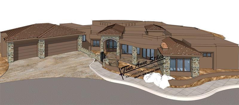
Susan, here is another stab at "committing" to a higher angle

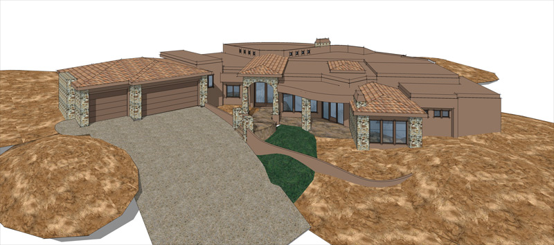
-
Great story, Roger. I'm very curious about where you were in AZ, I lived there for years and am pretty familiar.
I find this topic fascinating. A favorite book of mine is called 'Topophilia, A Study of Environmental Perceptions, Attitudes and Values' by Yi-Fu Tuan. It examines the cultural and social differences in the ways we interpret our surroundings. It's a great read on this subject.
One story he relates is about a visit to an indigenous people living in a dense forest. None of them had strayed far from their village for generations, nor had any of them left the forest. The author then takes one of them to the edge of the forest to a vast plain where they could see for miles. The man asks the author about a figure he sees on the horizon, to which the author replies it is an elephant. The man breaks into hilarious laughter and tells the author not to be so silly and that everyone knows that elephants are enormous animals, not small like insects. (recalled from memory so please excuse any inaccuracies, it's been a while but you get the idea)
-
Tina, that is looking interesting. Do you have permission to get closer in? Can you cut some of the property, just some, so that you can get a closer overhead view? I think that is what worked so well in the Jamieson painting I posted: from above but close in.
Definitely will need something in the foreground for depth. I wonder what it would look like if you employed 2 point perspective?
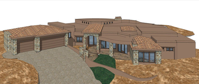
-
Susan, the drawing is set up as 2-pt. I did finally get some feedback from the client yesterday. The client wants the entire house in view, so not sure how to get closer in or at least have the "appearance of".
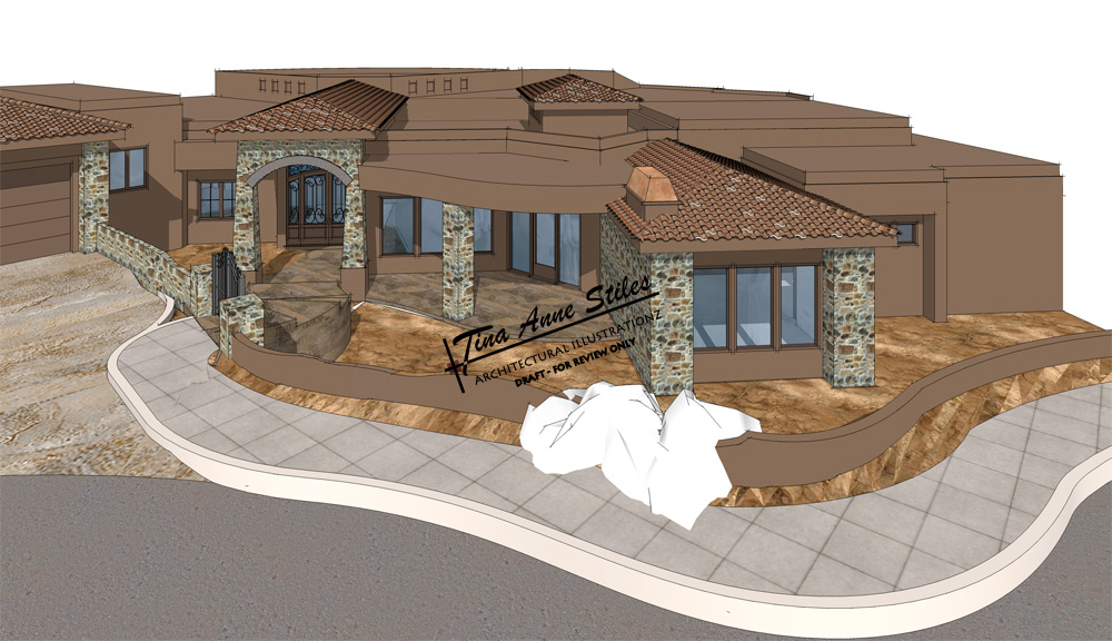
-
Tina I think the first one of the 2 is the more interesting. Or maybe not. I think I see a little distortion. What is the white stuff?
Hello! It looks like you're interested in this conversation, but you don't have an account yet.
Getting fed up of having to scroll through the same posts each visit? When you register for an account, you'll always come back to exactly where you were before, and choose to be notified of new replies (either via email, or push notification). You'll also be able to save bookmarks and upvote posts to show your appreciation to other community members.
With your input, this post could be even better 💗
Register LoginAdvertisement


