Slide Loft NYC [Photomatch]
-
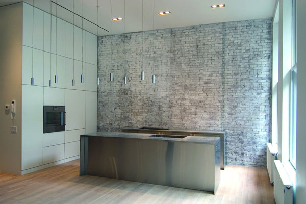
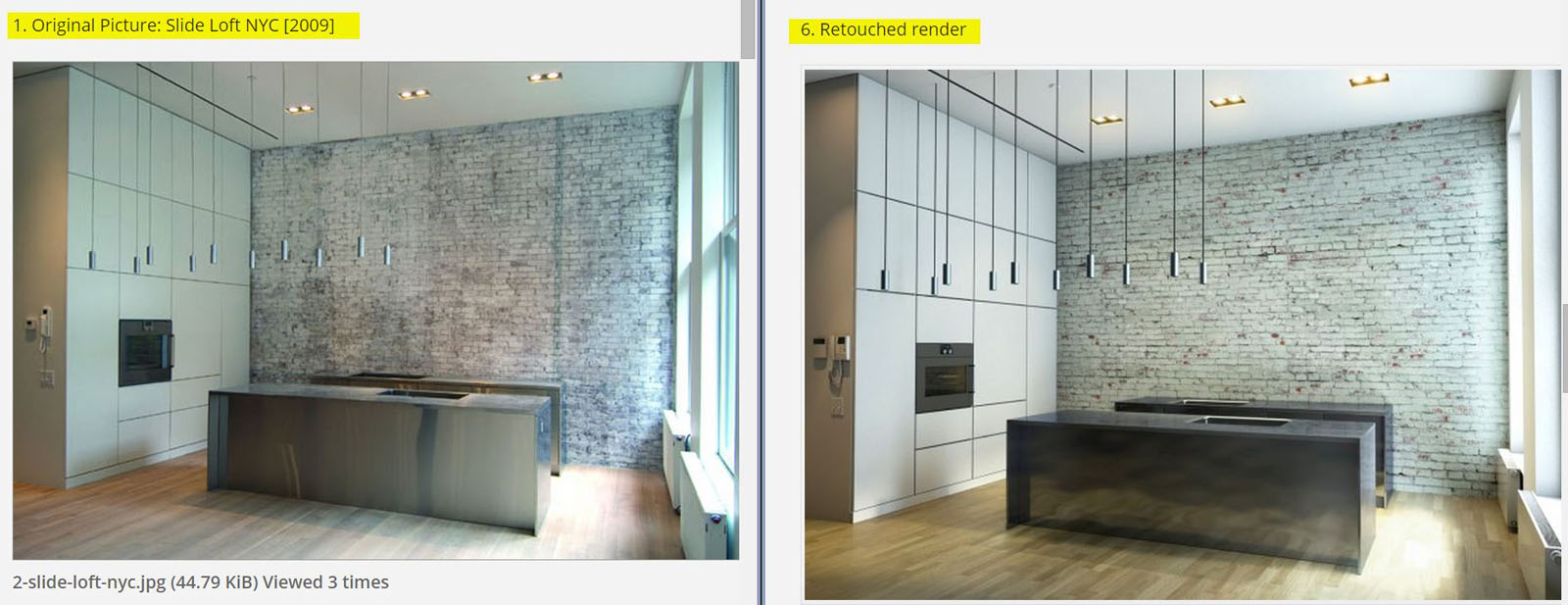
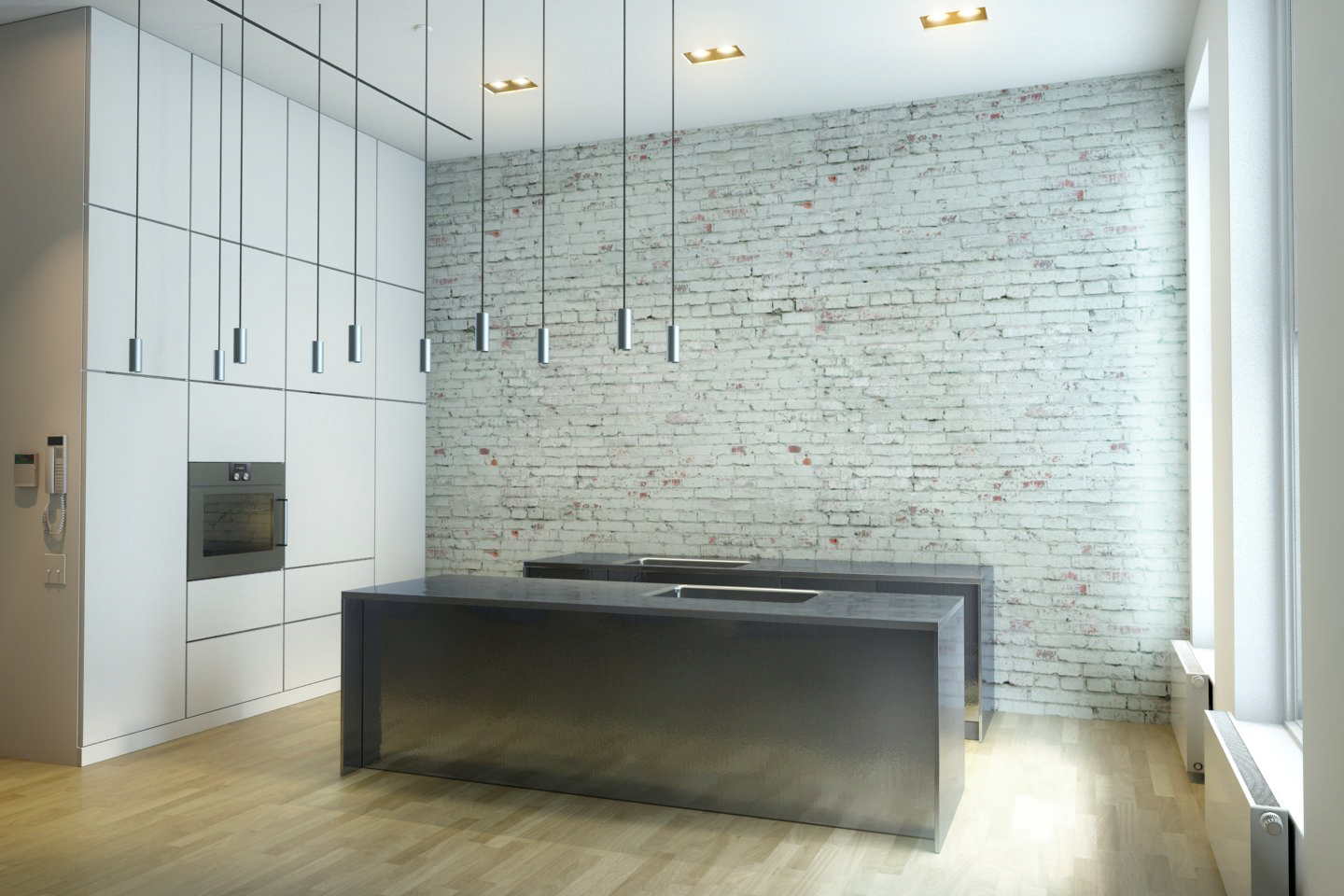
While looking for some kitchen design inspirations, this idea caught my eye, and decided to make an immitation of life from a bad resolution picture.
The original concept belongs to Ben Hansen Architect and it's a residential development project for a loft house in New York City, the year 2009.
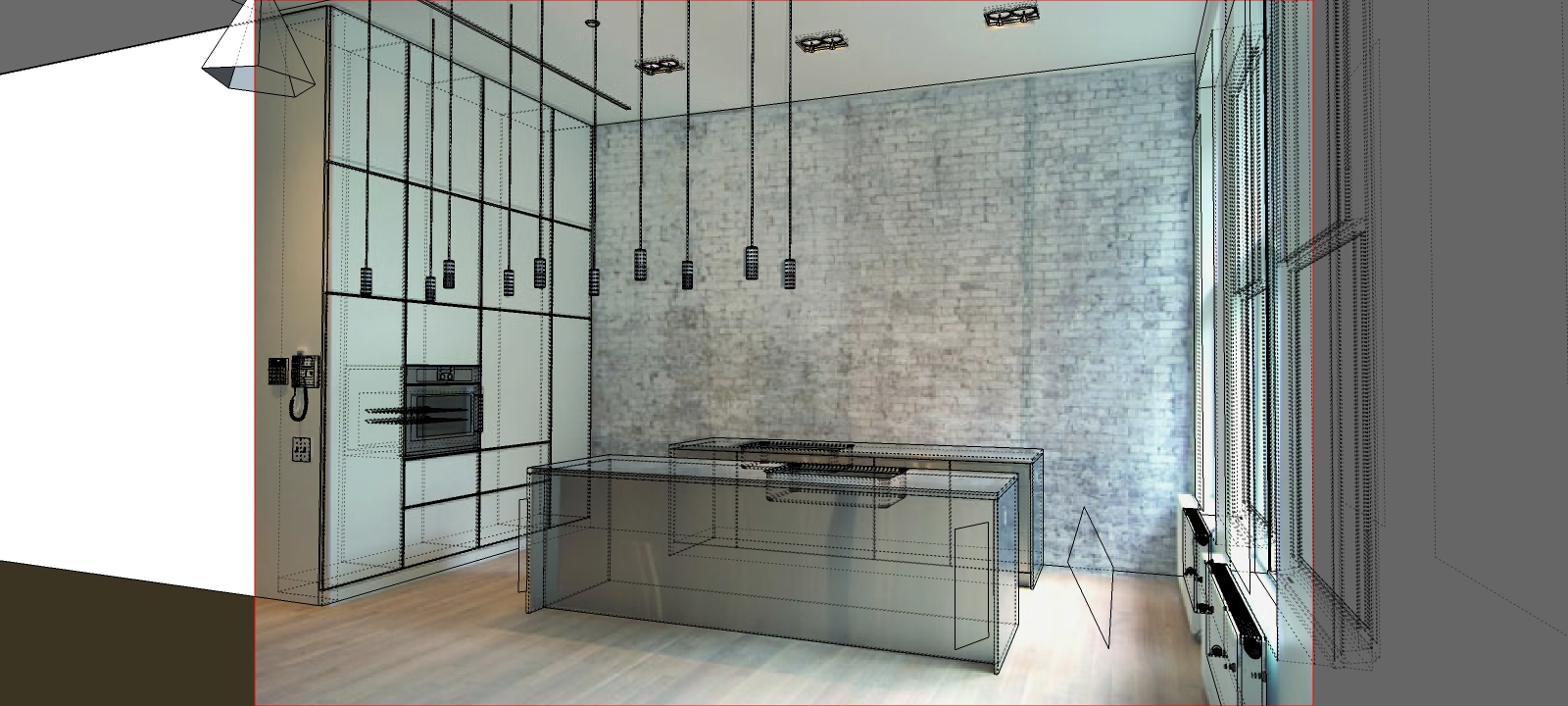
So, it all started from a picture. All modelling is from scratch, except for the radiators, windows, wall phone and alarm system, oven (which I modified to look like in real life).
- Original Picture: Slide Loft NYC [2009]
- SketchUP photomatch, with all details and wireframe
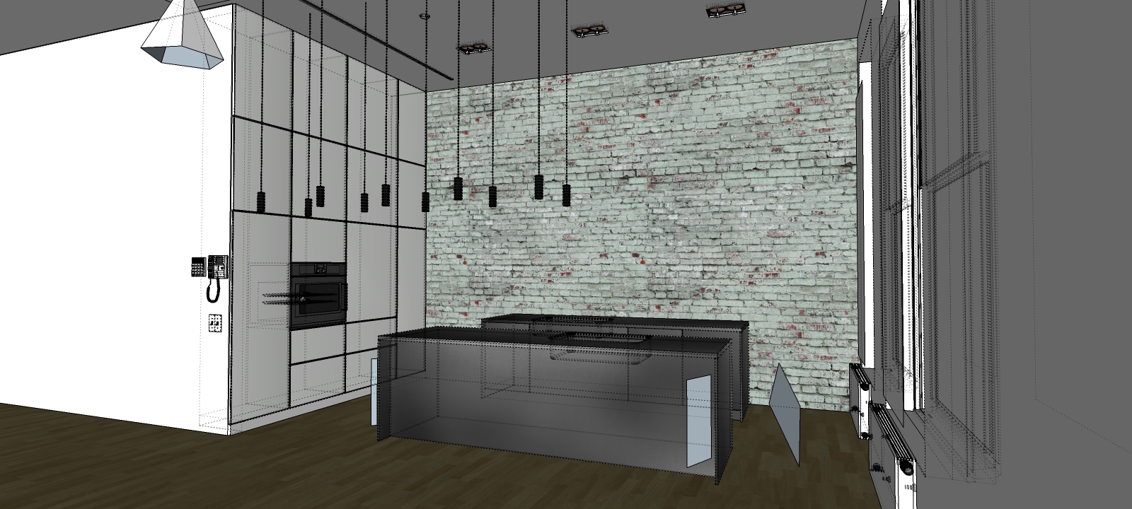
- SketchUP texturing and detailing
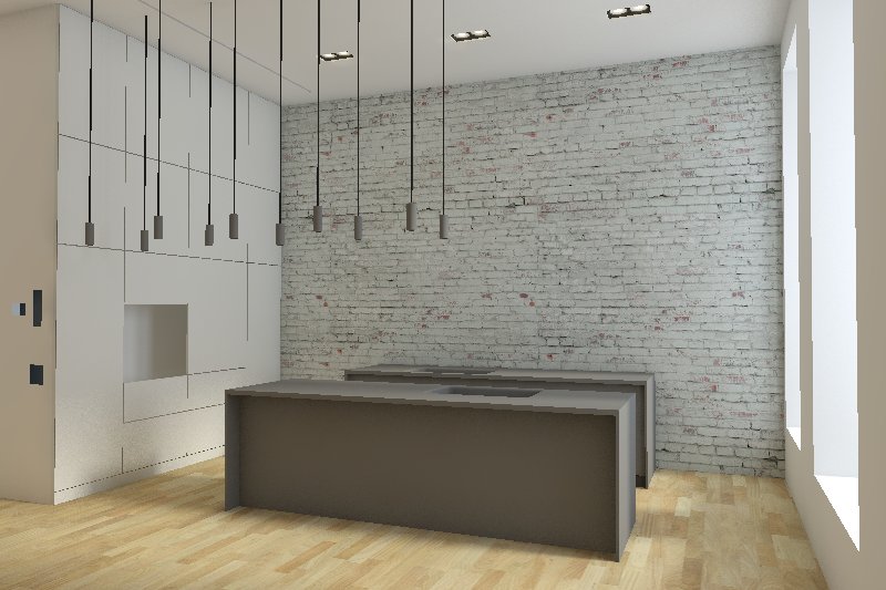
- First test image
- Raw render
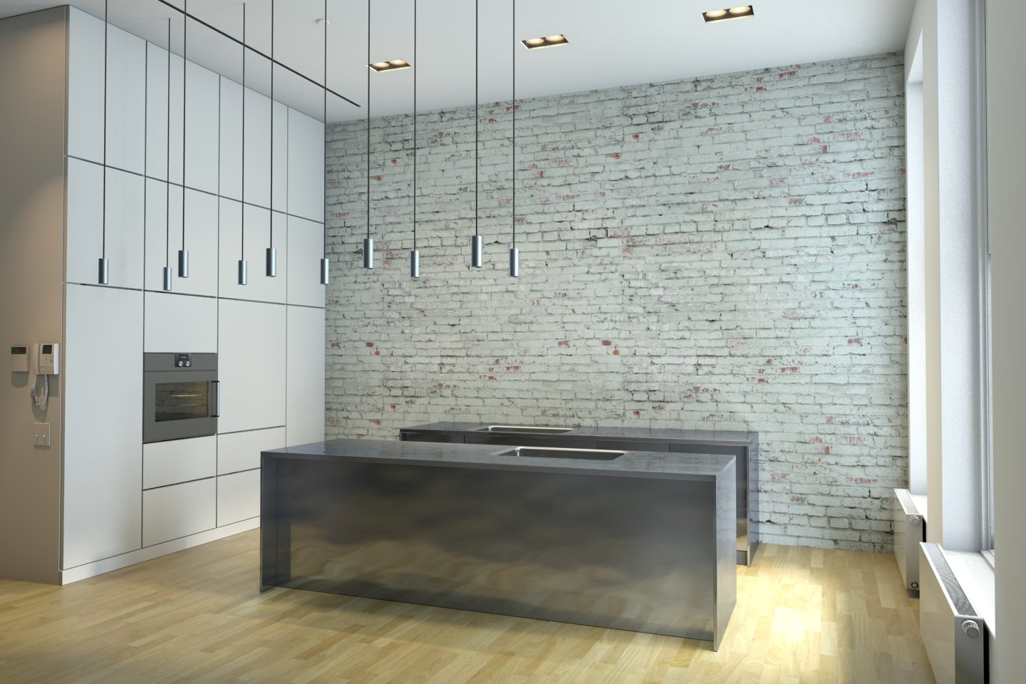
- Retouched render
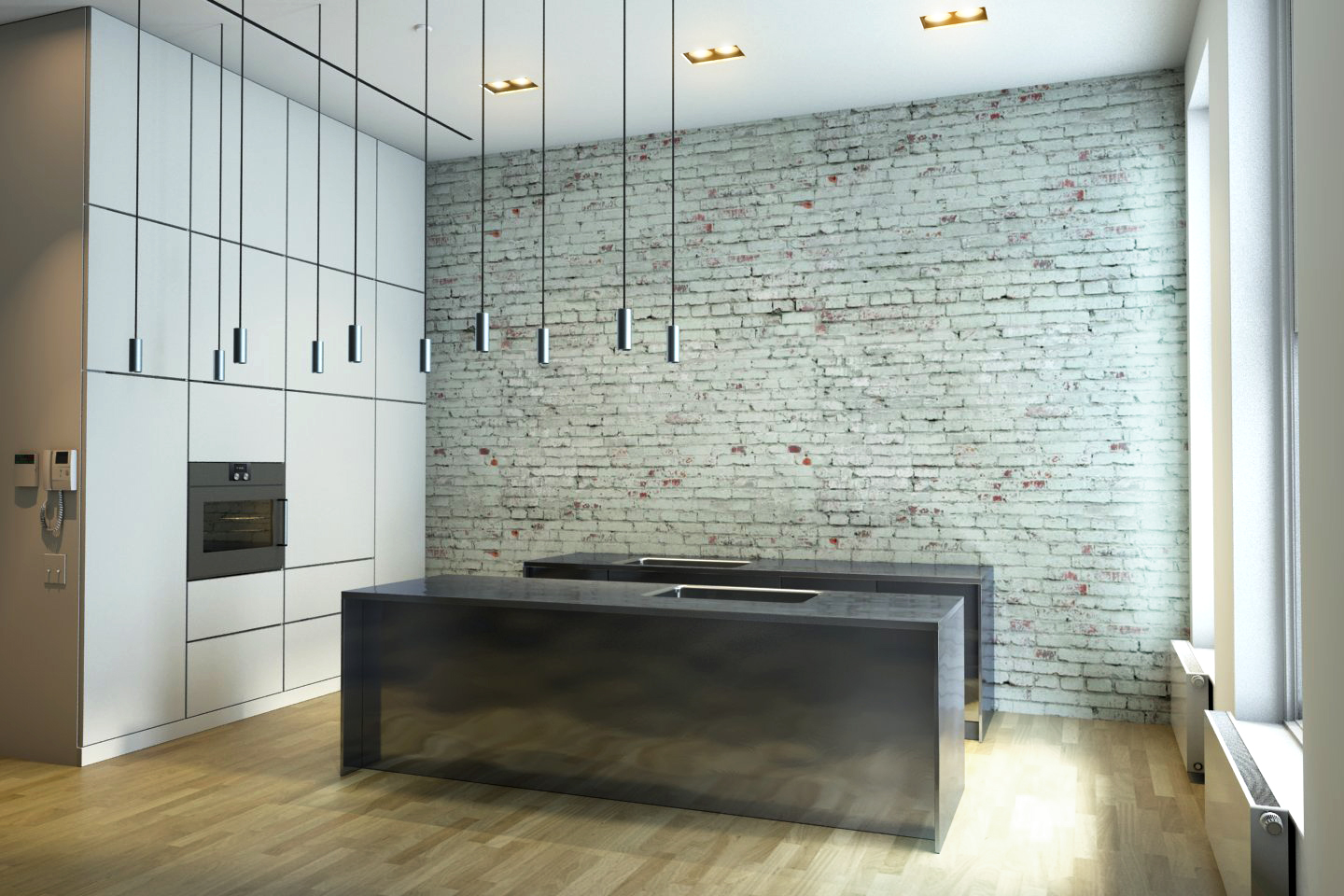
Hope you guys like it. It's my first ground-up photomatch projects ever. Of course, I couldn't find the exact textures for the brick wall and wood floor, also for the wall phone and alarm system 3D models. Had to work a lot more on that metal panel reflections, but they don't show up as in picture. One is real life execution of materials, something else in a virtual project. Rendered with VRay 2.0.
30mins - understanding space, lights and proportions
10mins - setting up photomatch scene
1h30m - modelling and texturing
30mins - testing lights and materials
1h - renderingT = ~4hrs total time, with post-processing.
-
Hi
your is approach is clever and your original image is well suited for such a task.What exactly is the intention of your work?
I compare the two pictures and I see almost no difference, which at least is an evidence
that you have worked very precisely within Photomatch
Anyway, well done!
-
@hornoxx said:
Hi
your is approach is clever and your original image is well suited for such a task.What exactly is the intention of your work?
I compare the two pictures and I see almost no difference, which at least is an evidence
that you have worked very precisely within Photomatch
Anyway, well done!
Hi!
Well, the intention is just personal training. I just thought that in order to achieve realism in rendering, one step is to immitate real images. Also, the purpose is not only to achieve realistic imagery, but to a well understanding of space, distribution of space and lighting.
Thanks for your quick appreciation! Respect!

-
Nice! And thank you for sharing the intermediate steps...
-
good work!
-
Very nice demo of use of Photo Match, of course taking it further with new textures in the render. Looks like that metal front is a challenge to get quite the same reflection, but the quality and color is quite similar, not to mention the great realism. (Now you can remodel the finishes for the new home owner who hates brick!)
-
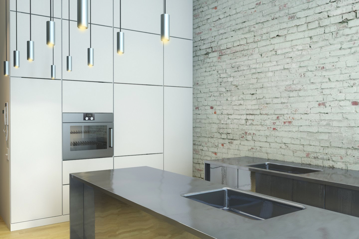
Here's another render with the corrected metal texture, almost. The close-up image shows it better I guess. Tried to make it with not only bump map, but visible face subdivision and rotating the resulted vertical lines at various angles, irregularily.
Hello! It looks like you're interested in this conversation, but you don't have an account yet.
Getting fed up of having to scroll through the same posts each visit? When you register for an account, you'll always come back to exactly where you were before, and choose to be notified of new replies (either via email, or push notification). You'll also be able to save bookmarks and upvote posts to show your appreciation to other community members.
With your input, this post could be even better 💗
Register LoginAdvertisement


