Fun with Twilight render
-
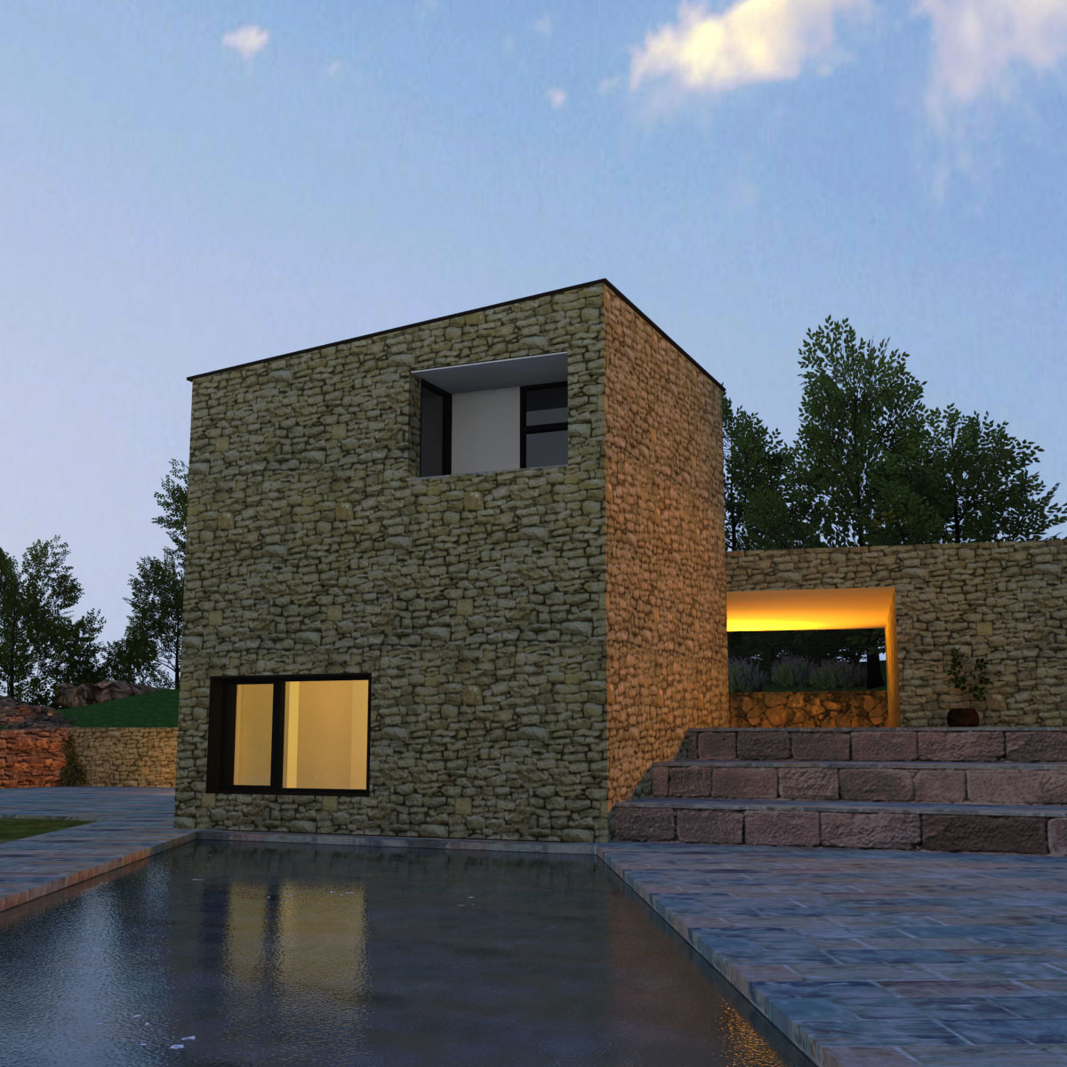
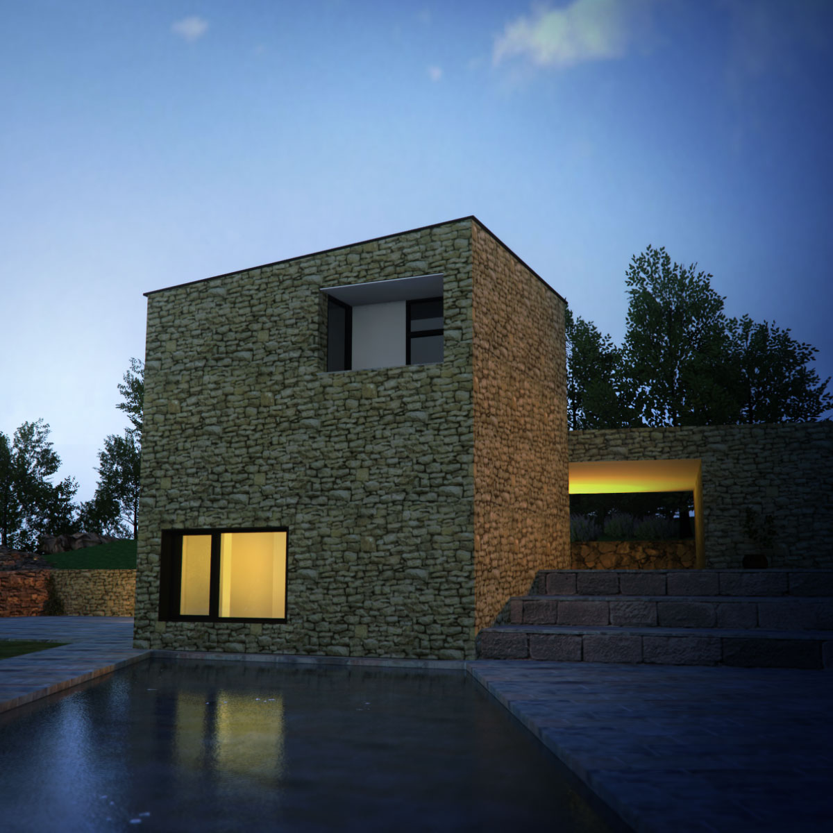
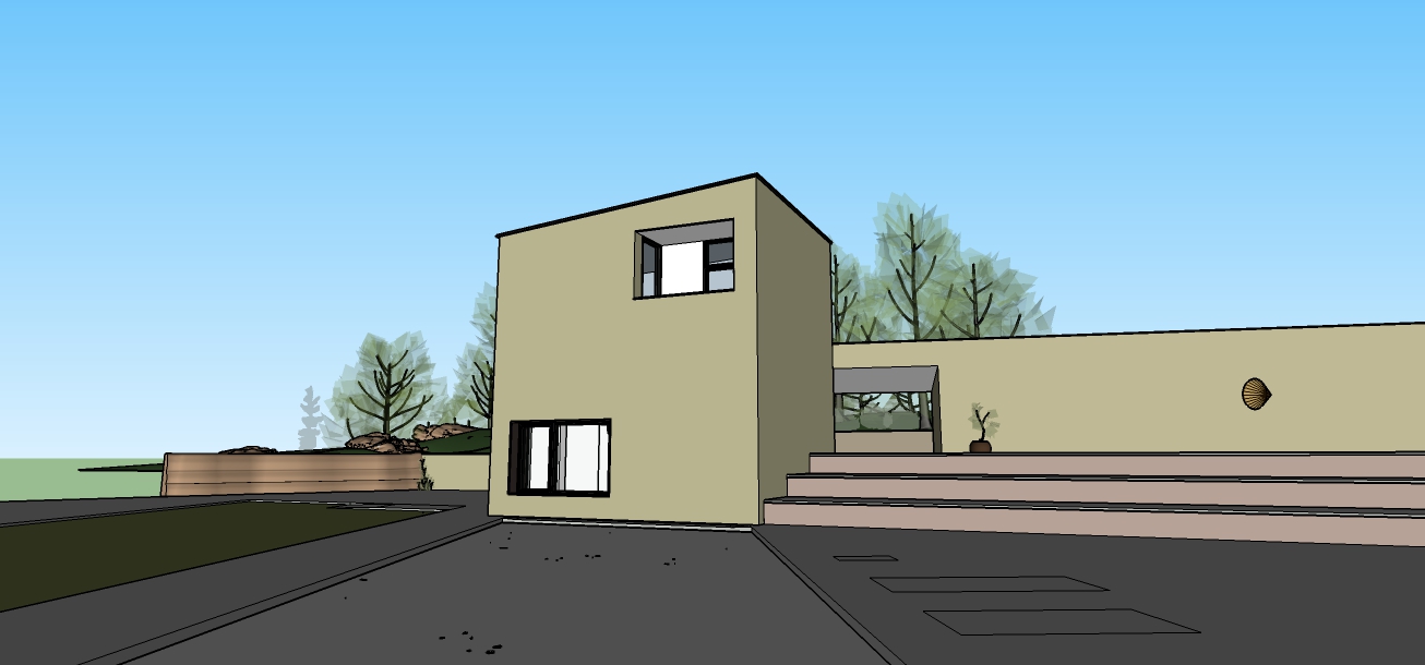
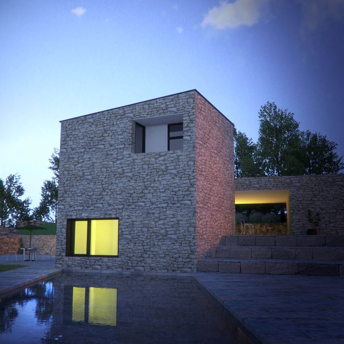
I modeled this based on a real project saw on Archdaily, a while back. Some textures are different and also the modeling is just by guessing with eye and is not precise.
-
Hello Majid, IMHO there's something wrong with the pool water, it looks iced over, maybe increase the bump/displacement?
John
-
Very nice! Great textures.
Yes, the water looks like it has a very thin sheet of ice. Didn't notice it at first.
-
Thanks for comments
The bump map I used is a procedural perlin noise and seems that it is still too much, while I have redused it by .02 percent. Will re-render it tomorrow -
Really nice renders.
For me, the rows of large stone blocks to the right look awkward. Too large to be steps, maybe if they were some sort of terraced vegetation?
-
Seems that there are some steps away from these three stone levels, in the original project. Here is the link to the original project on the archdaily:
http://www.archdaily.com/559181/histria-aromatica-homestead-vma/ -
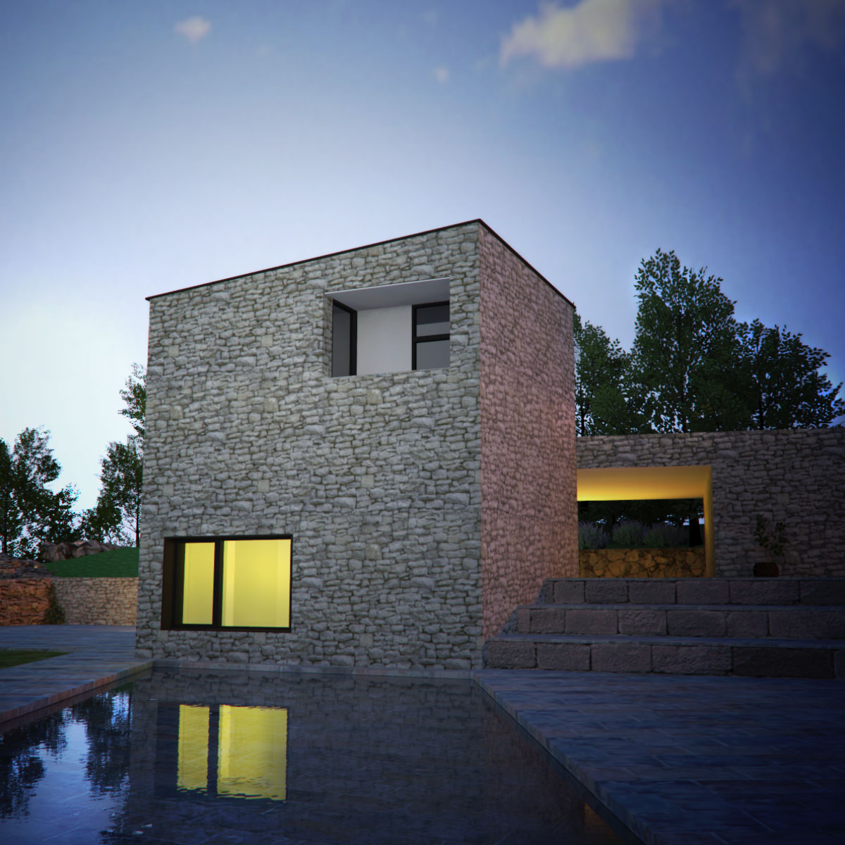
Here is another updated version with a larger but less bumpy texture water.
-
I have problems with the wall texture, it is too rustic , has anyone a nicer texture, maybe near to the original project?
-
maybe that one fits better:
http://www.cgtextures.com/texview.php?id=2611%26amp;PHPSESSID=t21tc52hppg62jteooiq2il6s5
-
Thanks mate!
Will give it a try soon. -
Hi Majid,
Actually I rather like the rustic texture. I think it makes an interesting contrast to the rather stark geometry of the structure.
Great looking image.
Jim
-
The water now looks perfect!
-
Hello Majid, the water looks much better
 , but there is still a couple of things IMHO that need a little tweaking.
Richard would shout Verticals
 the Villa appears to be falling backwards!
Secondly there is nothing to give the viewer a sense of scale/perspective. The viewers eye is drawn to the blocks on the right of the image, which in turn makes the house appear small. The texture sizes are conflicting.Hope this doesn't come across as harsh criticism, it's not meant that way.
John
-
Thanks Tadema for comments. As mentioned this is based on a real project, you may find it here:
http://www.archdaily.com/559181/histria-aromatica-homestead-vma/
Will give it a try after my vacation. -
Very nice, Majid. To convey scale, you could add an outside chair, maybe placed close or on top one of the stone terraces on the right, to illustrate they are not steps.
-
Daniel , Just added some chairs , etc... and here is the result
Hello! It looks like you're interested in this conversation, but you don't have an account yet.
Getting fed up of having to scroll through the same posts each visit? When you register for an account, you'll always come back to exactly where you were before, and choose to be notified of new replies (either via email, or push notification). You'll also be able to save bookmarks and upvote posts to show your appreciation to other community members.
With your input, this post could be even better 💗
Register LoginAdvertisement


