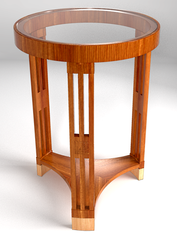
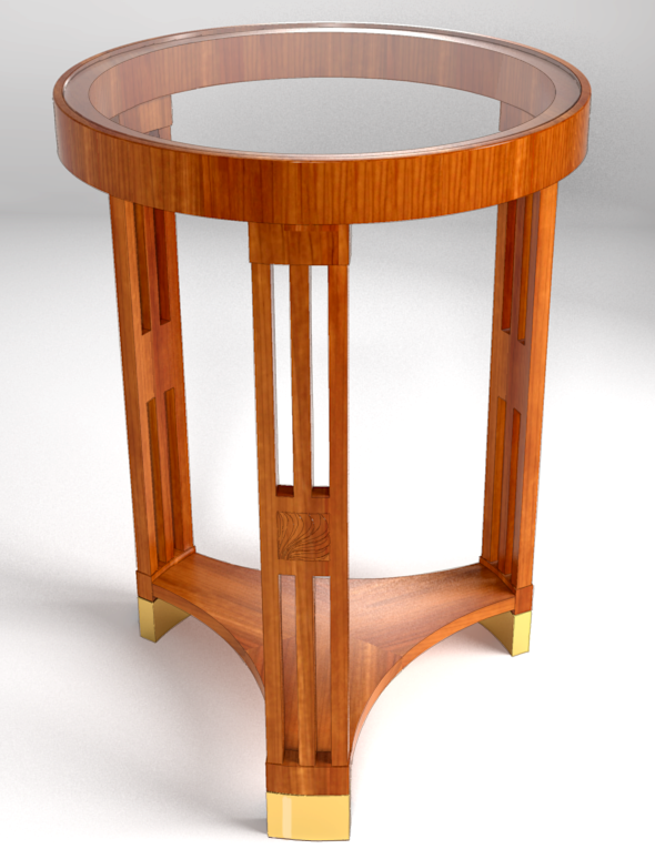
Round Mahogany Table, Hungary, 1910 WIP
-
Just a little play this morning. I need to make a change to the shelf veneer and put a highlight on the tiny bevel on the edge of the glass top.

-
Dave —
Great modelling and texturing as always, and of a very cool design. What do you use for rendering?
-
Thanks, Doug. For rendering I just use Kerkythea.
-
Impressive texturing

-
Sweet. Great job and design. Early Art Deco?
-
You sure that's a render? all the lighting details are so realistic. fantastic grain work too.
-
Thank you, all. Peter, I don't know what style it really fits into. I suppose early Art Deco is as good as any.
Kris, I'm flattered. The textures are actually some hand-drawn cherry textures I had. I edited one to make it darker and the other to make it lighter. I used a lot of lights this time. There are four for this render. I'm wondering if I can get that bevel on the glass to show better If I add a strategically placed strip light.
-
Brass feet instead. Maybe they are more appropriate.

-
I'm going to vote wood feet... But something about that second render made the wood inlay pop. Didn't even notice it in the first render, then bang look at me in the second. It's nice little detail.
-
I think I agree about the feet, Kris. If I were going to build this table, I would be inclined to make the feet out of the same wood as the rest of the table, though.
Do you mean the carved thing on the leg? Is that what popped out for you?
-
Yeah the carved piece, I took it to be an inlay, but I didn't maximize it.
-
No worries. It doesn't show very well even if you look at the full size image.
-
That looks damn real to me Dave
 I'd go with the brass feet, think with are more Art Deco'y'
-
Love it. Brass feet for me.
-
thank you Barry and Mike.
Mike, I tend to agree with you.
-
Nice.
Third vote for brass feet.
Hello! It looks like you're interested in this conversation, but you don't have an account yet.
Getting fed up of having to scroll through the same posts each visit? When you register for an account, you'll always come back to exactly where you were before, and choose to be notified of new replies (either via email, or push notification). You'll also be able to save bookmarks and upvote posts to show your appreciation to other community members.
With your input, this post could be even better 💗
Register LoginAdvertisement


