I'm On A Roll!!
-
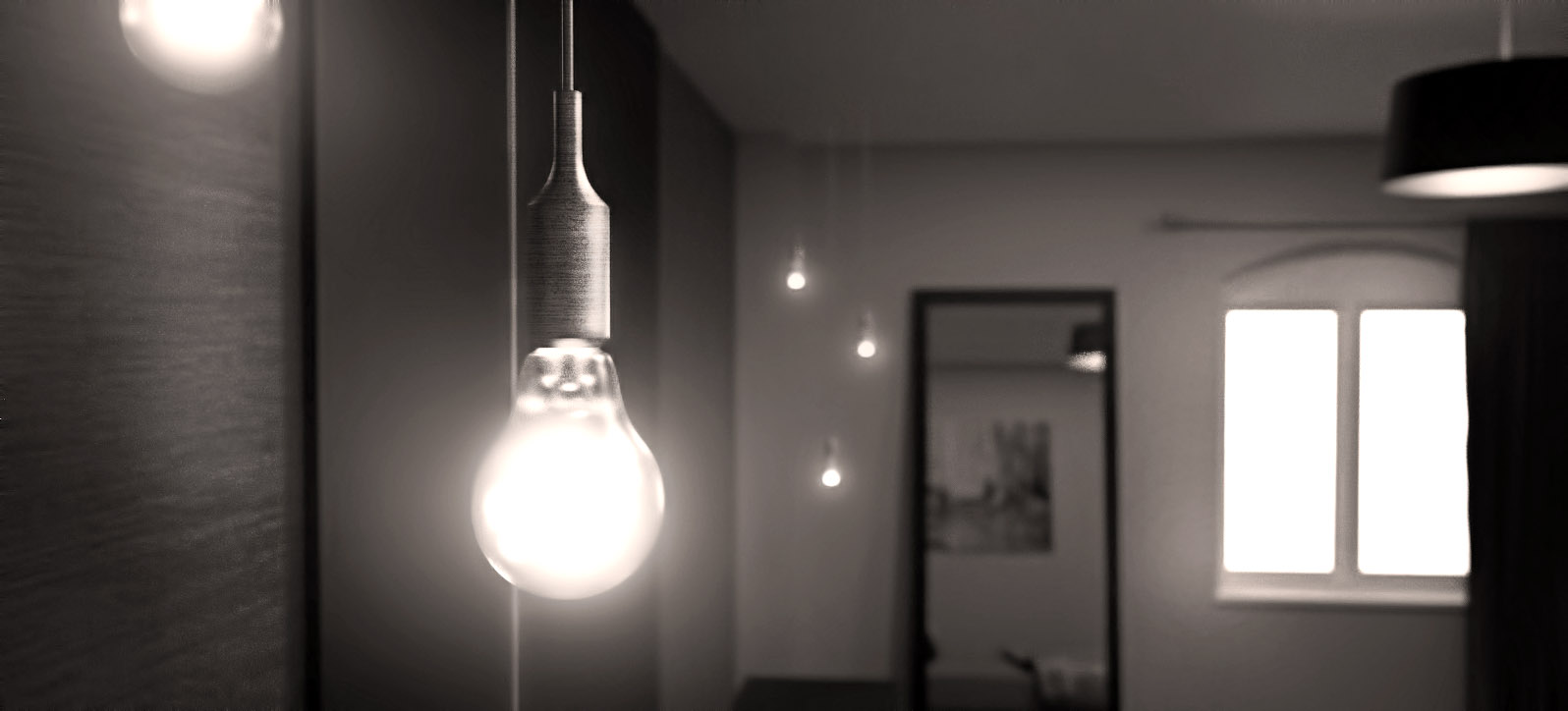
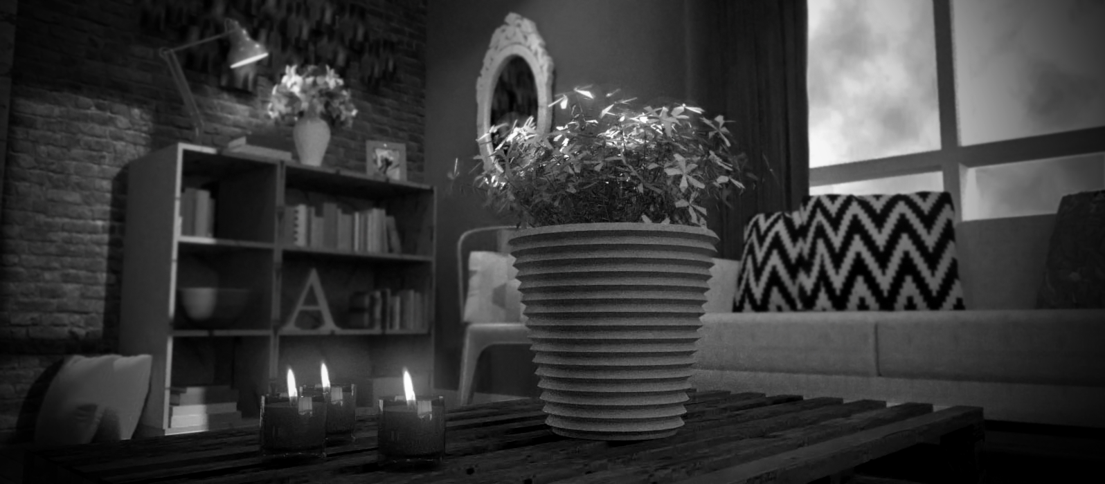
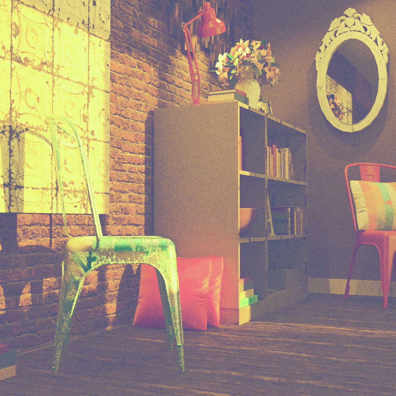
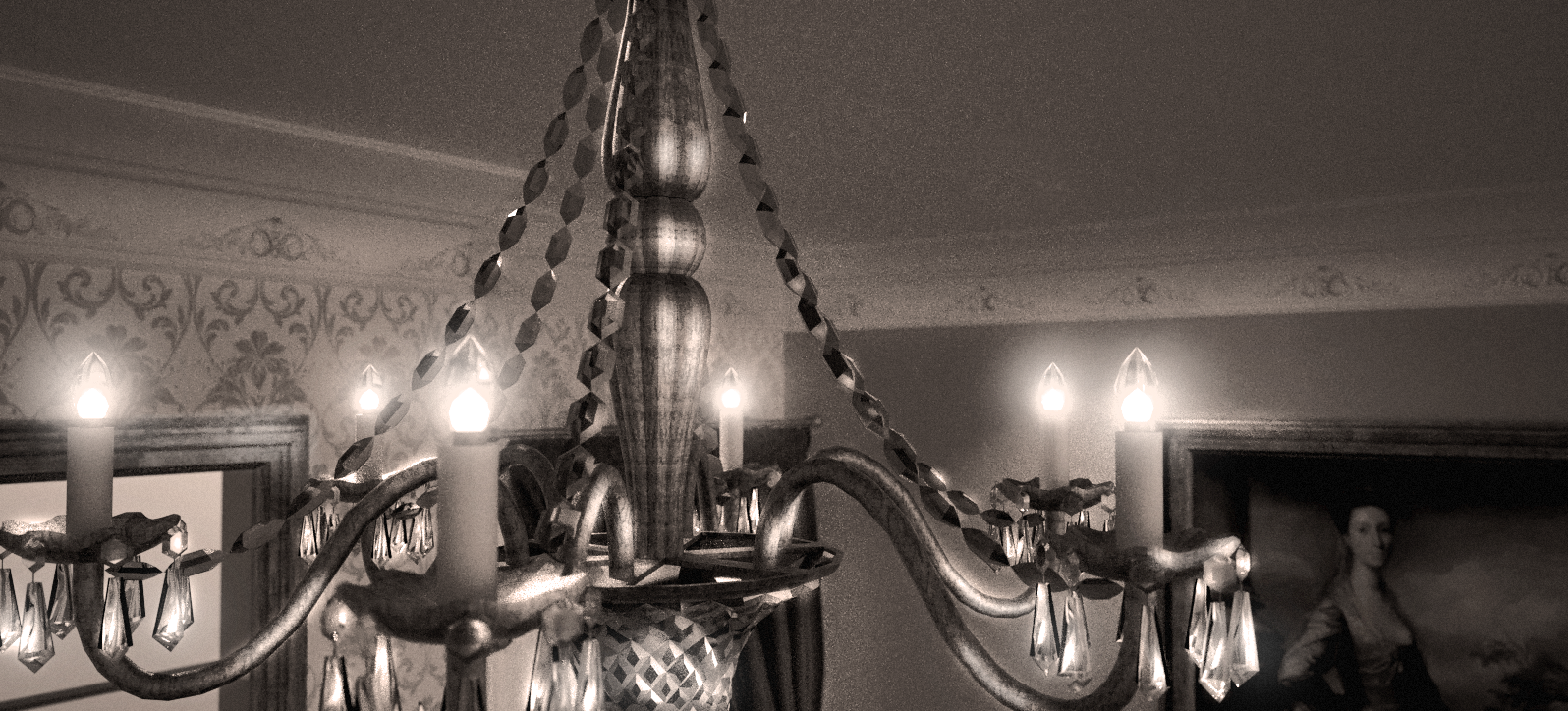
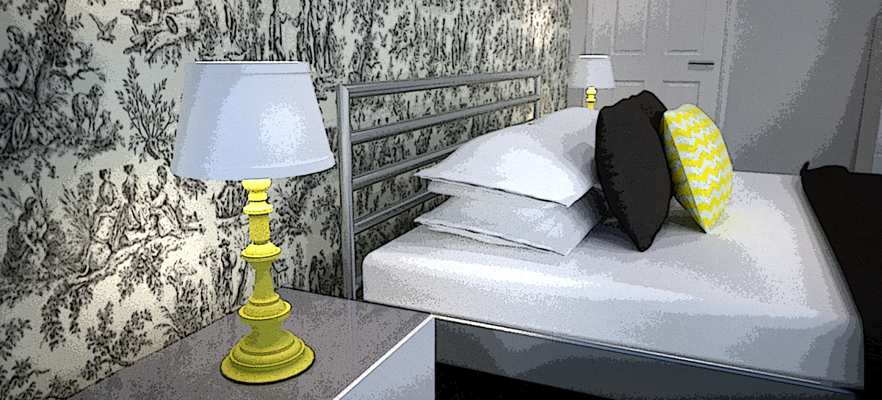
Ok, this my full collection of more 'arty' representations of 3D visuals using SketchUp, Maxwell Render and Photoshop. Come on Sketchucation, put at least one of these bad boys on your main gallery!!!!
Anita
-
Looking good. that 3rd one looks like a photo on instagram.
-
Thank you
 The third one was supposed to represent a vintage/retro quality but now that you mention it; it does indeed resemble the Instagram look!
 -
Yeah! Neet! Wow I really Like the first and 4rd one! Awesome.
-
Thanks! I'm thrilled that you like 'em!

-
Wow, what a talent!! Very nice work, Neets!
-

-
Thanks guys!
-
Hi Presumption! Nice renders tho. Try to soften the edges on your geometry in some places. For ex. that yellow frame mirror seems really low-poly. Maybe the bookshelf too could use a little round-corner love.
-
Thanks for the feedback Andybot! That's a fair point about the mirror, although I didn't soften the edges of the bookshelf because in reality it does have straight edges!
-
Hi Neets,
These are looking very good
 and very artistic. These renders will do on a commercial purpose.
Keep on going!!!
-
Thank you Jeremy. Yes, they look very commercial. I think I prefer the element of escapism and creativity that they convey, as opposed to the more practical renders I do

Anita
-
very good work! I like the DOF!
-
Hey there! Thank you, I'm glad you like it

I also played around with a funky animation of the hanging bulbs. Cool, huh?!
-
Wow, nice video. Explains it very well
-
Very good. you got the feel of the third one just right

-
Thank you!

Hello! It looks like you're interested in this conversation, but you don't have an account yet.
Getting fed up of having to scroll through the same posts each visit? When you register for an account, you'll always come back to exactly where you were before, and choose to be notified of new replies (either via email, or push notification). You'll also be able to save bookmarks and upvote posts to show your appreciation to other community members.
With your input, this post could be even better 💗
Register LoginAdvertisement


