Comment on my idea for a loft!
-
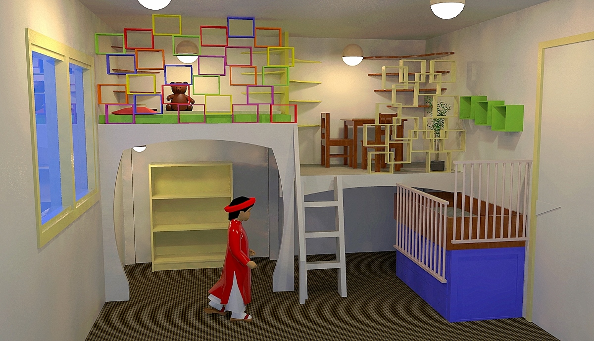
Here's a few ideas, simple structural, not interior design. Just thrown together quickly to give a bold concept.
By using simple shapes you can break up the cage effect and create usable book shelves for all the toys, books and nick nacks while still providing a safe structural barrier. Tapering curved corner shelves give more space to the area while still giving usable storage. Raising up the small bed gives you better access and good storage for bedding underneath, and the movable bars make nice safe area. When the time comes for a bigger bed you can still have it in a similar position, probably lower with the foot area extending under the loft. The chest of draws under the cot can be moved elsewhere.
Anyway, as I said, just a few random thoughts with bright colours to show the bits more clearly, not meant as a fancy design, just a look from a different view.

-
@box said:
Here's a few ideas, simple structural, not interior design. Just thrown together quickly to give a bold concept.
By using simple shapes you can break up the cage effect and create usable book shelves for all the toys, books and nick nacks while still providing a safe structural barrier. Tapering curved corner shelves give more space to the area while still giving usable storage. Raising up the small bed gives you better access and good storage for bedding underneath, and the movable bars make nice safe area. When the time comes for a bigger bed you can still have it in a similar position, probably lower with the foot area extending under the loft. The chest of draws under the cot can be moved elsewhere.
Anyway, as I said, just a few random thoughts with bright colours to show the bits more clearly, not meant as a fancy design, just a look from a different view.
Wow, that looks so much more like a room for kids than the rough model with lines all over that I made. I still am not really best friends with sketchup. I do love it, and I see the potential in it, but it doesn't always love me back (i.e. do what I mean it to do).
 Thank you so much for the ideas and very inspirational image.
 -
@s shepherd said:
I like the concept. Something just says to me you should have some direct bearing on the legs. It's probably fine as is but letting the legs in under the floor framing might be worth doing. Hanging something on the shear strength of a fastener can lead to a failure.
S
[attachment=0:1wdptmpb]<!-- ia0 -->post top.JPG<!-- ia0 -->[/attachment:1wdptmpb]
Yes, I thought about that too. Maybe that is better. I will make a version like that as well. What do other people think? It is better to put the floor frame resting on the legs, right? Also, as I drew it now, the legs are made out of two 2x4 beams glued and screwed together (since I can't find any 4x4 beams near here). Will that work as well?
-
The suggestion by S Shepherd is good practice for floor construction. It is an economical way to ensure safety and stability. Or, you could use countersunk and plugged heavy through bolt connections. (I don't think you want that.)
-
One thing to remember is you aren't building a house, the structure needs to be safe and secure but you won't be supporting the rest of the house with it.
2"x4" placed at right angle to each other will be stronger than face to face. You end up with an L shaped 6"x4" which is less prone to raking and can be more easily screwed to existing wall and such.
What your walls are made of makes a difference to how you would construct it also. If you have good solid walls you can easily fix the structure into the wall making it solid, however if it is cardboard or a rental property where you can't fix into the walls then you need to put in more diagonal bracing to stop raking and squeaking.
Here's a quick sketch where everything is a straight cut and can be precut to length for you. It's an often used simple prefab construction method. Four corner posts and a platform that can be built elsewhere and put together on site. The shaped front board doubles as both decoration and diagonal bracing. The corner blocks just lock things together. Once in position it can be fixed to the walls or suitable bracing added. The L shape of the upright also makes it easy to continue the construction to create your lower level, it's much easier to put screws through 2" wood than 4" and blocks can be added if necessary rather than having to do cut outs or long bolts.
-
We rent the flat and I don't want to damage the walls more than absolutely necessary. By the way, what do you think about this that was my inspiration in the first place: http://www.thehandmadehome.net/2011/08/how-to-build-a-loft/ That one is about as big as mine, the floor does not rest on the legs and it's not screwed to the wall. Also the legs are much further apart than in my 6 leg construction.
-
That looks quite good, whichever way you build it I'm sure will be fine. I don't see downward weight as being much of an issue, it's more about getting the structure stable. The main thing to be aware of is that without fixing it to the walls you need to think about bracing for side to side and forward backward movement. Adding even relatively thin boards to a couple of the faces of the structure (for example the back and side of the ground floor play area) will firm it up nicely and protect the real walls from little paint covered hands. They could be decorative, or pin boards or chalkboards, but even a few well placed diagonal braces will work wonders. It would be good too if you can make it in sections that fit together, then you can move it to another house or alter it as the kids needs change.
-
Metal connectors (from Simpsom Strong-tie) are very strong and effective. You can cover them over with trim or hide on the wall side. That plywood face will add strength if you make it connect to both sides of a joint. Glue is actually good too, but hard to dismantle.
Consider fastening to the wall framing with lag screws--at least in a few places in case of earthquakes- it looks like it will be braced in one direction at least (squeezed between two walls).
-
@box said:
That looks quite good, whichever way you build it I'm sure will be fine. I don't see downward weight as being much of an issue, it's more about getting the structure stable. The main thing to be aware of is that without fixing it to the walls you need to think about bracing for side to side and forward backward movement. Adding even relatively thin boards to a couple of the faces of the structure (for example the back and side of the ground floor play area) will firm it up nicely and protect the real walls from little paint covered hands. They could be decorative, or pin boards or chalkboards, but even a few well placed diagonal braces will work wonders. It would be good too if you can make it in sections that fit together, then you can move it to another house or alter it as the kids needs change.
Where should I put the well placed diagonal braces (for them to be well placed)?

-
Does everyone think that the L shaped legs is a better option than the 4x4 (2x2x4) ones? Would love more comments on that.
-
As for the L posts: Considering the quality of common lumber these days that probably would be a better option. You would be better off selecting the lumber yourself to get the straight and relatively unblemished pieces.
-
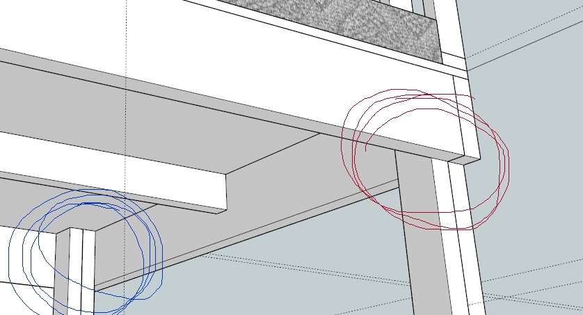
How about this then? In the original sketch the legs were like the blue one in this image, two 2x4's glued/screwed together all on the inside of the floor frame. Now I was thinking of having one shorter 2x4 still glued/screwed to the other one, so that the frame rests on half of the leg and the other half goes all th way up to the floor on the inside (red in the image). What do you think about that?

-
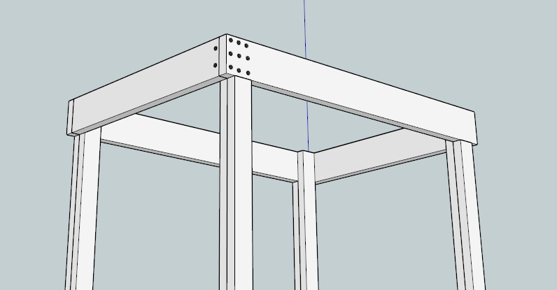
So, how about this construction then? Would it be o.k. that the long beams rest on the legs (but not the shorter beams)? Also, I made an attempt to put screw heads there. Too many? in the wrong place? This would be an easy construction, where I wouldn't have to use anything but certain lengths of 2x4 and 2x8.

-
Sara I stopped replying to your posts so others could have their say on the physics of your construction without my arty farty gibberish.
It's not that complex, it's a bunch of bits of wood screwed together, use more screws than you need if you think it will help, use right angle bracing to stop it from moving from side to side.The real danger in the construction isn't collapse it's squeaking. Build it.
-
@box said:
Sara I stopped replying to your posts so others could have their say on the physics of your construction without my arty farty gibberish.
It's not that complex, it's a bunch of bits of wood screwed together, use more screws than you need if you think it will help, use right angle bracing to stop it from moving from side to side.The real danger in the construction isn't collapse it's squeaking. Build it.
Thank you.
 It's not that I am that insecure anyway (even if it sounds so). I probably won't be able to build the thing until this summer (bacause I don't have the time and little brother won't be moving in for a few months yet). So while dreaming about it I thought I might just as well discuss it with others, and of course also get some helpful advice. I have gotten a lot of good tips here. Will probably build it first and then see where the bracing is needed. But if you have any ideas where good points are, feel free to tell me. I really have no experience in building things like this.
And if anyone else would like to comment on my last sketch, please do so.
-
I saw this article in the paper today and thought of your loft.
20 ways people have modified an ikea bunkbed.
Thought it might give you some more ideas.
http://www.essentialkids.com.au/photogallery/family-life/family-home/20-amazing-ways-to-modify-an-ikea-bunk-bed-20140225-33e4m.html
Hello! It looks like you're interested in this conversation, but you don't have an account yet.
Getting fed up of having to scroll through the same posts each visit? When you register for an account, you'll always come back to exactly where you were before, and choose to be notified of new replies (either via email, or push notification). You'll also be able to save bookmarks and upvote posts to show your appreciation to other community members.
With your input, this post could be even better 💗
Register LoginAdvertisement


