Modern House (Need Ideas/Constructive Criticism)
-
Hi everyone!
This has been my holiday project that I have been working on for the past few days on and off. Total working time so far is around 10 hours. I based the house off the link below, however I had to make a few modifications due to my skill or lack thereof. If this great community could give me some pointers or ideas on how to improve this project it would be greatly appreciated.
I would like to eventually place this in a nice HDRI environment, however I think it has a ways to go.
My main complaint is that the 2nd floor left wall looks a bit bare right now. Granted the picture I was working with does not show that side, so its really up to interpretation.
Overall I am happy with the way it came out, just needs a bit of tweaking, and that is what I am here for!
http://www.houzz.com/photos/97923/Bernal-Heights-Residence-modern-exterior-san-francisco
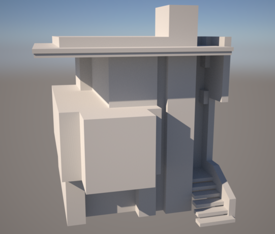
Roughly 1 hours work, laying the framework.
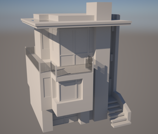
3-4 hours of work, finished most of the main design work.
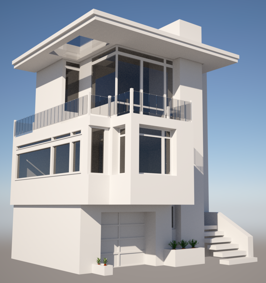
10 hours of work, lots of nit picking and fine tuning. Mostly wasted time with nighttime lighting that didn't work the way I wanted.
-
I think it's fantastic... Is that a skylight outside? I like the clear glass corner more than the structure corner level I. The second smaller planter I would just delete.
-
Good work. agree with Kris mostly.
I think it would be stronger if the fenestration were more consistent--perhaps following the upper layer--some variations are always nice. The upper level suggest lightness, but not the second level--still nice to see if some recess design would work.
But hey, it's your baby. Maybe it's going somewhere I don't yet see. Send more pics. -
Hi guys thanks for the feedback. This is really the first time I have taken a project seriously, I mostly make something from my head, hate it and delete it. Ill see what I can do about making the top floor a bit more consistent with the first floor. As for the skylight outside...yes thats there, thats what seemed to be in the picture I was following.
Should have something revised up tonight so check back then. Thanks again!
-
While I think this is a very interesting design geometrically, and you are doing a very good job of modeling it, I could not help but notice that the drip line of the roof plate seems to be directly over the entry stair, whereas, it would be very simple to correct this without detracting from the concept. But then, if it never rains in San Francisco, never mind.
I would bet also that the skylight is built on a curb.
-
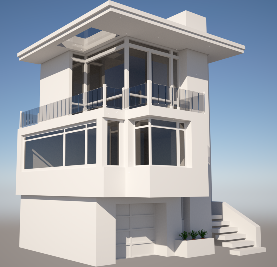
As promised here is the latest iteration of my project. I revised the 1st floor side window to conform with the "indented" style of the front face. I also made some revisions to the 2nd floor to give it a more open feel by extending the window on the left wall. In addition I took the suggestion of deleting the second flour pot in front of the garage.
Please excuse the fireflies in the render...
-
Looks great irkie... I like the stairs, but that style should probably be inside. I would go with monolithic poured stair with no open area underneath. I envision this home nestled into the side of a hill and that side would probably be in the ground.
-
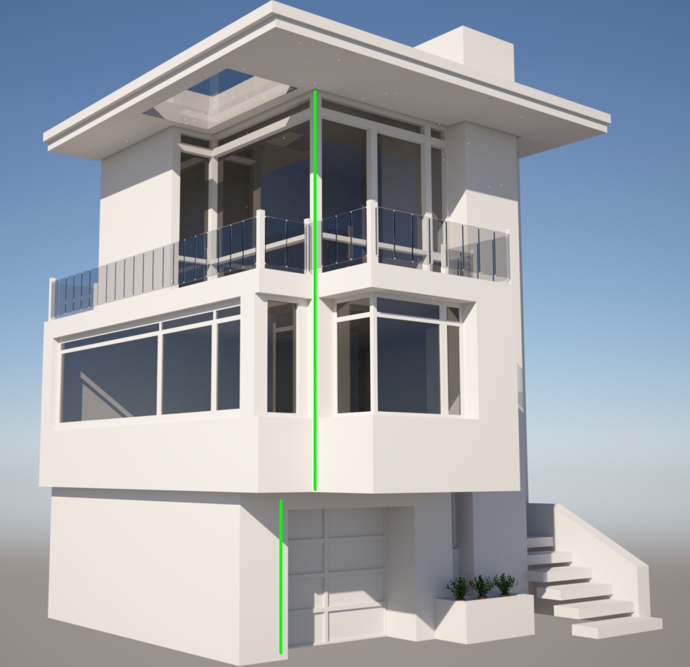
I love the design. Structurally it would save you $1000s of dollars in materials, designer fees and materials costs if you lined up the green lines so that you can have a single load bearing column at that corner. Ballpark I'd estimate you might be saving up to $10k in total there.
-
Cool

Does the inside is also made ?
Hello! It looks like you're interested in this conversation, but you don't have an account yet.
Getting fed up of having to scroll through the same posts each visit? When you register for an account, you'll always come back to exactly where you were before, and choose to be notified of new replies (either via email, or push notification). You'll also be able to save bookmarks and upvote posts to show your appreciation to other community members.
With your input, this post could be even better 💗
Register LoginAdvertisement


