Another Arts & Crafts Period Cabinet
-
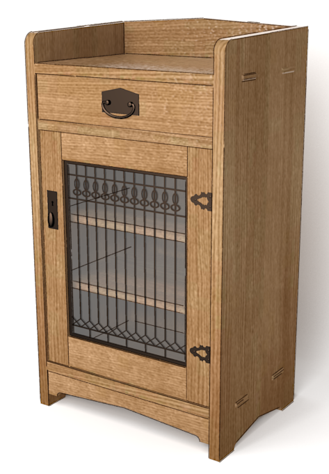
This is based on a cabinet from the late 1800s. I chose some very straight-grained quarter sawn white oak for this one and gave the oak a fumed color.

I need to work on the metals and learn how to render glass, still.
-
That texture is perfect!
Nice cabinet aloso -
Thanks, John.
-
Very nice cabinet! Do you plan on working on a PS method for the glass? Is that all leaded? It looks very intricate (small pieces).
-
Thank you, Peter.
I didn't plan on a PS method for the glass. I prefer minimal post processing. The glass would be all leaded and indeed, a bunch of little pieces.
-
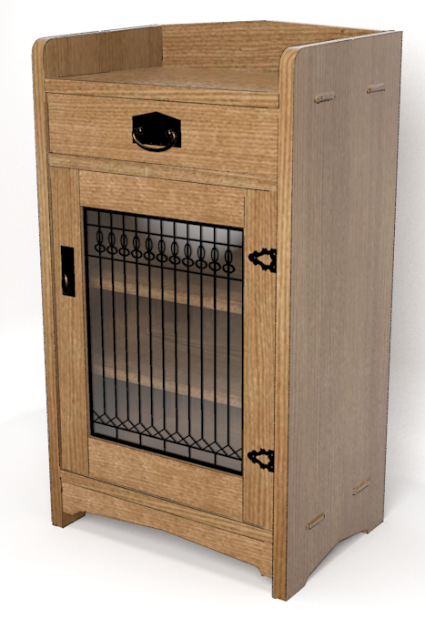
Better glass and lighting.

-
That looks really nice Dave but I'm curious, you tend to use sketchy finishes which look great but here you are talking about getting the glass right. Are you wanting to go more photo real that you normally do?
-
Thank you.
I guess I like the reflection off the glass and wanted to improve that. Still, in general I much prefer a sketchy style. In this render I did add what I intended was a subtle sketchy line overlay to add some definition between some of the parts. I was just playing around yesterday to amuse myself.
I don't have any plans to drop the sketchier looking images.
-
Ok that's good. With my limited rendering experience I would say adding something to reflect will make the glass look more reflective. Plus, as it's a leadlite, slight variations in the angles of the panes break the reflection for more realism.
Here's a quick version where I have given it a window to reflect. If you give your renders something like that then throw your line style over the top and it should bring it back to your nice finish with a distinct glassy look.
-
Thanks. That looks good. I know I can put something in the background to reflect in the glass. I was working on keeping the setup dead simple for this one so I just moved one light until I got a reflection. That's good enough for me.
Hello! It looks like you're interested in this conversation, but you don't have an account yet.
Getting fed up of having to scroll through the same posts each visit? When you register for an account, you'll always come back to exactly where you were before, and choose to be notified of new replies (either via email, or push notification). You'll also be able to save bookmarks and upvote posts to show your appreciation to other community members.
With your input, this post could be even better 💗
Register LoginAdvertisement


