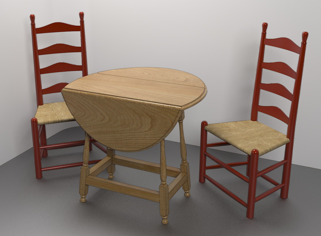
A Colonial Style Drop Leaf Table
-
I'm sure you can, and far better than me, it was the research I was interested in. Come to think of it, put in a couple of Octoberfest serving wenches and nobody will care what your table looks like.
-


-

For what it's worth I prefer the lighting of the first image.
-
@olishea said:
:lol:
For what it's worth I prefer the lighting of the first image.
Thank you. Can you say what you like better?
-
Just brighter. I know the second one has sharper shadows and less noise which is nice, but needs more brightness IMO. It looks quite dim on my screen. Could just be different monitors, of course, but it's looking flatter to me.
A quick exposure adjustments would improve it, or increasing intesnity of the light above if you can be arsed rendering again.
 Hope this helps.
 -
You're right, the second one isn't quite as bright as the first. I didn't make as much of an adjustment in the image editor on that one as I could have. I'll probably render it again with a couple of chairs and maybe a flagon of ale. For that I'll probably add a couple more lights, too, but I'll bump up the intensity of the top light a little more.
Thanks for the crit. -

-
Awesome!! Nailed it!
-
Thank you, thank you. I really ought to do something different with the floor but I think I'll move on to something else.
-
of course, no one mentioned that the table is facing the wrong way, but now i'm just nitpicking

-
It's not the table. It's the rude people who didn't move the chairs back before they left.

Hello! It looks like you're interested in this conversation, but you don't have an account yet.
Getting fed up of having to scroll through the same posts each visit? When you register for an account, you'll always come back to exactly where you were before, and choose to be notified of new replies (either via email, or push notification). You'll also be able to save bookmarks and upvote posts to show your appreciation to other community members.
With your input, this post could be even better 💗
Register LoginAdvertisement


