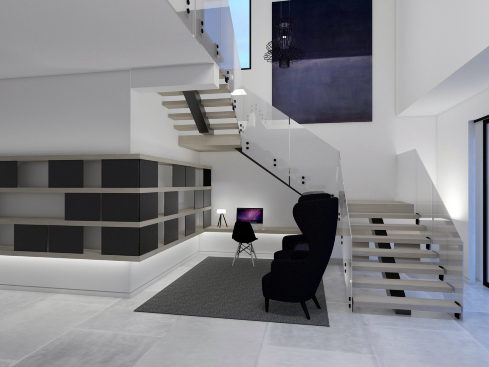
Library Under Stairs
-
SU 8
Vray 2.00.23590
PS CC
-
Wise solution.

-
-
Hey Susan, would you like any criticism to improve the image?
-
Hi olishea:
Would welcome any crits! And thank you for asking.
-
looks pretty nice! i definetly would change the floor texture, as it's obviously way out of scale...and as the topic of this image is "library" i would like to see some books

-
Hi Carloh:
Awesome suggestions! The stone on the floor of the project is actually huge, but I don't really like the default floor texture I used, so I agree it could be better. Would love to have had the time to add books and objet d'art to the bookcase. I think it would really bring some life to the image. The intent for this rendering was to get the client to sign off on the design solution and they did. So thank God for SketchUp and VRay! Both excellent communication apps!
-
Very nice!
-
@mooarchi said:
Hi olishea:
Would welcome any crits! And thank you for asking.
No problem. Thought it would be better to ask first because sometimes people don't want to improve.

The image has a strange blur going on. Is this a post processing artifact? Or something you've done with the camera settings in vray?
The carpet texture repeats too much, try find a high resolution one. The stone floor is out of scale and needs bumping with perhaps more reflection.
The office chair is out of scale, looks like a children's chair.
The armchairs are lost in their deep black colour. Adding a material template would bring out the details. At the moment they look like a big dark blob.
As Carloh said some entourage would really improve the image. Books, a cup of coffee maybe and a potted plant would look great in such a minimalist space. The entourage would add a broader palette of colour instead of the heavy blue hue that is dominating the render.
Hope this helps.
-
Hi olishea:
All awesome crits! I believe the blur is PS post-work. I don't see it, but will probably learn to with time and experience. The Eames desk chair is in fact to scale. I am a stickler for scale and always verify the dimensions of the actual furnishings since more often than not purchased models are not scaled properly. It might be due to the fact that the Tom Dixon wing chairs are over-scaled in actuality. I agree about them appearing like big dark blobs. Don't know what a material template is, but I would like to know and utilize the technique in future renders.
A big thank you for taking the time to help me to perfect my rendering techniques!
~Susan
-
The blur looks like some sort of lens blur, nothing is sharp like a photograph. Did you run a "reduce noise" filter in photoshop or anything? gaussian blur? If not check your vray camera settings. I am unfamiliar with vray so just make sure there is no DOF blur applied, or whatever equivalent setting there is in vray. Pinhole is normally sharp.
I just used "material template" as a generic expression for adding parameters to make the texture look like a true material. Nothing in reality is absolutely flat, especially fabrics. They can have a very subtle sheen while still being fabric in nature. See this example photo:

Ah so that's why I thought the Eames was small....the other chairs are over-sized. Still though, something about the desk height makes me think it's a child's space. Perhaps coincide the top of the bookshelf/library with the underside of the stair tread? Just a thought. It will give more height to the desk which, again, looks too low. I could be totally wrong and it's just a question of perspective.
Would love to see a reworked image if that's your intention. Some entourage would definitely help. Just anything to get away from all the blue, for fear of it becoming quite a clinical and cold space. But maybe that's what your client wants? Could be a killer image this one!
-
Hi Oli:
The desk is 30" high, but it does set back 12'-0" from the face of the outermost bookcase. So the perspective is deceiving. And yes, I did use Gaussian Blur in PS. So it is not the camera settings. I would definitely like to see warmth added to the image. I also think the glass handrails could be better. Thoughts? Anyone wanting to give this scene a go, send me your email and preferred version in a private message and I'll email the file.
Thank you again!
~Susan -
You are better off posting a dropbox link (or box.com) so people can download.
Yeah gaussian blur isn't really suitable for this...I would only use it to add depth for product renders where there is a high depth of field and foreground objects.
The handrails need a slight touch of green like real frosted glass. It also needs some noise in the texture. You can make a "noisemap" in photoshop and then apply your translucency to it in your render engine. Some engines have a "blurred translucency" option.
A quick and easy way to add warmth is by applying a warming filter in photoshop...not too much of course. Another way is changing your physical sky colour or just add warmer entourage. The blue canvas doesn't help the cold feeling. You can also reduce blues in photoshop by introducing yellow/red into the blue spectrum although I wouldn't say that's appropriate for this image at this stage.
-
Oli:
Thank you for all the great tips!
Just created a dropbox folder, so I will share the link w/anyone wanting the model.
Hello! It looks like you're interested in this conversation, but you don't have an account yet.
Getting fed up of having to scroll through the same posts each visit? When you register for an account, you'll always come back to exactly where you were before, and choose to be notified of new replies (either via email, or push notification). You'll also be able to save bookmarks and upvote posts to show your appreciation to other community members.
With your input, this post could be even better 💗
Register Login


Advertisement