Site Marketing Plan - Layout / Indesign
-
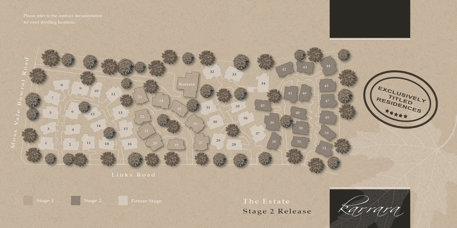
Here is a nice little site plan I prepared yesterday for a client's marketing efforts.
The plan was prepared in Layout then exported as a layered PDF and dragged into Indesign where effects are added to multiple copies of the layer managed PDF.
The paper background is one I created from scratch and as the PSD is multi-layered I can adjust any of the paper properties, from texture to fibre weight

-
It looks really nice, Richard...!

I like your style a lot... It's eye appealing...
-
Subtle & clean.
-
Lucky you do not supply the whole market mate, I'd never have any dosh left. Very nice work, as per usual Sir.
-
Thanks as always Fred, Chedda and Mike! Really fun little job - well once you get past the clients want for it to have LOTS of colour! I reckon the result is more "elegant"!
-
Damn you're brilliant,Richard. I can sort of see what you did but somehow I wouldn't have got there myself Ha! Very effective. Works a lot better than more tedious CAD approaches.
-
Strange how for marketing & advertising clients insist on saturated gaudy colours to pop out of high street windows. I think some clients especially those employing an architect empathise more with the clean & subtle look. Having a different approach will at least make you stand out from the louder competition.
-
Not to take away from the site plan layout and excellent work on you part, I was wondering if the planning department has minumim side yard and set back requirements. Seems like you can not walk between some of the houses. The local fire department may have their own requirements. Some areas with houses this close together require fire rated walls on that side of both the structures.
Just some thoughts, Bob
Hello! It looks like you're interested in this conversation, but you don't have an account yet.
Getting fed up of having to scroll through the same posts each visit? When you register for an account, you'll always come back to exactly where you were before, and choose to be notified of new replies (either via email, or push notification). You'll also be able to save bookmarks and upvote posts to show your appreciation to other community members.
With your input, this post could be even better 💗
Register LoginAdvertisement


