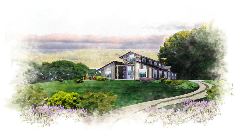
{NPR} Garden Barn
-
One of my east coast projects.
-
Lovely.
-
I like picture, mood. But one thing: for me white image frame is too big and the image itself becomes too small

-
Really nice Tinanne! I love the sketchy style here. Something you don't see much any more.
-
Can you share any details of how you got to this point?
-
sorry, but it's very poor.
-
@rv1974 said:
sorry, but it's very poor.
I disagree but saying it's poor and not at least offering some constructive advice seems rude.
IMO. -
@jpalm32 said:
@rv1974 said:
sorry, but it's very poor.
I disagree but saying it's poor and not at least offering some constructive advice seems rude.
IMO.Well in my turn I'd say it's rude to state the neg evaluation of the specific work is rude.
But if you'd like me to expand, no problem: boring composition, too much empty space, poisonous and dirty colors, the collage sources don't work together, watercolor faking is mediocre. I'm guess it was some speedy routine. -
@rv1974 said:
@jpalm32 said:
@rv1974 said:
sorry, but it's very poor.
I disagree but saying it's poor and not at least offering some constructive advice seems rude.
IMO.Well in my turn I'd say it's rude to state the neg evaluation of the specific work is rude.
But if you'd like me to expand, no problem: boring composition, too much empty space, poisonous and dirty colors, the collage sources don't work together, watercolor faking is mediocre. I'm guess it was some speedy routine.Somebody break your crayons when you were a child or something?
-
No, I red some depressive economic reports just before posting here
. Usually I wouldn't bother to react.
P.S. Seriously in my system of coordinates the compliments like 'lovely' and 'very nice' lay in this area (I tried to find some examples in the similar field- rural SU NPR): https://corner-bar.googlegroups.com/attach/205fcd5d36dce52c/1800%2520waterc2.jpg?view=1&part=2 or this https://corner-bar.googlegroups.com/attach/4cf80546ae47dfe0/GrantMarshall-G13.jpg?view=1&part=2 . With all my respect, the attached output is fairly distant.
IMO cheap flattering steals possibility to progress; usually I appreciate my criticizers, they provide some valuable food for thoughts. -
@rv1974 said:
No, I red some depressive economic reports just before posting here
. Usually I wouldn't bother to react.
P.S. Seriously in my system of coordinates the compliments like 'lovely' and 'very nice' lay in this area (I tried to find some examples in the similar field- rural SU NPR): https://corner-bar.googlegroups.com/attach/205fcd5d36dce52c/1800%2520waterc2.jpg?view=1&part=2 or this https://corner-bar.googlegroups.com/attach/4cf80546ae47dfe0/GrantMarshall-G13.jpg?view=1&part=2 . With all my respect, the attached output is fairly distant.
IMO cheap flattering steals possibility to progress; usually I appreciate my criticizers, they provide some valuable food for thoughts.So show us how it is done Rembrandt.
Is that your work?? Very nice if it is.
If not enlighten me to your talent. -
I don't believe his comments are too harsh or unjustified. I agree with the "poisonous" colours, although I'd say they are "swampy" and acidic. Even just removing removing some blue from the green would be kinder on the eyes (hue/saturation in photoshop, introduce more yellow/red into the greens).
White space is your friend (in the words of Richard), but I also believe there is a bit too much in this case.
Sometimes I feel people would rather say nothing can post a negative criticism....we shouldn't be scared to say what we feel. I would rather hear 20 negative crits than nothing at all, at least you can progress.
Saying "sorry, but it's very poor," doesn't help anyone. You can constructively criticise without tearing the work apart.
Just my thoughts and they are completely subjective.

-
@jpalm32 said:
@rv1974 said:
No, I red some depressive economic reports just before posting here
. Usually I wouldn't bother to react.
P.S. Seriously in my system of coordinates the compliments like 'lovely' and 'very nice' lay in this area (I tried to find some examples in the similar field- rural SU NPR): https://corner-bar.googlegroups.com/attach/205fcd5d36dce52c/1800%2520waterc2.jpg?view=1&part=2 or this https://corner-bar.googlegroups.com/attach/4cf80546ae47dfe0/GrantMarshall-G13.jpg?view=1&part=2 . With all my respect, the attached output is fairly distant.
IMO cheap flattering steals possibility to progress; usually I appreciate my criticizers, they provide some valuable food for thoughts.So show us how it is done Rembrandt.
Is that your work?? Very nice if it is.
If not enlighten me to your talent.those examples are not mine. the authors used to post here a lot, try to google 'sketchup watercolor'. To post my works in other people threads is ethically problematic IMO. I could PM if you wish.
-
Wow. I certainly had no idea this rendering would cause such a fuss. I put it up for kicks to see what the comments would be. It is not my usual style, but thought there may be a tip or two out there to make it better and give me something to play with.
I am thankful for all the comments. I am always striving to do something different and have better technique. I will say that I do prefer the details of what needs to be worked on rather than "sorry, but it's very poor." That doesn't give me anything to work with. Thank you for elaborating in later posts.
I find the words "poisonous" and "acidic" odd choices of words? Not words that I would usually use to critique someone's drawing but again, I appreciate the input.
Thanks everyone!
-
"acidic" is commonly used to describe colours like that. I wasn't saying the image is acidic, but rather the green.
-
@olishea said:
"acidic" is commonly used to describe colours like that. I wasn't saying the image is acidic, but rather the green.
"Saying "sorry, but it's very poor," doesn't help anyone. You can constructively criticise without tearing the work apart."
That was my point in first place. He DIDDN'T offer any!
I never said his comments were too harsh.He can show his work if he wishes can't he? I think he says he can't because he works for the CIA or something.
No name, WEB site, no location, NEVER a display of his work, ..
Now we get that of ALL his years of work he has NOTHING to show because dark forcers prevent him.I trully hated arrogant, lazy & pompous asS&& architects before I came to this site.
40 years of working with them made pretty sick of them.
People on this site were beginning to change my mind.
Then alas, the truth raises it's ugly head. -
@jpalm32 said:
No name, WEB site, no location, NEVER a display of his work, ..
So we can't criticize someone's work unless we do better ?
Next time you see a bad movie, don't you dare criticize it before making a better one !
-
@unknownuser said:
No name, WEB site, no location, NEVER a display of his work, ..
Now we get that of ALL his years of work he has NOTHING to show because dark forcers prevent him.I trully hated arrogant, lazy & pompous asS&& architects before I came to this site.
40 years of working with them made pretty sick of them.
People on this site were beginning to change my mind.
Then alas, the truth raises it's ugly head.
Unfortunately from your gorgeous web site and endless row of your works I still didn't managed to understand what kind of services exactly did you provide for those 'arrogant and lazy' individuals. But if those bastards deserve epithets like 'pompous asS&& architects' they must penetrated you really hard.. for 40 years. It's rather strange: so furious fighter for good manners with a perfect aesthetic sense should be treated better.
-
@olishea said:
"acidic" is commonly used to describe colours like that. I wasn't saying the image is acidic, but rather the green.
Thanks for clarifying Oli. I had not heard that before.

Hello! It looks like you're interested in this conversation, but you don't have an account yet.
Getting fed up of having to scroll through the same posts each visit? When you register for an account, you'll always come back to exactly where you were before, and choose to be notified of new replies (either via email, or push notification). You'll also be able to save bookmarks and upvote posts to show your appreciation to other community members.
With your input, this post could be even better 💗
Register Login


Advertisement