New logos developed with LayOut (UPDATED)
-
Although they look simple enough, it took a while to get both to what I considered right. I can't believe just how easy LayOut makes this stuff!
I generally start with a layer of solid dark colour as a background then introduce solid white primatives from which I create a basic shape. I then copy the dark background object to the top to blank off parts of the white primatives.
This way of working is brilliant as I'm not chopping up the logo and needing to then finely adjust points and curves. Only when I'm very close to the final do I then either trace all around all the intersects or slice and join!
I still have about 40 logos to do to complete my current portfolio! Phew seems like a lot of work when I say it like that! It also nice to utilise for demonstration some rough test renders have lying around. I might do up a little screen capture video of the next simple one!
I particularly like the Storage Qube icon as it describes visually an adaptable modular storage solution.
Busy rainy weekend so added a few more!
The Studio homes magazine cover was also compiled in Layout.
Helmsman Sport
Storage Qube
Form Homes
Built Small
Lux Home
Panel Form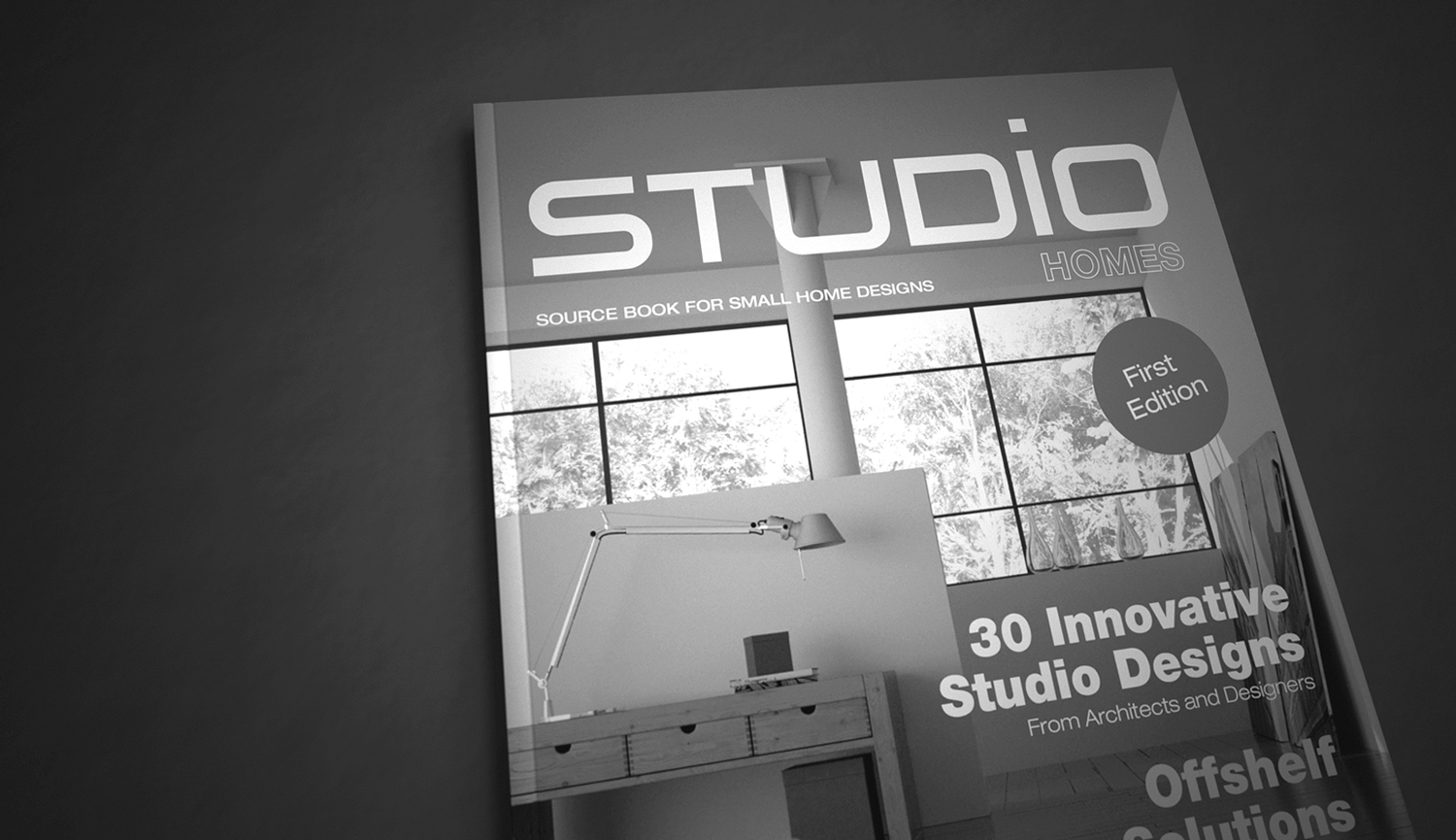
Studio Homes
Living Array -
Wise logos.
 Would be great to see the video.
 -
very good!
I like them a lot
-
Good work, particularly the Storage Qube!!!
-
Brilliant stuff Rich,very elegant and simple.
Simplicity is a hard thing to get right, ironically enough.
(I think the first one is my favourite) -
Yeah pretty straight & simple Rich the cube is best to my eye, maybe because i like the image also that goes with it.
-
Beauty of the simplicity!

-
Nice Richard. Are these for companies or are you working on a promotional portfolio? (like Don Draper made to get his job?). The cube is great1
Can you subtract the background shapes-cut out the forwards shapes? That's how I'd do it in other programs.
(Sorry, I thought of Honda for the first logo.)
-
Very slick, I like the Qube one too. Interesting to see what can be done with Layout as I have only recently started using it. Need to start thinking of it as a desktop publisher as well.
-
noice!!!!!
-
Thanks ALL for the vote of support - it's always nice to know your heading in the right direction!
@davidh said:
Brilliant stuff Rich,very elegant and simple.
Simplicity is a hard thing to get right, ironically enough.
(I think the first one is my favourite)You're right mate! Getting enough message into the most simple representation isn't ever that easy. I see so many logos that are so featured fill that sure they let you know the message but get lost when it comes to our ability to recall them easily!
That is the key I always think - "Less Is More"!
-
@pbacot said:
Nice Richard. Are these for companies or are you working on a promotional portfolio? (like Don Draper made to get his job?). The cube is great1
Mate at the moment they aren't for companies but hopefully so! Meaning I've designed them and making them available for purchase. I know strange sort of business model but my hope is that someone starting up, new project home company or developer who is struggling for a good Brand sees the opportunity in at least one and then I can further value add. Developing the brand, print and web design, all market collateral, signage and advertising.
I guess the model is a little like the "Brand Crowd" model excepting there the majority of logos are available with an attached domain. To me that makes them rather worthless unless completely generic, and that raises other issues.
Check out my website it might give a better understanding (though I've still got a lot of work to do on it)!
@unknownuser said:
Can you subtract the background shapes-cut out the forwards shapes? That's how I'd do it in other programs.
Unfortunately that is one of the features missing from layout!!

@unknownuser said:
I thought of Honda for the first logo.
You're right mate, it was funny, I did the design then walked over to the beach to chill and walked straight past a Honda. I raced back thinking wow that's a bit iffy! Though I think it is certainly dissimilar enough. Though with any logo I always recommend a complete trademark search within the proposed category or preliminary application to ensure one doesn't get in the pooh later!
The original concept started as a wedge shaped 'H' with a yacht hull and winged keel separating the sides but aiming to depict a hull schematically wasn't working well! So I went with something that may still be interpreted as such!
Hello! It looks like you're interested in this conversation, but you don't have an account yet.
Getting fed up of having to scroll through the same posts each visit? When you register for an account, you'll always come back to exactly where you were before, and choose to be notified of new replies (either via email, or push notification). You'll also be able to save bookmarks and upvote posts to show your appreciation to other community members.
With your input, this post could be even better 💗
Register LoginAdvertisement


