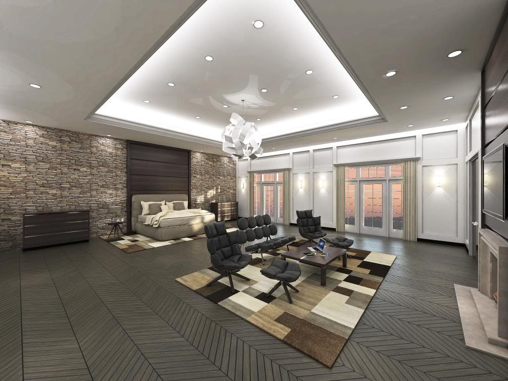
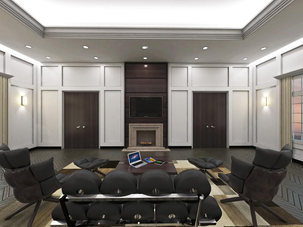
Bachelor Pad / Mancave Test Renders
-
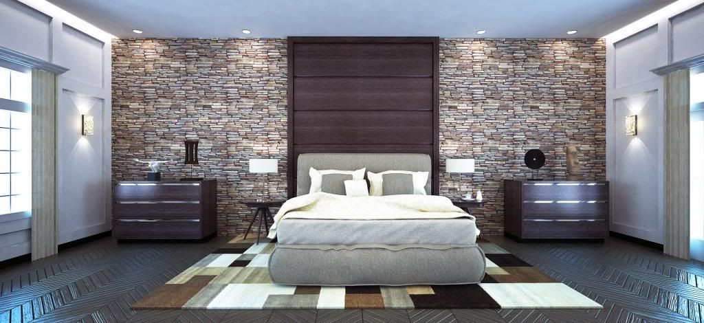
Downloaded a bunch of new materials for V-Ray and used them as an excuse to bang out this scene as a test. Check it out.
EDIT: Photoshop Post-Process to increase exposure
-
The floor looks great in the first image. Mancave lol it's huge, i think it needs the cinema screen & projector plus kick ass speakers somewhere. Is the beer fridge behind the double doors ?
-
Needs more light in my op. It is too dark.
-
Looks nice, but underexposed.
-
Very nice. I've seen that couch design, but wonder if it is more of a design statement than a useful piece of furniture - doesn't look comfortable.
-
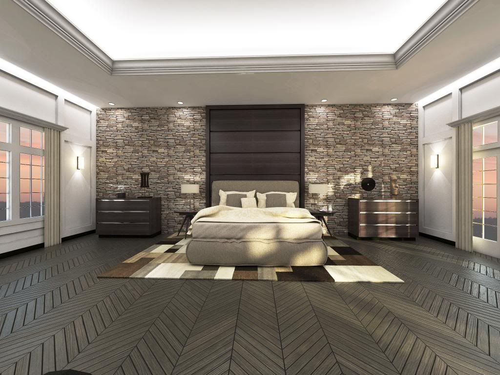
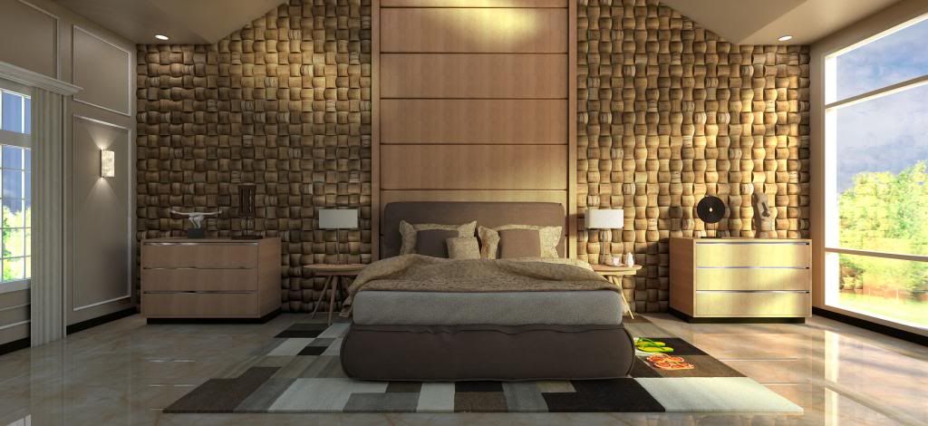
Used a different visopt for better light, check it out.
-
the upgrade is better. Tweak the parquet, its gaps are huge and the bump should be lower.
-
Great renders...!

The model and scene have huge potential...@rv1974 said:
the upgrade is better. Tweak the parquet, its gaps are huge and the bump should be lower.
I agree...
The bump is way too strong... -
Nice renders, I think reduce the bump on the floors and more light and it's done, by the way what is that armchair, what model is that?
-
The armchair as well as most of the furniture in the model are from the Podium Browser PAID version. It is an excellent timesaver and the models are high quality.
-
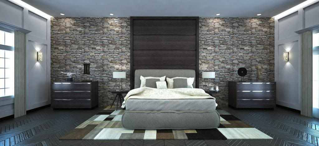
New material test.
-
I think all of them are very nice.
Some man-cave! Wow!
Hello! It looks like you're interested in this conversation, but you don't have an account yet.
Getting fed up of having to scroll through the same posts each visit? When you register for an account, you'll always come back to exactly where you were before, and choose to be notified of new replies (either via email, or push notification). You'll also be able to save bookmarks and upvote posts to show your appreciation to other community members.
With your input, this post could be even better 💗
Register Login


Advertisement