Classic Kitchen
-
Hello everyone!
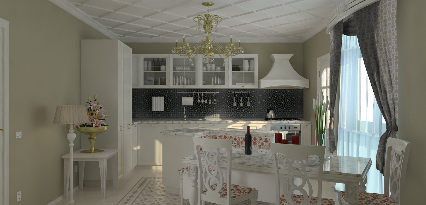
This is my last project, after a long period of "abstinence". It's a budget classic kitchen, and I tried to give just enough technical details but not too much. I did some post-production for the first time, and obvious, everything is exaggerated, but I still find them better then the original renderings.
I must say, most of the objects ware imported, from the warehouse and from a scene that I had but I can't remember the author.
Regards,
Stefan
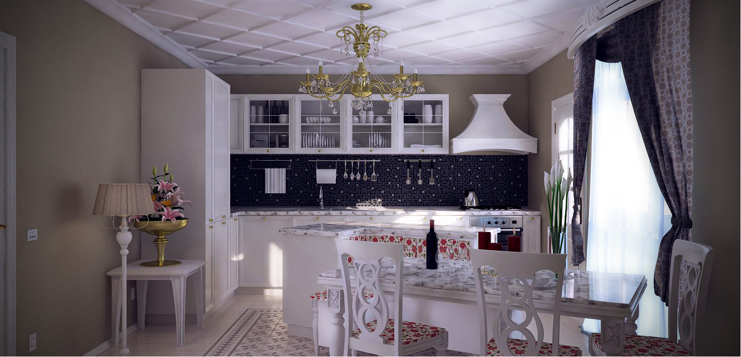
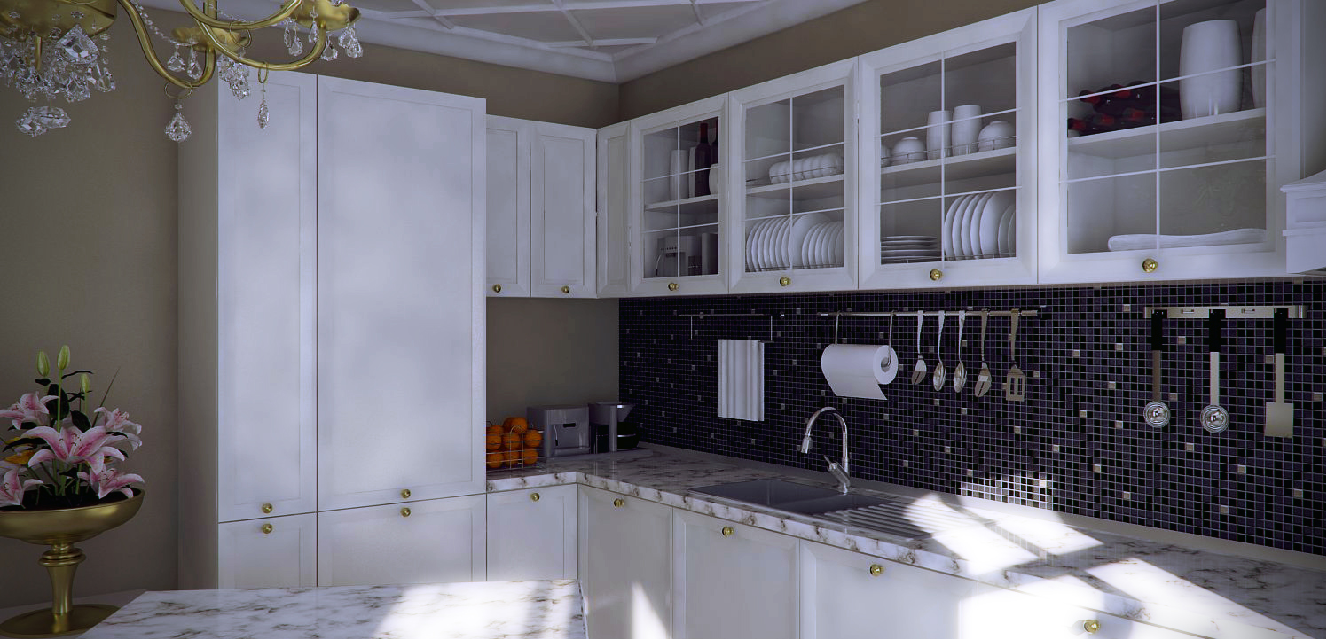
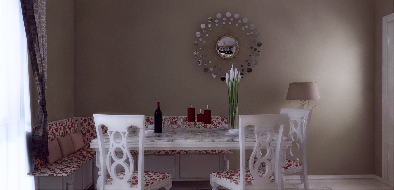
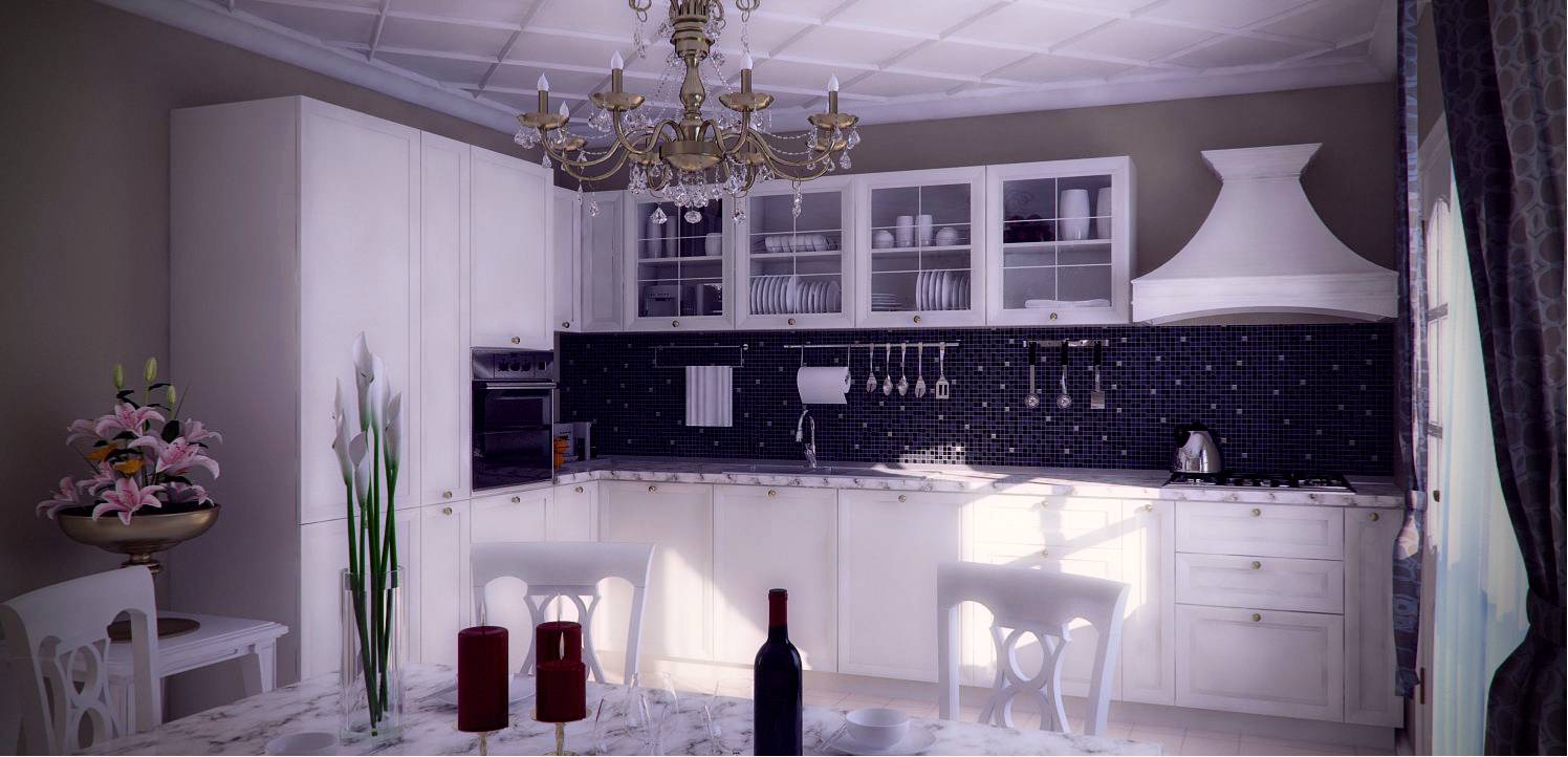
-
Very nice
 love the details.
John -
Thank you John!
-
really good details, nice rendering

-
Great work Stefan.
Now I'd love to see one with the dirty dishes piled high, and the napkins strewn about, the wine spilled...... you know, like my place
-
Thanks for comment Jaryn and Mr, Dale. I had a hard time making it look like that, so I can just imagine how many grey hairs I'll get if I'll try to make some mess.
At this moment, I really hate myself not taking into consideration post-production sooner. Not that I nailed it with this images(because 90% of the time I didn't knew what I was doing), but the fact that I prefer these over the originals, says it all.
Here it is a raw rendering, just to see what I'm talking about:
-
Hello Stefan, I like to think PP is around 30% of the total work in any render BUT you also need a good model and textures as a base.
John -
Very nice! How large was the file, just wondering.
-
I agree, and saving JPEG's was definitely a big mistake. The file size was 45 Mb.
Thanks again for your comments!
Stefan -
The kitchen design snap posted above is one of the best kitchen design I have ever seen.
A perfect color combination and looking very elegant. -
Very nice!
-
Really nice...!

Love all the details...!
Hello! It looks like you're interested in this conversation, but you don't have an account yet.
Getting fed up of having to scroll through the same posts each visit? When you register for an account, you'll always come back to exactly where you were before, and choose to be notified of new replies (either via email, or push notification). You'll also be able to save bookmarks and upvote posts to show your appreciation to other community members.
With your input, this post could be even better 💗
Register LoginAdvertisement


