Looking for feedback please!
-
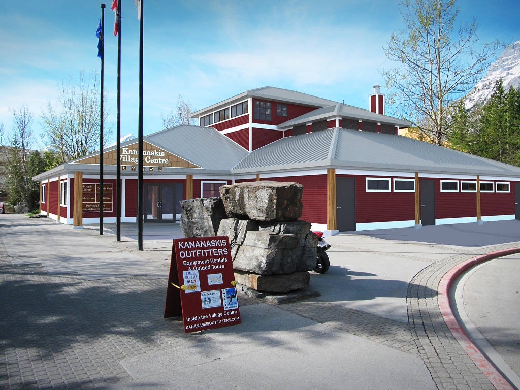
Hey Guys and Gals - I'm working on this sketchup-vray-photoshop render and am looking for some feedback please. Specifically, how can I make the white trim and roofing of the building look less.. cartoony? and if anyone can point me in the direction of a good cedar shake texture it would be much appreciated.
Thank you!

-
Great start.
I don't use V-Ray, but would it be possible to add a Normal or Bump map, or even a procedural to the white trim? I agree it looks flat and does take away from the rendering.
As for the roof, it just looks a little clean, can you use dirt maps in V-Ray?
By the way how is Kananskis. As an old ex Calgarian, I remember my first trip up to the lakes in a landrover over an almost impassable Alta. Power road, and many hikes up Ribbon and Galatea.
-
I bet if you spent some time in photoshop, you could get this integrated a bit better... like lowering the saturation and lightness a bit and getting that white to be not so white. that is one of the major issues.
-
Nice rendering, but I can see your point. Your building is too pristine - you need to add some weathering. I think Tadema explained how he added rust to his dump truck rendering in Photoshop. You might look at that. You might also want to rethink your composition so the flagpoles do not block the sign (on the building), and the rock formation is not aligned with the corner of the building.
-
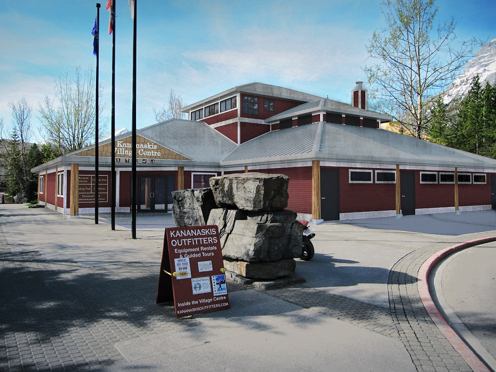
Hello Will03, I find once you lose the white in PS it's almost impossible to pull back, I suffer with the same thing all the time. Hope you don't mind, a couple of minutes in PS just to give you a general idea.
Love that ground on the left.
John

-
Thanks for the great feedback all!
@dale - Calgary and area are great these days! New mayor is awesome, the stampede and globalfest and everything are just booming here!
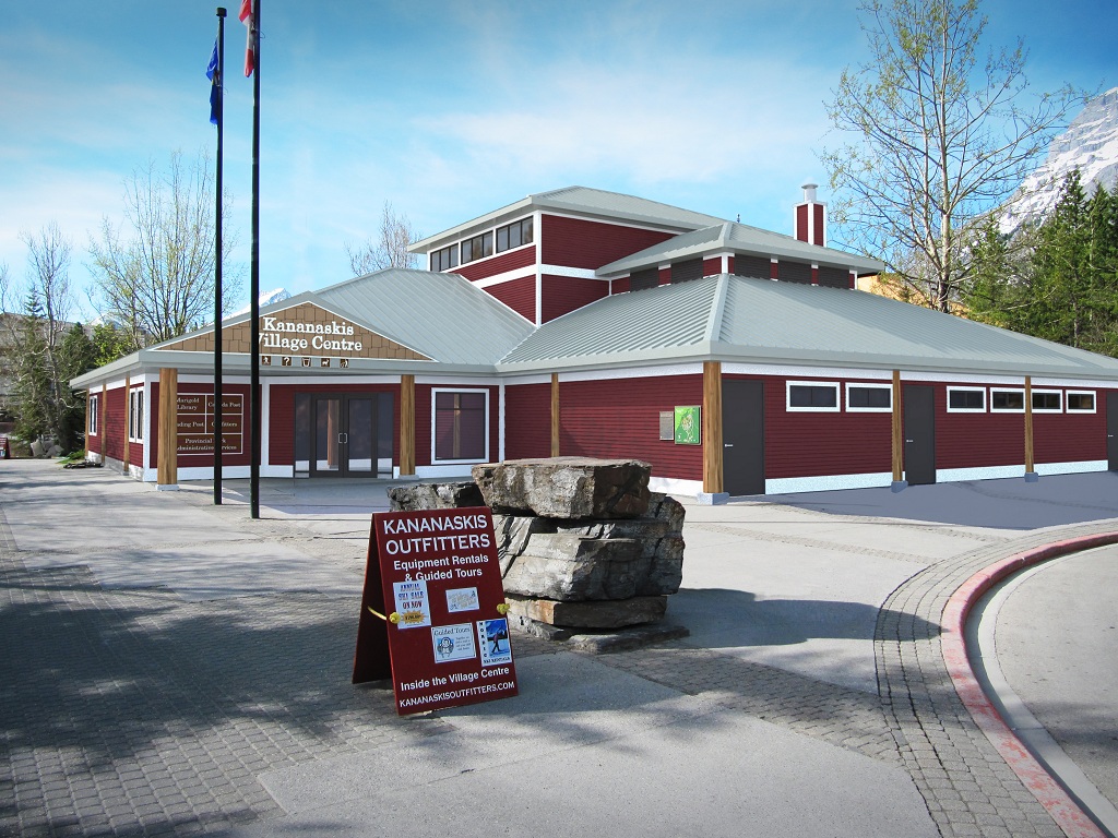
@tadema - thanks for your rendition! looks great - did you just brush in that effect?Thanks for the hints on the white - I added a procedural noise bump map and it didn't have as much effect as I would've liked... I also changed the colour a little bit, and then added some noise in ps. let me all know what you think!

-
You are right, the model looks 'flat' around windows/doors, eaves, wall cladding.
As dale said...
To overcome the problem use 'VRayDirt' texture map - you will get the depth in VRay or PS through post production...
Some users are adding the map directly in VRay, but for greater flexibility I used to do that in PS.- Save the model under new name - I always added 'Dirt' to my name
- Apply 'VRayDirt' texture map to the whole model
- Adjust 'Radius' and 'Distribution' (as a starting point) to get the 'Dirt' intensity and spread right - Look for some YouTube presentations.
- Calculate the render few times to get the best shot - you will get monochromatic render (keep all of them and paste into PS)
- Overlay in PS - paste above your image
- Manipulate using the blending and transparency options for LAYER (Multiply etc. plus transparency at 75% - play with the settings)
- You can paste all of them and keep on separate layers and see which 'Dirt' looks good by switching layers - On/Off
The end effect would give you nice, soft, realistic shadow depth throughout the model.
It will bring the model back to life. Good luck
-
Nice work. I love the concrete work. As a painter I can tell you that using an off-white will help. Though it won't be pure white, it will still be "white" without being so bright. Or if you can manipulate the color just add a little black (just a touch) to shut it up a little. From what I see it seems to be an issue of color choice and material for the building. Try to stay away from primary or bright colors. You would be surprised what lighting will do so don't be afraid to go darker or dirty up a color in a paint program. Even just changing the wooden beam textures to darker wood with a bump map would make a big difference. Aside from the color choices on the building, the scene is very nice.
Hello! It looks like you're interested in this conversation, but you don't have an account yet.
Getting fed up of having to scroll through the same posts each visit? When you register for an account, you'll always come back to exactly where you were before, and choose to be notified of new replies (either via email, or push notification). You'll also be able to save bookmarks and upvote posts to show your appreciation to other community members.
With your input, this post could be even better 💗
Register LoginAdvertisement


