Spaceship (Collaborative Project)
-
I had a pm exchange with iichiversii and got the idea to try doing a collaborative project to get the creative juices flowing.
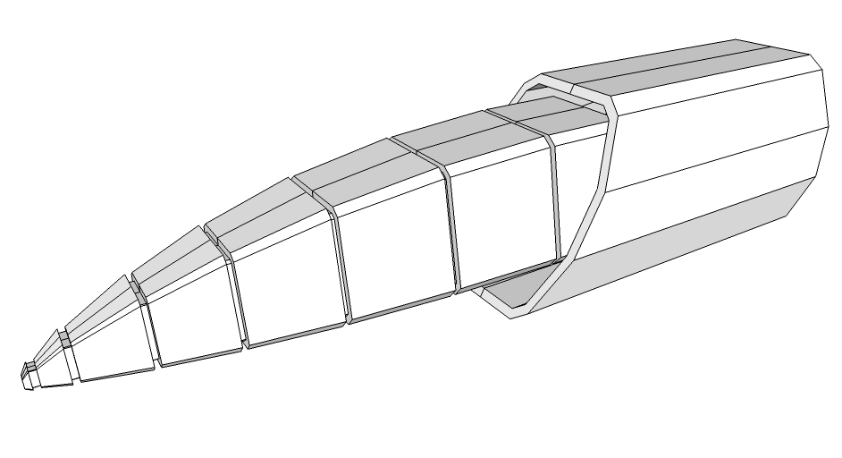
Here's the first piece of the model.

-
Let's make something beautiful

-
Nice, I'm thinking at first sight a star fighter, but it has huge potential to being a starship, iv all sort of ideas processing already, military theme, exploration theme, ummmm, which root should I approach this, it almost resembles the Normandy SR2's nose, but the rear surrounding reminds me of a ships engine I imagined as a child, it was an exploration ship, much like Prometheus, Im going to choose exploration but with the can ability to defend itself also, so exploration starship much like the enterprise, so should we give this ship landing capabilities or just keep it as an orbital ship, if it's just orbital capable it's going to need a shuttle, a shuttle is going to need a cargo bay, hard choices, we will see as the progress of this model continues, this could turn out to be totally different, remember its a collaborative project, feel free to ad to it, we will discuss if your ideas work or not, let's make something beautiful

-
Cool, an explorer ship sounds good.
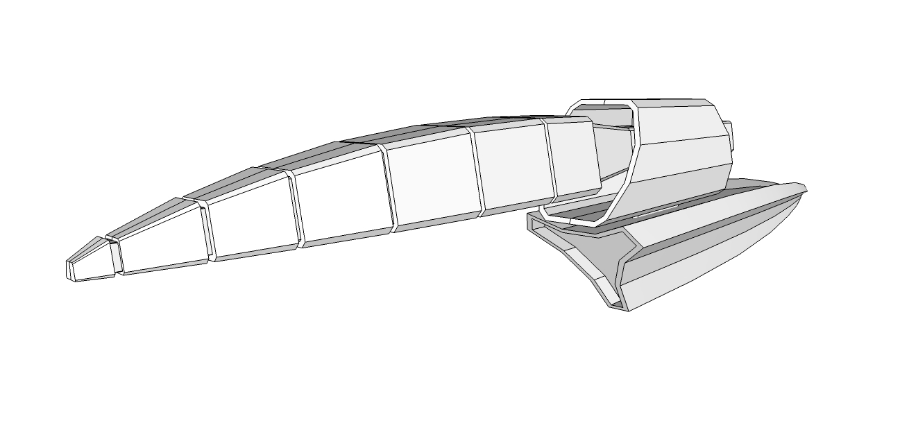
I made a few small changes. It basically looks like the pic above.
-
I used part of the model to create trusters, not sure about the position or size.


Link to the model is in the link below
https://www.dropbox.com/sh/pz8qbu23gzgcz4d/4ANVdOYONF?m -
You already put the thrust effect on?...let's put that as finishing details.

-
@marian said:
You already put the thrust effect on?...let's put that as finishing details.

Couldn't contain myself

Just had to be sure it looked just right before posting
-
I does look neat.

-
Cheers Marian, I more or less used the rear end of the first part you modelled, it looked like a thruster so I taught I would work on it, I would like to do some more work to them, would like to see other concepts too for the thrusters

-
Roger, I'll do something tomorrow.

-
Iv a few ideas bruing, I'll tackle it tomorrow also
-
I started doing something for the thrusters, but then I got a completely different idea. This is the way I normally work.


-
If it fits, wear it, i like it and it looks well

-
Did a few modifcations, not really sure myself if it does it any justice, what you think Marian?


Link to model below
https://www.dropbox.com/sh/pz8qbu23gzgcz4d/4ANVdOYONF?m -
Cool to see this teamwork and sparring of ideas

Keep it up and I can't wait what the proudct of this adventure will look like

-
Hmmm I like some things about it, but doesn't seem to work that well.
-
I was thinking that, I was working on the main body but had to scrap it as it didn't suit, I got carried away with the design then, ideas I had didn't work so well either, any ideas what the ships role would be, for example is it a cargo ship, military, exploration type, etc etc.... And the size of this ship? I had a few ideas but they didn't look so good so found myself back at square 1

There is no douth that we both have different styles in ship design and merging these styles is going to be difficult but I like the challenge.
We discussed constructing a bridge for this project also, and every
Starship has a completely different style bridge, if you compare the starship "Enterprises bridge" to the halos "Pillar Of Autums bridge" there are no similarities what so ever, if I were to design a bridge I would use the "Pillar Of Autum" style, and if I guess correctly Marian being a Trekkie would go with the "enterprise" style, would I be right Marian?
So we need to invent some sort of workflow to design a ship with different style artists, I myself like the box type and Marian likes the sporty streamline look, so what angle should we approach this at? This is an interesting case study that could have huge potential, or it could be a utter disaster, but either way it's a study to see what 2 artists can come up with and I'm curious to see what we can come up with

-
It is indeed a challenge, but hopefully a fun one.
About the bridge, I was thinking of having 2 bridges, one an emergency battle bridge like in Trek, but it would consist of a semisphere or sphere that has in its center the captain's chair. The ceiling/walls would all be one giant screen allowing the capatain to judge the situation with a clear view of the surrounding space. I got this from Legend of Galactic Heroes, quite an ingenious and practical setup. The main bridge would be one outside the main hull of the the ship, similar to sea going vessels with big windows.
This would be ideal for an exploration ship, you can thus see things through scanners as well as with your own eyes and if the situation requieres it you have a back up bridge ready to go.
I'm thinking the ship should be a few hundred meeters long 100-200m
-
Nice illustration, so a clean ship then, not the industrial type like in halo or alien movies, this bridge resembles the enterprises bridge, so I was right, Marian I like this concept, and your going with a virtual window instead of an actual window too, you Trekkie dog you
 .
.So it's an explorer class ship 100-200 meters long, a yauth of the stars more or less, but having the ability of defending itself, interesting, so an orbital ship or a ship with landing on planet capabilities?
-
Oooh, nice, I would rather the under part in the position you had before, and scaled a little larger, I'm only judging from the pic thu, I'll have to download later for a closer look

Hello! It looks like you're interested in this conversation, but you don't have an account yet.
Getting fed up of having to scroll through the same posts each visit? When you register for an account, you'll always come back to exactly where you were before, and choose to be notified of new replies (either via email, or push notification). You'll also be able to save bookmarks and upvote posts to show your appreciation to other community members.
With your input, this post could be even better 💗
Register LoginAdvertisement


