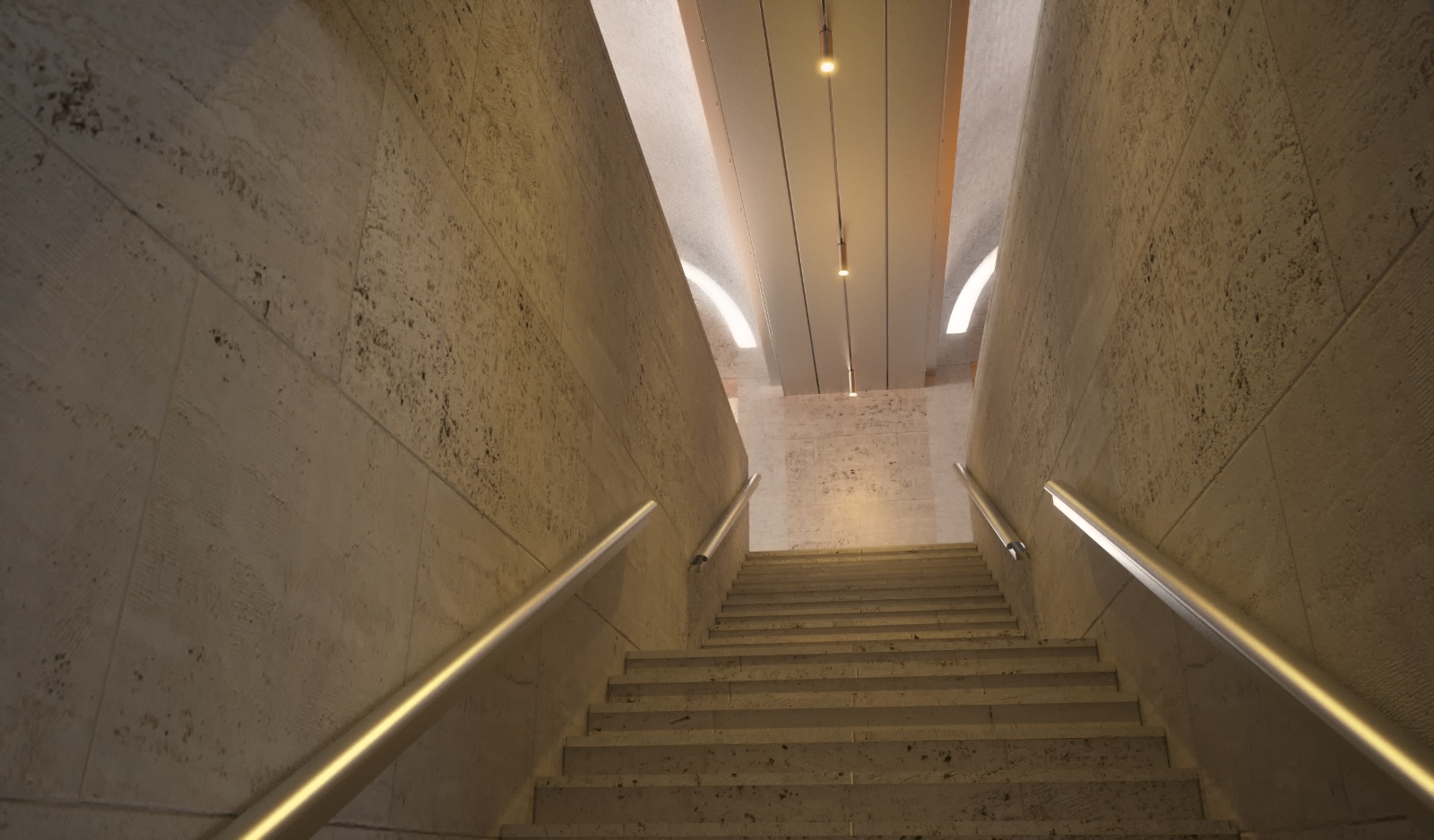
KImbell Art Musem Louis Kahn 1972
-
Nice render!

 That was one of the first buildings I modeled when I was learning CAD (in 1997) using Microstation Triforma. Ahh, brings me back
I can imagine the indirect lighting takes a long time to process with Maxwell, it looks pretty clean though, what SL did you run it to?Andy
-
Nice render. Perhaps more indirect light since that is what the design is all about? I guess that is hard when you are looking toward the directly lit outside. Kimball?
-
Nice job Chedda! I wonder what was giving the noise, could be the reflector within the light fittings?
Again great job mate, I hope this is part of a series!
-
I took it to SL 25, i have re-textured this model 3 times but the problem persists. I think part of the difficulty is that it breaks most of the rules of maxwell. Never use glass around light sources etc etc. I am going to have another go at finding the culprit when i have the time. The building is finished so yes it may well be part of a series. Thanks guys.
Simon
-
very nice model... the only thing which disturbs me is the flat looking surface of the leather bench.
i hope you guys don't mind if i give comments to pictures in the gallery since i'm pretty much a beginner in 3d modelling and i didn't post a scene myself this far.
-
Yes Carloh your welcome to comment. Actually the upholstered leather cushion has a lot of geometry, perhaps it is th texture itself you are referring too ? The light in this scene is also rather unique, if the light was more singular and directional i believe the bench would be better highlighted.
-
maybe when the camera is placed 1 or 2 steps forward it could solve the "problem"? just my noobish point of view

-
It's a rather stark space, so I think having the foreground elements helps the composition. Maybe the leather could have increased reflection to catch some of the highlights from the exterior to the right.
-
I have been to this museum a couple of times, and it is one of my favorite pieces of Architecture. You did a great job of rendering it.
-
Thanks J Smith it is good to have an eye witness account. This building is extremely popular with students and architectural courses. Is is perhaps my biggest challenge to date in trying to re-create lighting conditions. The next in the series is being prepared.....
-
This stair leads from the lower road & car park entrance, to the upper Gallery. Maxwell & Sketchup as always SL 21.6. Many thanks to Jason Maranto for helping me with this model. Also my friend Tomasz who converted the EPS file to dwg.

Hello! It looks like you're interested in this conversation, but you don't have an account yet.
Getting fed up of having to scroll through the same posts each visit? When you register for an account, you'll always come back to exactly where you were before, and choose to be notified of new replies (either via email, or push notification). You'll also be able to save bookmarks and upvote posts to show your appreciation to other community members.
With your input, this post could be even better 💗
Register LoginAdvertisement


