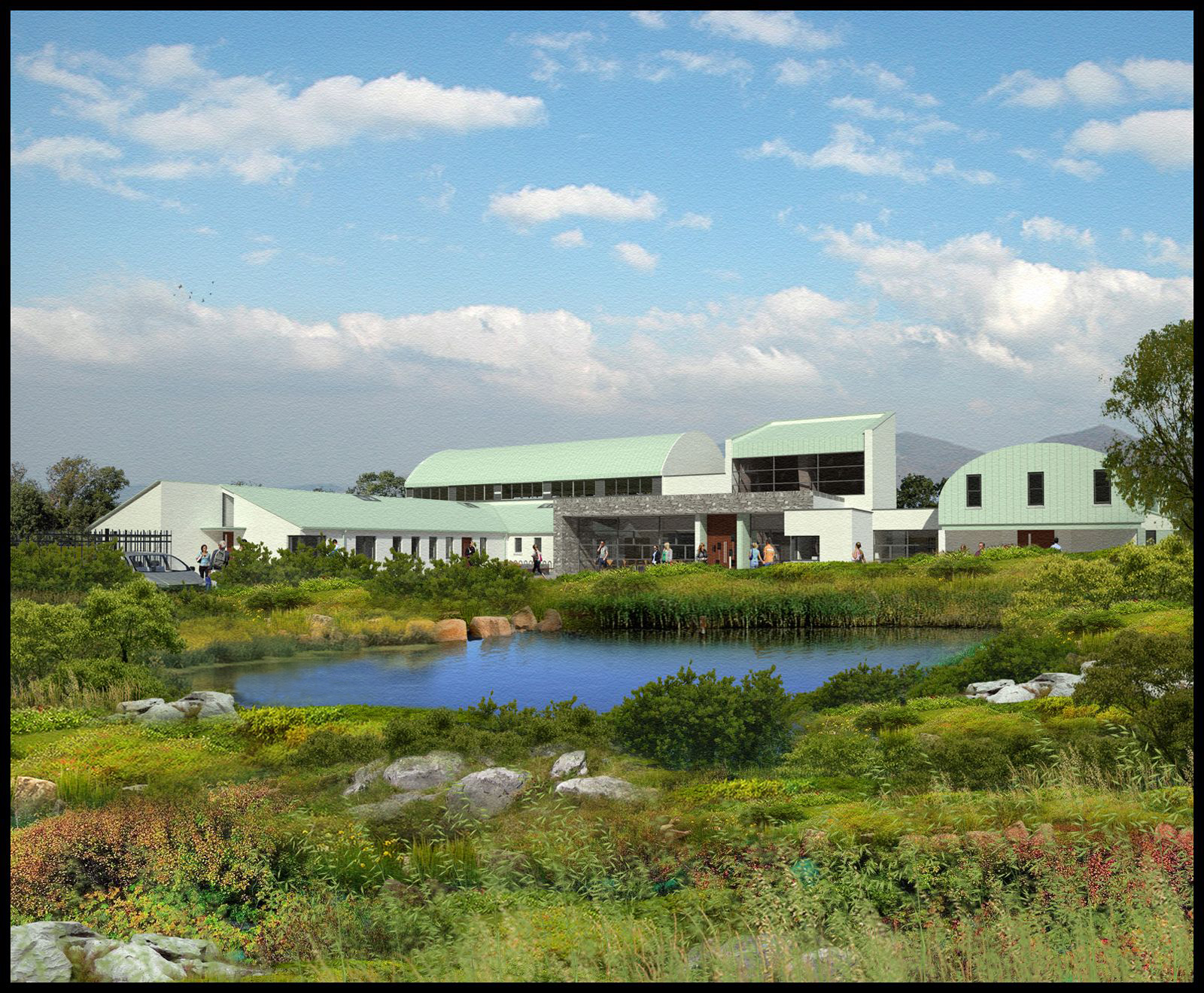
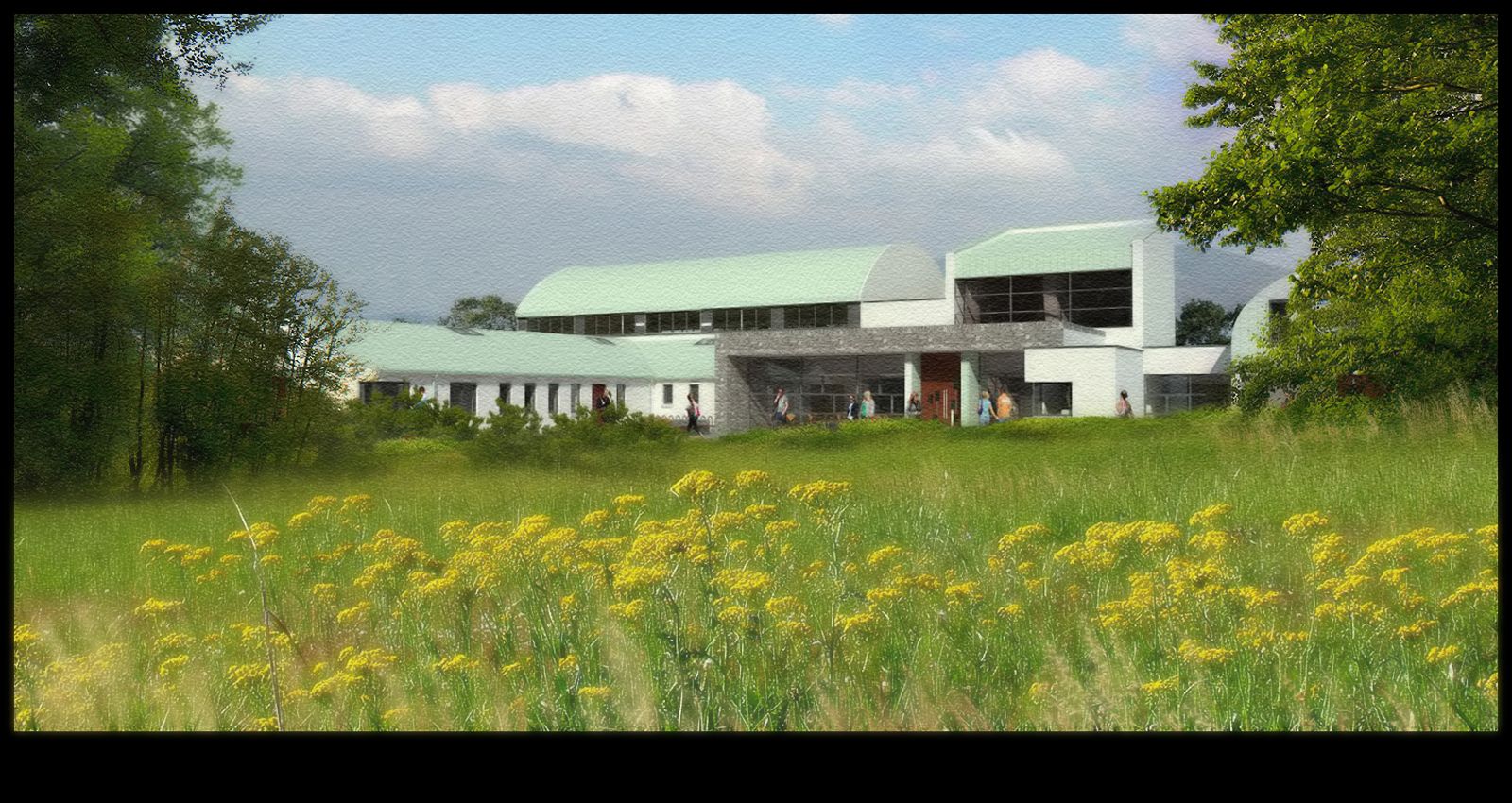
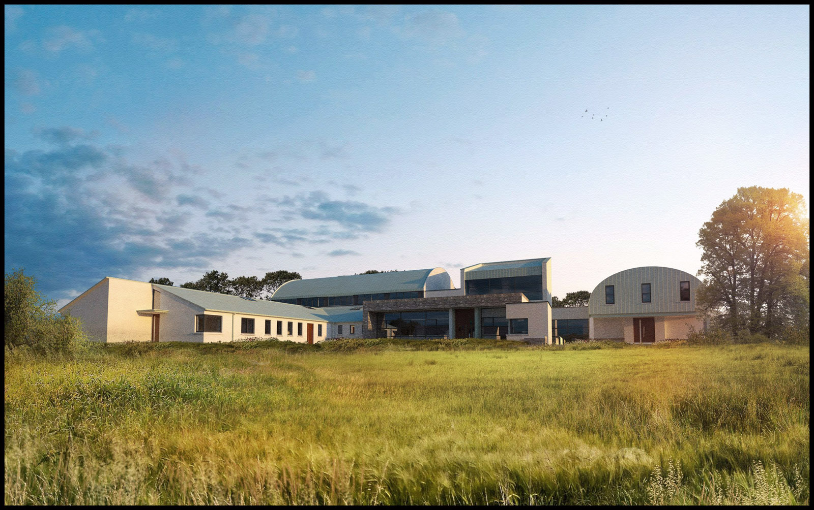
View across country
-
Attached is a view across the adjacent fields,at close to noon.There are about 30 layers of vegetation in the photoshop file,with different elements layered over each other and local masking done to allow them to blend together.
-
Cool vegetation, seems very realistic!

-
Fantastic work. How do you do it to look so good in one place? Is all vegetation from the same source?
-
Awesome scene and vegetation David as usual...
allanx
-
A lot of the vegetation is clip art I have built up over the years.Others are purchased such as the grain planting at foreground which is a digiart product.These Grains are very high in resolution so I normally place them right at the foreground,overlaying them on each other and adding gaussian blur to create a sense of depth.
Its really all about layering multiple images on top of one another,trying to make sure that the lighting on the clipart is someway consistant with the main render.As these are not photorealistic I dont get too concerned with matching elements exactly.
I often use trees as hedges/bushes.by placing them low behind another element such as some planting or rocks,only the tops of the trees are visible,which helps to suggest hedges.(I would use trees because you can get a lot of tree clip art with quite a high detail but not so much actual hedges.)
Then its all about blending the individual layers using either a mask or an eraser with a low opacity so you dont get a hard edge from one piece of vegetation to another.You dont have to look too close too see this effect in the image but I feel when taken as a whole,it works very well.This masking/blending also means you dont have to have crisp edges on your trees/planting as everything sort of almagamates into one (thats the idea anyway!)
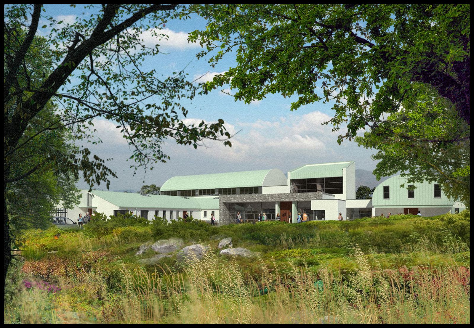
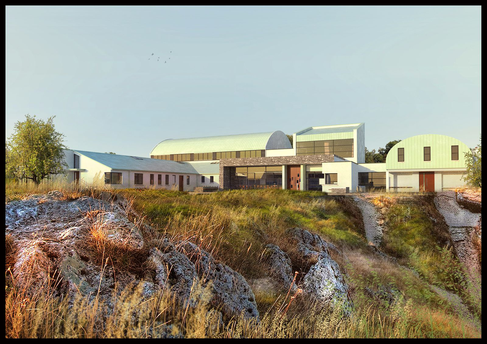
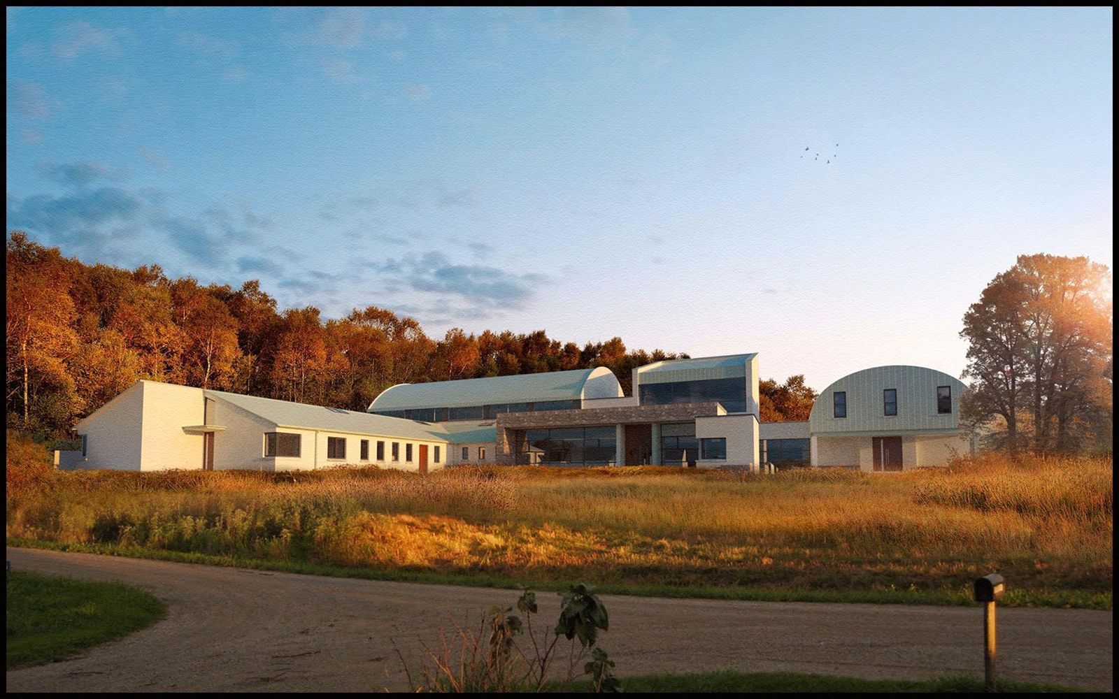
Below is a second version where I moved around some of the middle ground planting and added some additional grains.I also added some trees on either side darkening them a little to try and pull them more to the front.(you can see the grey stones in the middle are actually bleeding into the surrounding planting,a bit too much I think,but as all planting is photoshop it wouldn't take long to revise it)
-
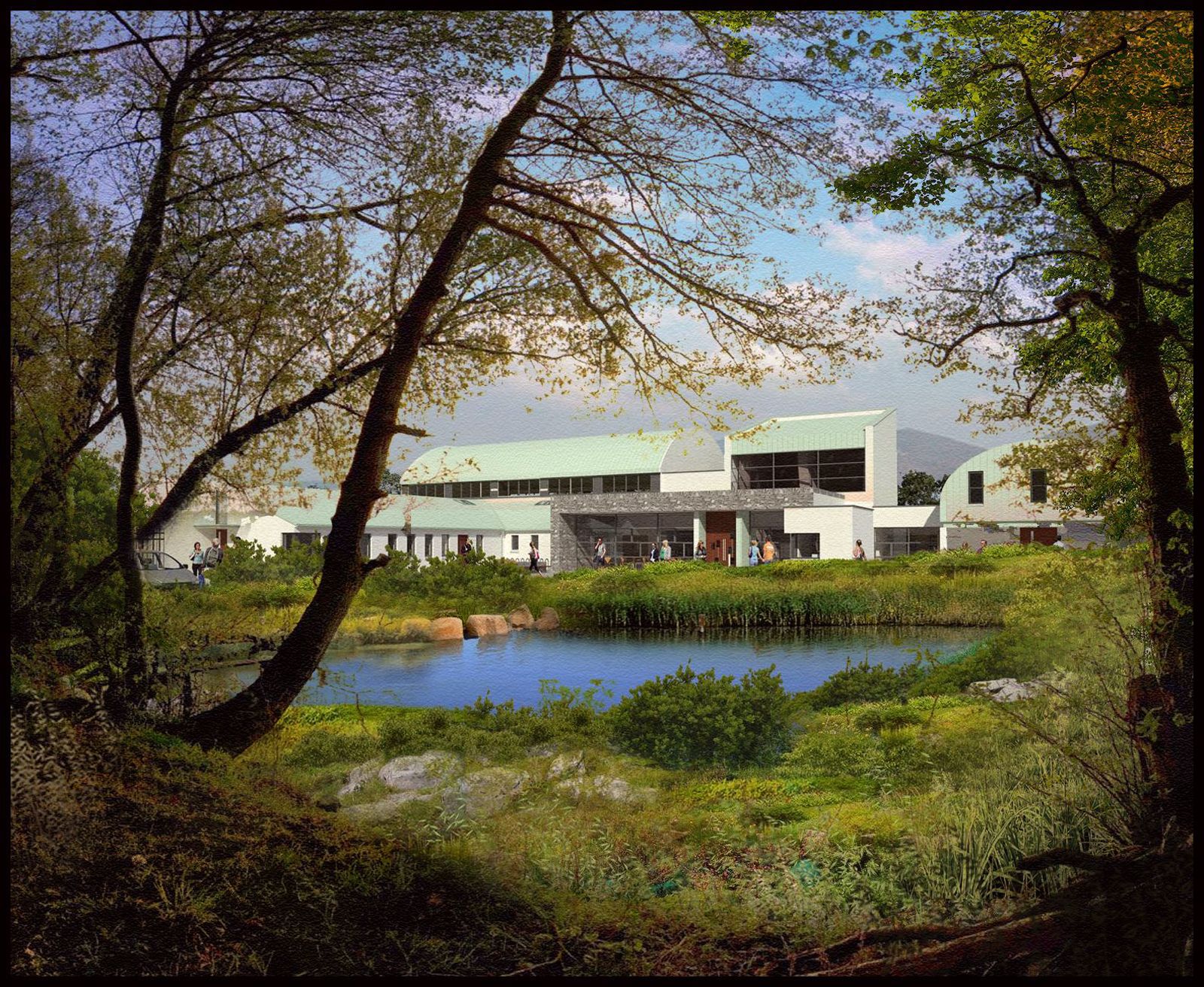
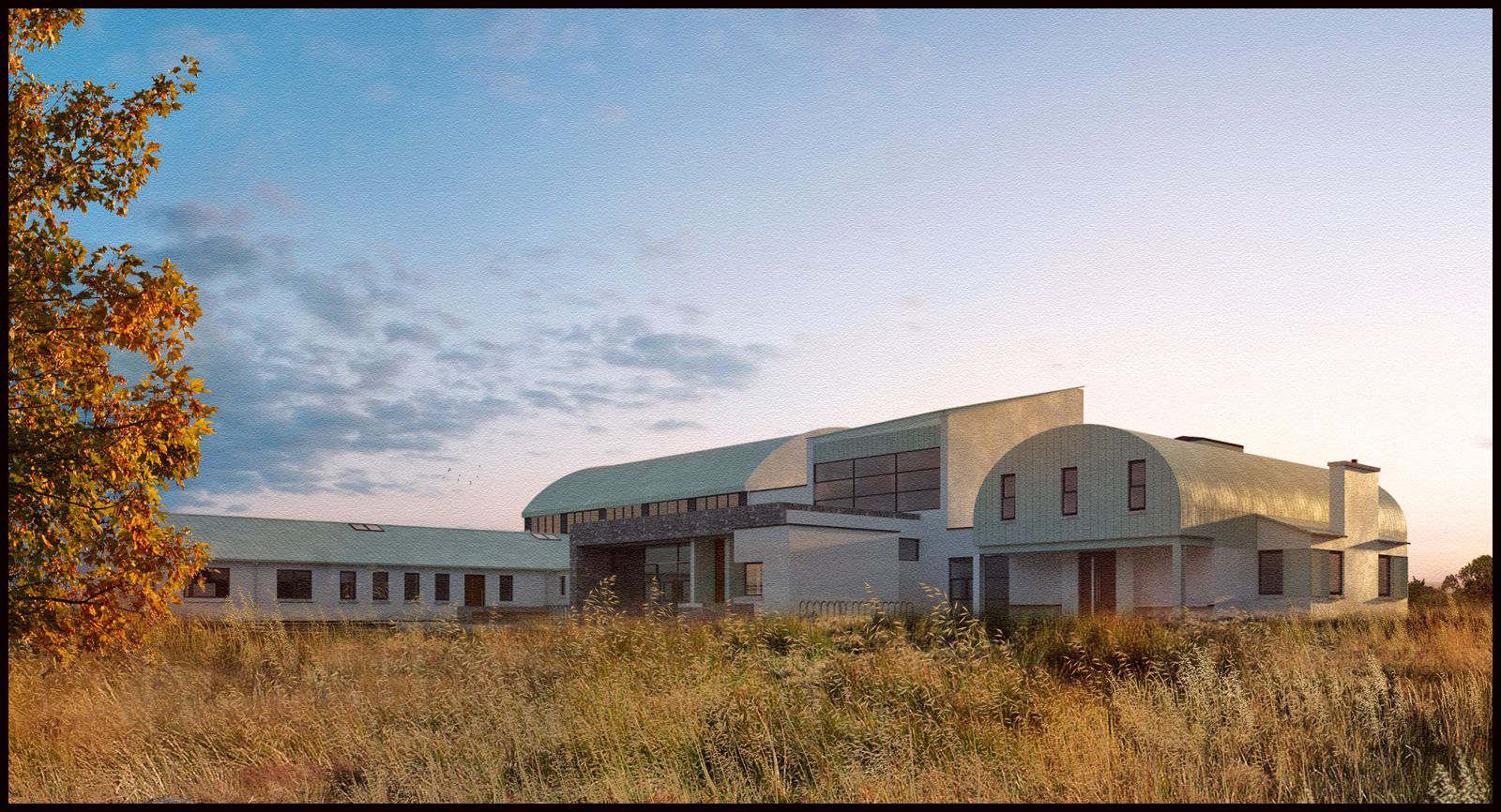
A more foreground oriented version.I quite like the effect of darkening the foreground to accentuate the main image.This can be dome witha vignette but I much prefer to add the extra detail of planting,just to make things more interesting.
-
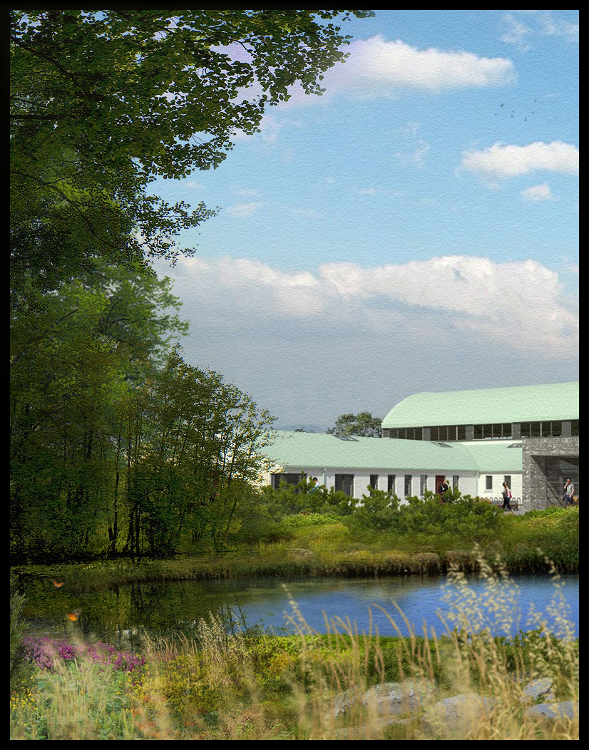
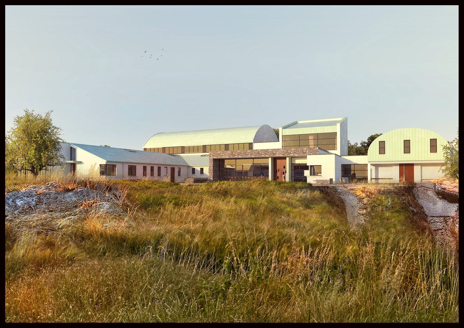
2 more versions with different vegetation.
-
All great images, David. How do you draw the distinction between photorealistic and artistic? I think most would accept some of the first pictures as PR. Some pros might point out details in lighting, as you say.
If you will, what is the best method for localized masking in this sort graphics?
Thanks for the new posts. Regards, Peter
-
Very nice images, I like the integration of vegetation and building.
-
A low evening sun shot with a much more detailed foreground.Again this foreground is made up of numerous layers overlayed and blended together.I removed the cloudy sky and preplaced it with a more clear sky as I felt the image needed a peaceful/blank area to offset the foreground detail.It also helps to accentuate the building.
Pbacot,
This is what I would refer to as more photo-realistic than the previous images,although it does have some "artistic flurishes".
The main difference between what I call Photorealistic and non-photorealistic with my images is that in the non photorealistic images I dont spend as much time adding shadows to the vegetation.While I try and use entourage that reflects the lighting of the original render,its not that important for me in NPR ,except if there was a large element such as a foreground where it would look odd if it didnt cast a shadow.With the image below I spent a while adding highlights to try and match the low evening sun which would be to the left in this image.
I burnt in some additional highlights to the main rocks at front and a couple of areas of grass that popped up in the middle ground.The easiest way to use masking is to copy in some planting on a new layer and add a layer mask.
Then using the gradient tool drag where you want the planting to start fading.then apply the layer mask.I would usually do this a couple of times for each piece of planting until I feel it sits well enough with the surrounding plants.This Technique can help to fill in the foreground with a lot of detail very ,very quickly.
-
nice work congratulation
cane we seed nice collage ----
-
I felt the foreground rocks in the previous image were a bit too strong so I added some additional grass to soften it.This was then colour toned to try and match the grass behind.
The second image is a wide shot of the building,again with a low angled sun.I noticed after rendering that the bump map for the standing seam on the copper roof is inverted and consequently the ridges are now indentations,I'll have to fix that later.
Regarding low angle sunlight,one of the things it does is pick up texture/bump maps very well if the light is coming at an angle to the bumped map surface.It also creates,in my opinion much better moods for rendering.
(there is a slight texture on the second image as there was a fair bit of grain in the render.By adding a small amount of texture it helps to hide these artifacts and also helps to tie the whole image together.
-
-
A simpler foreground with the low evening sun.I sometimes use lens flares in photoshop but usually only on the very edge,suggesting the sun.Its a little bit overdone here,but I wanted the effect of a bright,warm summer sun burning thru the tree.The sun is actually more to the right in the render but I guess you can call this artistic licence!
-
A revised version of the previous image.I felt the warm evening sun needed to be reflected more in the trees and vegetation,so the overall tone is that of a golden brown.
I also added the road to the front which as its darker,helps to accentuate the light on the middle ground and the T junction also helps with the dynamic lines of the overall image.
-
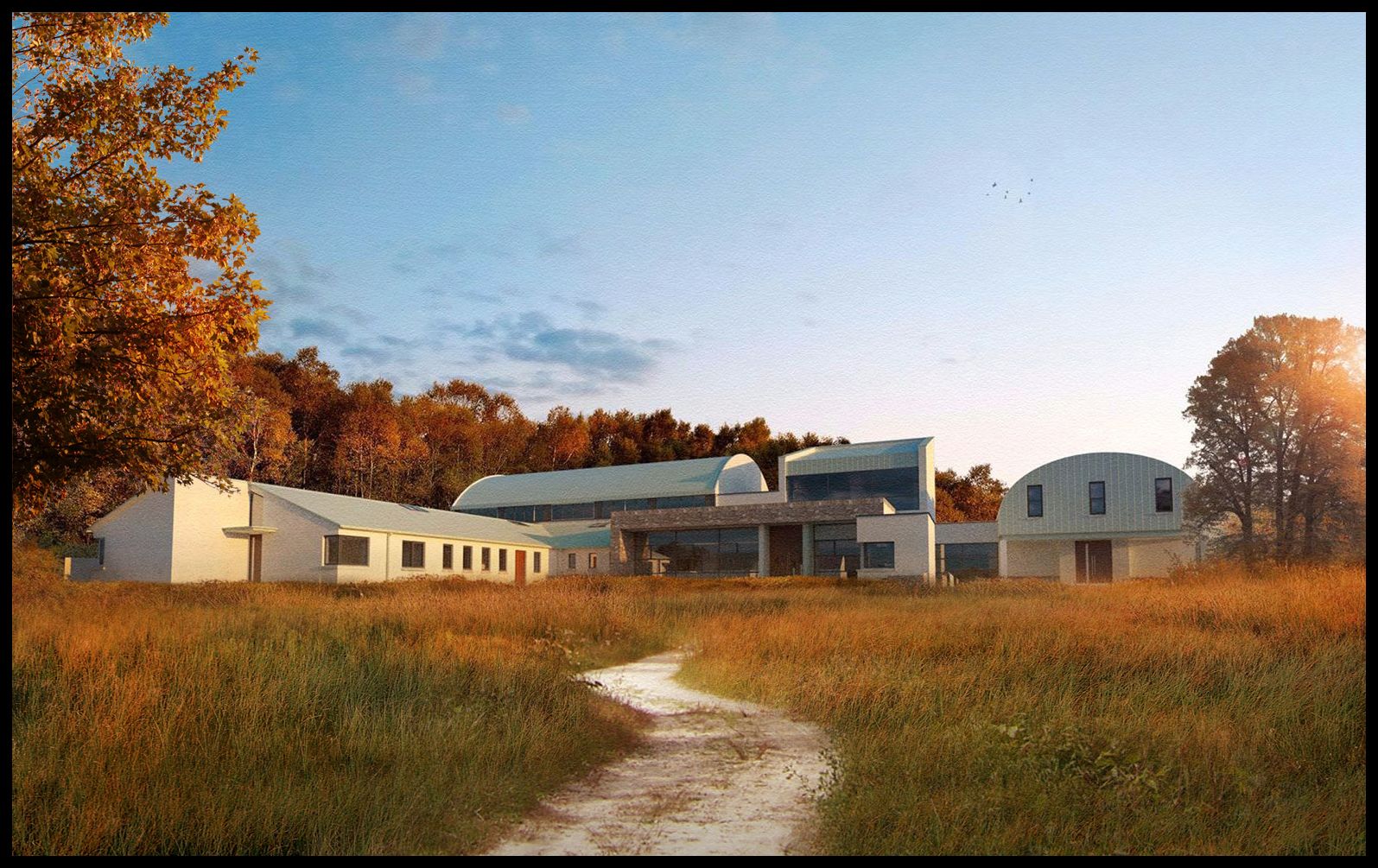
And the final image of this building.I wanted to make the image more organic and reduce the amount of straight lines and added the path instead of the road,with the additional foreground tree.
-
David,
It's a treat and a great help to follow your thoughts on this. I like this last one best! The background forest in the former one was a little "threatening". With the foreground, this is very friendly but I wonder if the owners expected a sand driveway. It looks like one of the victims of the recession. Never leased or got the parking lot.
Peter
Hello! It looks like you're interested in this conversation, but you don't have an account yet.
Getting fed up of having to scroll through the same posts each visit? When you register for an account, you'll always come back to exactly where you were before, and choose to be notified of new replies (either via email, or push notification). You'll also be able to save bookmarks and upvote posts to show your appreciation to other community members.
With your input, this post could be even better 💗
Register Login


Advertisement